Settings
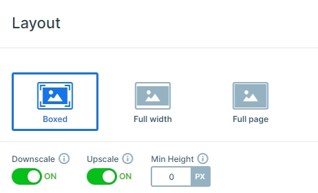
People still use boxed designs, even if full width sliders are much more popular. The best thing about boxed sliders is that they fit nicely into any page or post content. They look like they truly belong there and don’t break the layout either. This Boxed Particle Slider is a great example for a stunning modern boxed slider.

Layers
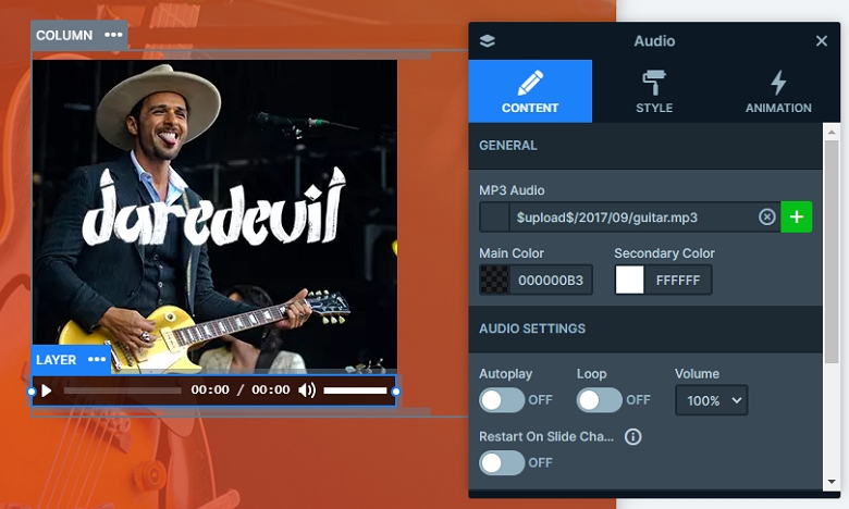
You can see a one row two columns structure on the static slide. There is an image, a heading, a text, and a button layer on the left side, and an audio player with a cover image on the right side. Creating this layout is incredibly easy. You just need to add a simple image layer, then put an audio layer below it.
The image layer has a handy shortcut on the sidebar. This shortcut makes it easy to add the most popular layers, like the image, heading or button, fast. The audio layer doesn’t have a shortcut, so you’ll need to open the add panel to add it. After adding the layers, the audio and the image layers need a maximum width. This ensures that the image and audio layer have the same size.

Animations
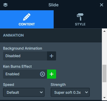
Each slide background image has a Ken Burns effect on it. This effect gives a movement to the images, and combining this with the slider autoplay makes the slider special. Also you can see small particles, which cheers up the slider. You can customize this in the animations tab of the slider settings.

Layout
Static overlays are special slides. They are above all the other slides in the slider. When the normal slides change, the static overlay remains in the same place. This makes them perfect for cases where the content doesn’t need to switch with the slides.

Creating a Static Overlay is incredibly easy. First you should add your new slides to your slider. Then, when you create a new slide, you’ll see a new option appearing at the end of the Add Slide options.
Editing a Static overlay is the same as editing any other slide. The only difference is that you’ll see the next slide’s background behind it. Static Overlays can’t have a background on their own, as that would cover the slides below them.
Responsive
The boxed particle slider is fully responsive, it looks good on tablet and mobile as well. In mobile you can see the row wraps after 1 column. By default, the left column will be on the top, and the right on the bottom. But you can change this order if you drag the green column boxes in the layer window.

Related Post: What is a Particle Effect and Why Should You Use It?
Related Post: Use the Popular Ken Burns Effect on your Slider


