Settings
This slider is unique because it contains both one YouTube, MP4 and Vimeo video slide. This demonstrates one of Smart Slider’s great strengths: you can create any kind of content using it. Within one single slider, you can show several various slides for instance, a simple image, YouTube, Vimeo or self-hosted video, and an imageless content slide. Moreover, you can create an image slide and put a smaller video layer on it. Exactly as you can see it in this full width slider example.
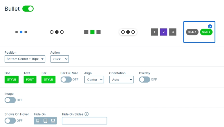
There are many ways to switch slides: you can use arrows, drag or swipe or use the text bullets at the bottom. Text bullets give a convenient navigation experience, as they give an idea about the slide content before switching there.
Layers
The background image of the slides is blurred to increase the contrast and make the texts more legible. By the way this is a setting that is available for any slide background image. So you don’t have to upload pre-blurred images, which saves you a lot of time.
Each slide contains heading layers which are the textual content. Each heading has a different style, because in Smart Slider you can customize every layer. Below the headings you can see a button layer, which opens the video in a lightbox. This way the visitor can enjoy them without distraction in the highest possible size. This is also great for the loading time, as the videos won’t show up until the lightbox is launched. Our lightbox supports both YouTube, Vimeo and MP4 videos.
The difference between the slides are the videos. The first slide has a Video layer on it, the second displays a Vimeo video, and the third has a YouTube layer.
Animations
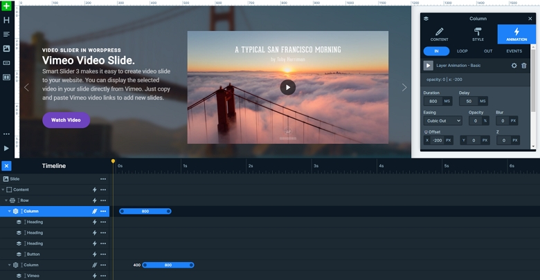
The 2 columns of the slides have an incoming fading animation. This animation displays all of the layers inside the columns, so all layers have layer animation on it. The left side comes in earlier then the right side comes in.
Layout
What makes this slider special (apart from showing videos from different sources) is its layout. On the left side there’s a short description about each video, which we placed to the right side. The layers are in a row, the left column contains the textual layers, and video, Vimeo and YouTube layers are in the right side.
Responsive
The slider looks great on desktop, and thanks to the default positioning, it’s gorgeous on mobile as well. For small screen users the slider displays the two columns below each other, with the video on top.
Related Post: Why do You Need a Video Slider on Your Website?
Related Post: Add Lightbox Slider to your WordPress site
Related Post: 11 Beautiful Full Width Slider Examples


