Settings
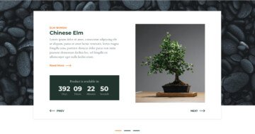
Tired of common product sliders? Do you want to show more than just one product for the visitor, but not to distract them with many? The Product Showcase slider is what you need! The showcase slider type displays one slide, the active slide in the middle. Then on the left and right side (if there’s enough space) they can see parts of the next and previous slide. This helps the visitor with two things: focusing on one product and learning that there are more products to see.

Layers
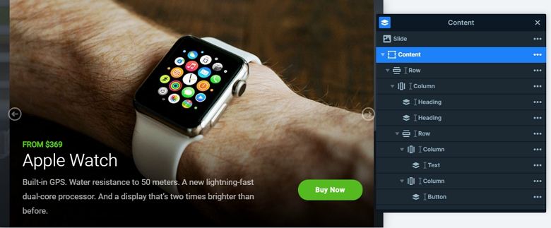
Each slide has the product image as a slide background. This allows the image to be seen in a large size. At the bottom of the slides the visitor can learn more about the product. The first and most obvious information they see is the price of the product, which is green. Below the price, they can learn the name of the product written with a large, white font. The last content on the left side is the product description. On the right side, there’s a CTA button the visitors can use to buy the product. It has the same green color as the price and it’s pill shaped.
Animations
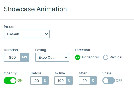
When you switch a slide, you can see the slider moves horizontally. This animation is the main animation of the slider which you can set in the Animations tab of the slider settings. Also, you can see the next and previous slides are much darker than the active slide. This is because their opacity is 20%, so you can focus on the active slide, but you can still see the other slides.
Layout
Visitors can navigate on this slider in three ways. The first and most obvious way is the arrow on the left and right sides of the slider. It’s a special shaped, white arrow, which is easy to notice on the dark background. Apart from the arrows, the visitors can switch slides by dragging or swiping. This swiping is favored on touch screen devices, like mobiles or tablets. On mobile the swipe is much more natural, than tapping a small arrow. The third way to switch slides is clicking or tapping on the next or previous slide. This action makes the slider switch to the selected slide.
Responsive
When you check this showcase on smaller views, you can see the slider will be smaller, and you can see only one slide on mobile. Because of that the visitors can focus on the content, and all of the layers are legible.
Related Post: Do you Need a Product Slider for your Webshop? Yes, you do!
Related Documentation: Responsive behavior of the showcase slider


