💡 Best features in this slider
- Image layer with Loop animation
- CTA button
- Animated Shape divider
Slider Settings
The 404 Blurry template is a full width block what you can use to display a user friendly 404 error page. Blocks are special slider types in Smart Slider, what you can use to take advantage of Smart Slider’s awesome features, without having to create an actual slider. So, Blocks are not sliders, but sections, and they can only display one slide. As a result, they load fast which makes them perfect for creatign a hero header.
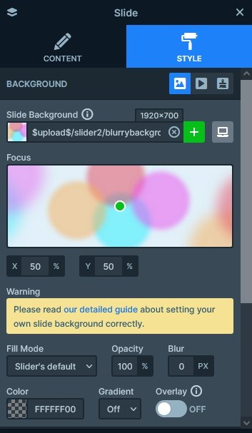
In the background of the slide you can find a blurred image, which displays circular shapes. Although this image is actually blurred with an image editor, Smart Slider has a blur option. So, if your image isn’t already blurry and you don’t want to edit it with your favorite image editor, you can just use our tool to make the images blurry.
Layers
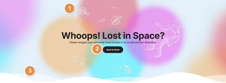
The 404 Blurry block features the most commonly used layers. These layers are: image, heading and button. The two heading layers display the main headline and subheading which tells the visitor why do they see this page. The button is to create a nice CTA to go back to the home page.
The most fun elements on the slider are the image layers. They display illustrations, which are trendy elements to use on a website nowadays.
Animations
The 404 Blurry block is full of animations. Every image layer you can see has their own layer animations. For example, the cat image has a loop animation that rotates it away from the slider and back again. The planet images appear with a cool rotating and scaling effect.
Apart from the layer animations the layers also have layer parallax effect. This makes them react to the mouse movement, which is fun to play with. As you move the mouse cursor above the block, the layers move to the opposite direction.
Layout
Smart Slider has two ways to position the layers. One is Default positioning, which you should always use to create the content of your slide. Default positioned layers have superb responsive behavior, and load fast on your site. The other is Absolute positioning, which is perfect to create decorative elements. You can drag’n’drop Absolute positioned layers anywhere on the slide, so it offers a free positioning. But it’s much harder to make them responsive than Default positioned layers.
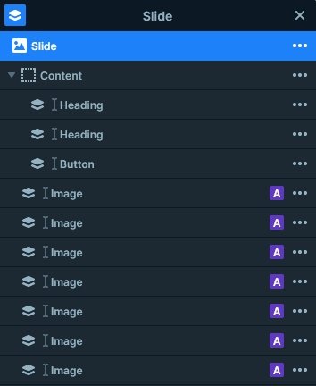
At this slider you can find 3 Default positioned layers: the two headings and the button layer. The other layers are purely decorational, so they’re in Absolute position. The Absolute positioned layers are under the Content layer, which makes them appear below the main content.
Responsive
Smart Slider’s Default positioning allows you to create great looking sliders fast, and takes care of the responsive behavior. Of course, you have lots of tools if you’d like to fine tune the result. One of the most popular tools is the Font resizer, that makes the fonts smaller for mobile devices. This way they fit better into the slider, and make it look more professional.
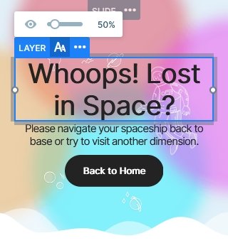
Default positioned layers can increase the height of the slider if they need more space. We took advantage of this at the 404 Blurry slider, and set top and bottom paddigns to the slide. This makes the slide appear taller, and have more white space, which looks great.
Related Post: Why Do You Need a Good WordPress 404 page?
Related Post: 11 Beautiful Full Width Slider Examples
