Settings
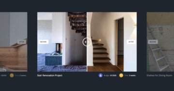
The showcase slider type has been made to replicate the cover flow effect. The essence of this WordPress slider is that you can see multiple slides together. The active slide is the one in the middle. As you can expect, the main functionality of this kind of display is to easily find something. You can set this slider up to show together as many slides as you want, which can help with the navigation between them. The navigation makes the usage fun, and it is more likely that the visitor will go through all the slides.
Layers
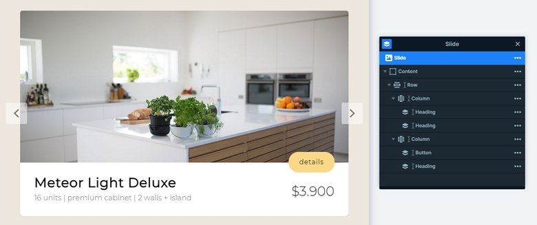
Each slide has the same layout and layers. There is a big image which is the background image of the slide. On the bottom of the slider you can see a row with 2 columns. There are 2 heading layers on the left column and another with a button layer on the right. This button has a negative margin, so the layer is between the image and the row.
Animations
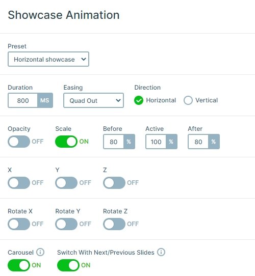
The slider has a horizontally showcase animation. There is only one active slide at a time, which eliminates problems like having autoplay on videos, and the layer animation plays better. The focus goes to the active slide, so you can create slides with more details, which will be more noticeable. The navigation gives a better user experience, the interaction is much more vivid than just clicking on an arrow, and letting the slides simply slide in.
Layout
The slides are next to each other, and the previous and next slide are smaller than the active slide. Because of that the visitor can focus on only one slide at a time. This slider type is great to display your sponsors or partners in your WordPress blog. The best layout for the showcase slider is to put it into a full width position of your WP theme, where it can stretch through your whole browser. Mainly because that is how it looks best, but also the responsiveness that way is better.
Responsive
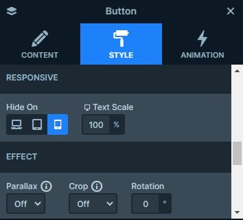
The response behavior of this slider type is that as the screen gets smaller, everything is getting smaller. When you check the slider on mobile, you can see the button layer is hidden. You can hide layers on different devices on the Style tab of the layer window.
Related Post: 11 Beautiful Full Width Slider Examples
