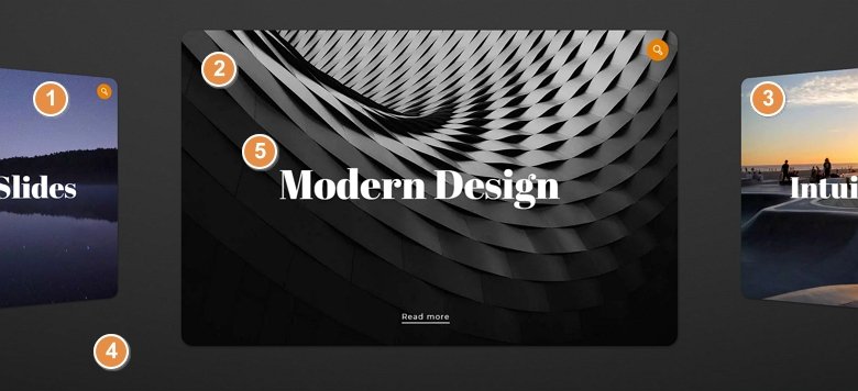
💡 Best features in this slider
- Previous slide – for navigation
- Active slide with lightbox
- Next slide – for navigation
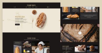
- Slider background
- Layer parallax effect
Settings
At the showcase slider you can see multiple slides together. The active slide is in the middle, but you can switch to other slides by clicking on them or with a simple mouse drag. The non active slides are rotated by 45° and are scaled to 80% of the original size. With these settings your slider will be better looking and clearer, and you can focus on the active slide.
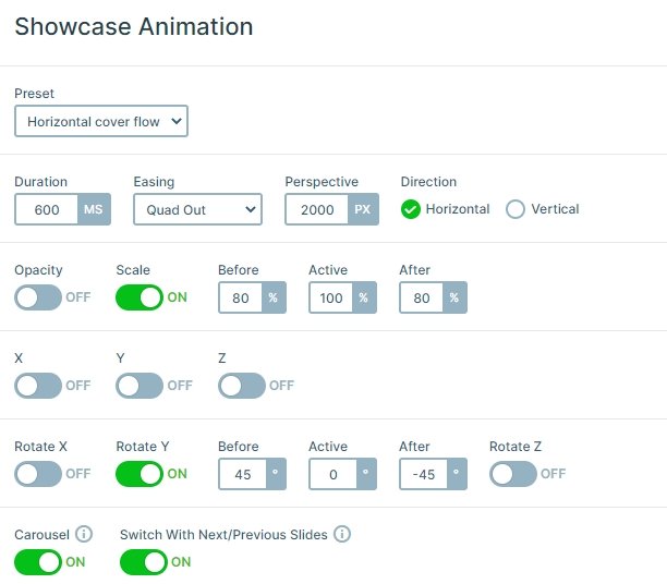
You can navigate horizontally, and there is the carousel option turned on. This means that the slides will cycle through continuously without stopping at the last slide, so after the last slide will come the first one. A simple dark grey background image is used which you can easily change to another image or you can pick a background color at Slider settings → General tab → Slider Design.
This showcase sample slider uses the boxed layout so the slider can be as big as the container it’s in. So you can use it easily in your theme, it will fill the area where you put its code.
Layers
Each slide has the same layout, and layers: an image layer on the top, 2 heading layers and an area layer. The Read more text makes an interaction with the visitor, you can put a link there and the visitor can navigate to another page or post. Also, you can see there is a line below the Read more text, which is a 2px height area layer. You can use it as a separator or a cool design element.
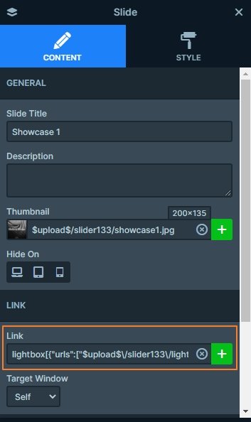
If you click on the active slide, a lightbox will appear with the background image. With a lightbox you can open images, videos or a page in iframe. You can use it without breaking your theme layout, because the lightbox appears above the current page, not within.
Animations
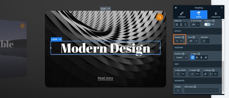
In the Showcase sample slider you can see a layer parallax effect which is based on the mouse cursor position. With this parallax effect your slider will be more powerful, and can make the illusion that the layers are live. If you hover on the slide you will see that the layers will move in a different direction.
Layout
Each slide uses the same layout, there is an image on the top right, and 2 rows below it. In the first row is the heading layer, and the other heading and the area layer are in the second row. At the top row the stretch option is enabled so fills the vertical area of the slide, and puts the image on the top and the other row on the bottom.
Responsive
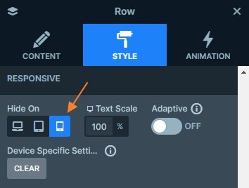
If you check the slider on mobile, you will notice that the second row with the Read more text is missing because it is hidden on mobile which you can save space, and your slider won’t be too big. But if you want to enable these layers, then open the layer list, find the row, and enable it on mobile at the Style settings of the row.
Related Post: Add Lightbox Slider to your WordPress site
Related Post: How to Create Beautiful Responsive Image Slider?
