💡 Best features in this slider
Settings
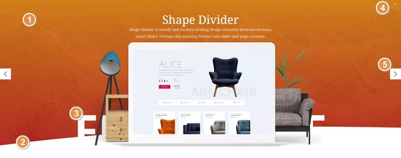
This shape divider slider example is a full-width slider with lots of layer animations. The basic idea was to create a portfolio slider, which has the shape divider at its bottom. The white color of the divider matches the background color of the section below the slider. This makes it seem as if the curved shape is a part of the white section below.
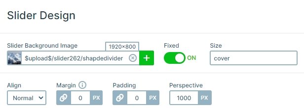
The slider has a fixed background image, which is similar to the parallax effect. The result is stunning, you can easily achieve it. Each slide has gradient background colors with an opacity, so the slider background image is visible below the slides.
Layers
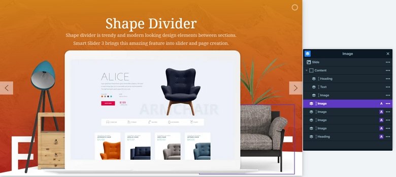
Each slide contains the same layers: there is a heading layer on the top, then a text layer and an image layer come. These layers are the main content of the slider, but you can see more layers below them. These layers are decorations in the slider, and are in absolute position. You can select these layers from the layer list, and then you can change or customize them.
Animations
This slider has lots of nice layer animations which can catch the visitors’ attention. The white heading layer creates the most interesting effect, the layers are above the shape dividers, thus the white heading seems to be a part of the divider.
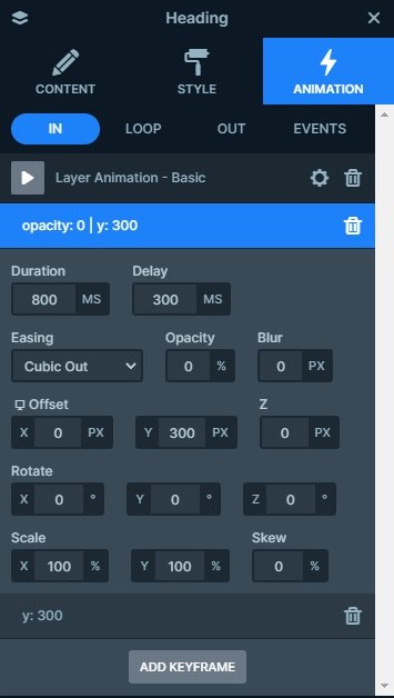
The heading layer in the background is built up from 2 keyframes. The first keyframe has 300ms delay, and comes from 300px to their original position. The second keyframe has 200ms delay and it will finish the animation with a back out easing, and the text will go to the bottom.
Layout
In Smart Slider you can position your layer in 2 ways: with default and absolute position. The default positioning works like a page builder, and you can achieve a good responsive behavior. With absolute positioning you can move your layers freely on the canvas, and you can put the layers above or below other layers. You can also mix these positioning options, like in this example.
The animated layers in the background are in absolute position, and they are below the content layer. Because of that you will need to open the layer list to select these layers. Once you select a layer, you can move it, delete it or replace it.
Responsive
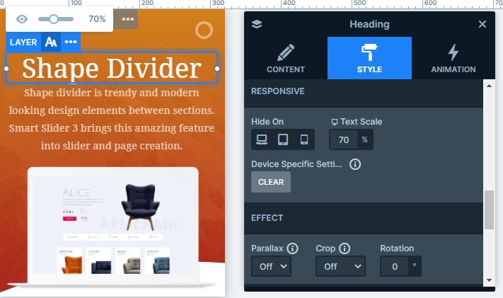
If you check this slider on smaller devices like tablets or mobile, you can notice, the background layers in absolute mode are hidden. Also, the default layers like the heading and text layers are smaller. You can make your text smaller with the Text scale option. This is device specific, so you can work with different values on different devices.
Related Post: Add Beautiful Section for your Website with Shape Dividers
Related Post: Use Beautiful Layer Animations in Smart Slider 3 Pro
Related Post: 11 Beautiful Full Width Slider Examples
