Slider Settings
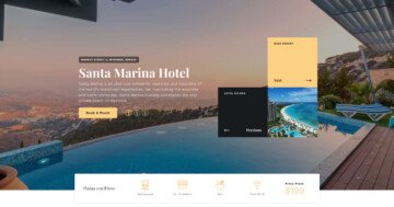
The SEO Agency template is a full page slider. Full page sliders are super popular because they fill the screen both vertically and horizontally. In fact, they make hero sections and hero sliders look spectacular! But you don’t need to create a typical hero slider to be able to use a full page slider. They’re super versatile and can be used for anything else.
There are two settings that go with the full page layout super well. The first option is the Mouse Wheel setting, which allows visitors to go through the slides by scrolling with their mouse. Since the slider fills the whole browser width and height, the mouse wheel option creates a great user experience.
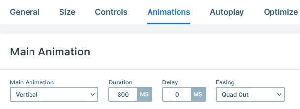
The other option that goes well with the Full page layout is the Vertical Main Animation. The Main Animation is the basic way to make the slides (both background and layers) move. A vertical animation paired with the Mouse Wheel control and Full page layout creates a spectacular slider!
Layers
The SEO Agency template uses basic layers. You can find headings, texts, images and a button on each slide.
At the right bottom part of the slides, there are up and down arrows for navigation. These are image layers, and they can switch slides using the Link Actions.
Animations
The most obvious animation you can see on this template is the layer animation. Layer animations are great to introduce layers to your slider. That is why we use them to introduce almost all layers with some kind of cool movement.
The other animation you can see is the Layer Parallax effect. If you move your mouse cursor, the large round shaped image in the background slightly moves.
Layout
There are two kind of layouts in this template that worth mentioning. The first one is the large colored image and the figures on top of it. The base of the layout is the colored image which is in Default position. The reason the decorative figures can appear on top of it, because these are in Absolute position.
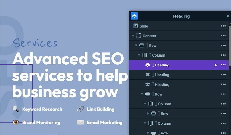
The other interesting layout is the rotated SEO text on the left side. It’s also an Absolute positioned layer, that’s rotated with Smart Slider’s Rotate option. To modify the text of this layer, simply open up the Layer List and use that to find it.
Responsive
Smart Slider is a responsive slider and has many great tools to fine-tune your slider for small screens. For example, if you add a row it’s columns are automatically wrap below each other on small screens. Of course if you have a layout where you need the columns to be next to each other, you are free to modify it.

Apart from the automatic options you can make lots of manual edits. For example, you can adjust the text size using the Font Resizer. Or, you can hide layers to ensure that your content fits into mobile devices. Additionally, you can even change order of the columns, for example, to make a column containing an image appear above the textual content.
Related Documentation: Fullpage layout
Related Post: What is a Full Page Slider and How to Use it?


