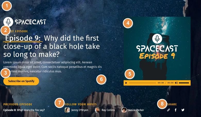
💡 Best features in this slider
- Ken Burns effect on the Slide background
- Highlighted heading layer
- CTA button
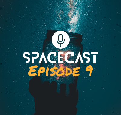
- Image layer
- Audio layer
- Particle effect above the Slide background
- Image box layers
- Icon layers
Settings
The Podcast Block is a full width section you can enrich your site with. Blocks in Smart Slider are special sliders. They’re not exactly sliders, as they can only display one slide. So, why should you use a block on your site?
The block type allows you to use Smart Slider’s powerful features on your site, without having to create an actual slider, with more slides. You can enrich your site with our 24 layers, or use effects like Ken Burns, Particle or Parallax. Additionally, blocks load super fast! It’s not like the speed would be a problem if you use Smart Slider 3, as it’s one of the fastest sliders.
Layers
The Podcast Block is full of interesting layers. The most special looking is the Highlighted heading layer. The Highlighted heading layer is perfect to make a text stand out. That’s why we used it on the main headline, which has a double underline at its “Episode 9” text.
The other interesting layer is the audio layer on the right side. It lets you add an mp3 sound to your slider what your visitors can listen.
The third layer that’s worth mentioning is the Image box layer. It creates the content under the “Follow your hosts” headline. The image box layer has three parts: an image, a heading and an optional description.
Other than these layers, you can find rows and columns, images, icons, headings and a text layer. There’s also a button layer what you can use to call your visitors to take action.
Animations
There are two animation effects on the Podcast Block which help you amaze your visitors. First, the Ken Burns effect that creates the zooming effect on the image. It’s a very simple effect, but it makes your block look interesting and helps getting your visitor’s attention.
The other effect is something you won’t spot too easily. It’s called Particle effect, and it creates small, moving particles behind the layers. These particles interact with each other and the mouse as they’re moving. When they get close, a line appears and connects the dots. When you move the mouse around, the cursor pushes the particles away.
Layout
The base of the Podcast Block’s layout is a two column row. This holds the main content: the episode details on the left, and the audio on the right. This row is stretched which makes it fill the available space, and pushes the second row to the bottom.


