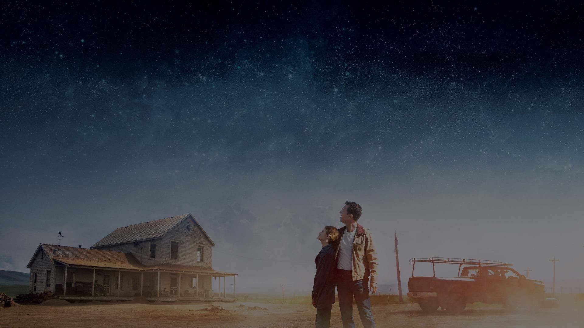
Slider Settings
The Movie Slider is a simple type slider that uses the full page layout. Simple sliders are traditional sliders, which display one slide at a time. This helps the visitors focus on the slide, as they’re not distracted by the content of other slides. Also, simple sliders give you plenty of horizontal space to display content on big screens.
There’s a Static Overlay on this slider, where you can find the Next and Prev buttons. Static Overlays are special kind of slides, which don’t slide, but appear on top of all other slides in the slider. So make sure you don’t use more than one Static Overlay in your slider, as both will appear together.
For navigation, visitors can use the Prev and Next buttons on the Static overlay. For touch screen users, the left and right swiping is supported as well.
Layers
There are many different layers on the Movie Slider. You can find the common layers, such as heading, text and image on each slide. The heading layer contains the title of the movie the slider displays, while text layers are used for the rest of the texts.
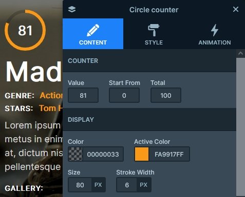
The most special layer on the slides is the Circle Counter layer. It’s a kind of counter, that both counts up using a numeric value, and fills a circle shape. The circle counter layer is an interesting layer you can enrich your slides with.
Animations
The most obvious animations on the slider are the layer animations. Layer animations are special effects you can use to introduce layers to the slide, making it more interesting to view. Also, you can use them to make layers disappear from the slide. There’s a layer animation on most layers, which make the slides more interesting.
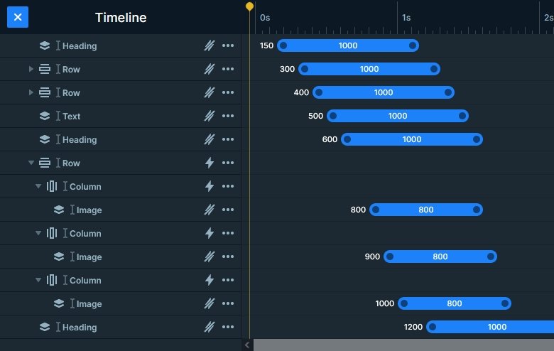
There’s a background animation on the slide background images. It’s a parallax-looking slide switching effect, which slowly moves the upcoming image on top of the previous one. It’s a simple effect, but cheers up the slider.
Additionally, there’s a lightbox on the image layers of each slide. The big image layer displays a YouTube video in the lightbox, while the small images display an image gallery. Smart Slider Pro’s lightbox supports a wide variety of visuals you’d want to display. For example, you can display videos, images or even websites. Additionally, you can mix the displayed visuals as you like. For example, you can create a lightbox, where you display a video and two images after each other.
Layout
There are interesting layouting solutions in the slider. For example, there’s a four column row under the movie title displaying the white and orange texts. The full width option is disabled at this row, which makes the columns break into new lines automatically when needed.
Responsive
Smart Slider 3 offers many responsive options to optimize your sliders for small screens. You can change many options device specifically, for example, the font size or the distance between the layers.
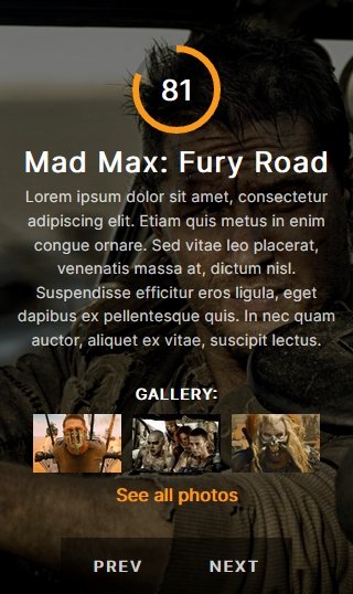
If you check the Movie slider on mobile, you’ll notice the large image layer, the counter and some other layers are missing. These layers were hidden on purpose. When optimizing for mobile, you should always aim to create sliders which are around 550px tall. As a result they’ll fit nicely into the various sized mobile screens.
Related Post: What is a Full Page Slider and How to Use it?
Related Post: 9 Point Ultimate Checklist to Create your Next Slider
