Slider Settings
Just as it can be noticed from its name, this slider is created with the Full-width slider type. One of its many benefits is that it offers a responsive look that can look outstanding on different screen sizes.
It makes use of different types of controls to offer your visitors the most convenient experience while browsing your website. One of them is to simply drag your slide horizontally. This is most beneficial for smaller screen sizes, where swiping is often used.
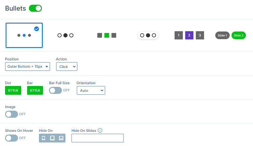
Besides this, you will notice the three dots under the slider. Visitors can use the bullet points to choose whichever they would like to view. Moreover, bullet points are very helpful in case you want to show the number of slides available in the slider.
Lastly, the third option is to use the arrows shown on each side of the slide. They are easy to understand with their clear and individual design. In addition, it’s perfect for viewing slides one by one.
Layers
This template uses many types of Smart Slider’s captivating layers. It implements the fundamental layers, like the Image layer, Heading layer, and Text layer.
However, some of them, like the Image Area layer, are specifically designed using Absolute layers. They are super easy to use, as they can be drag’n dropped anywhere in your design, enhancing the whole outlook. This makes it easy for overlapping layers just like we did in this template with the Image Area layer.
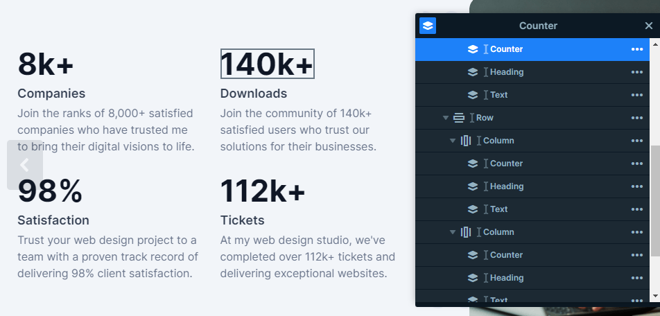
Moreover, we can find that the Countdown layer is very eye-catching with its own uniqueness, which is perfect in this case, as this template is representing the company’s achievements with it.
The layer parallax setting is a simple but effective way to enhance your image’s character, in this template’s case it’s used as a design element.
Animations
This template’s Main Animation is set to Horizontal, so the slider moves horizontally. It’s very simple but effective.
Moreover, as you can see the content is introduced in many different ways. Using Shape Dividers can cheer up your slides with their trendy design. What’s more, is that they are fully customizable, so you can create your own modern graphic shape.

On top of that, all of the layers have their own smooth and lightweight layer animations. They all together help with catching and keeping the visitors’ attention with their unique movements. The Monolith Full Slider template’s animations are all in harmony together, which can be easily created using the visual timeline. Here the delay and duration can be changed.
Layout
The two-column row layout can be found on each of these slides. Both sides assis different purposes. Let’s take the first slide as an example, while the left side provides us with important information, the left side’s purpose is more about making the whole look more engaging with the supporting images it offers. Both are very important in their own ways. Altogether, it results in the perfect minimalist layout.
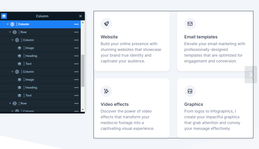
On the other hand, the following two slides are wholly about providing information for the potential user. Both have one of their columns separated into another two rows with two additional columns.
Responsive
Smart Slider offers different solutions for responsive design. This template’s layout offers many benefits that the slides can take advantage of to create the perfect view for each device. The Wrap After setting lets you design your rows differently for all screen sizes. You just need to set the number of columns you would like to break your content into.
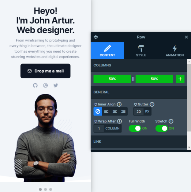
Furthermore, one of the many useful tools in Smart Slider’s responsive settings is the Font Resizer, which can be very handy in any case to adjust your design specifically for each particular device.
In addition, the Hide On option was the perfect solution for the third slide’s text content. It lets you hide different layers device specifically.


