💡 Best features in this slider
- CTA button
- Image layers with layer parallax effect
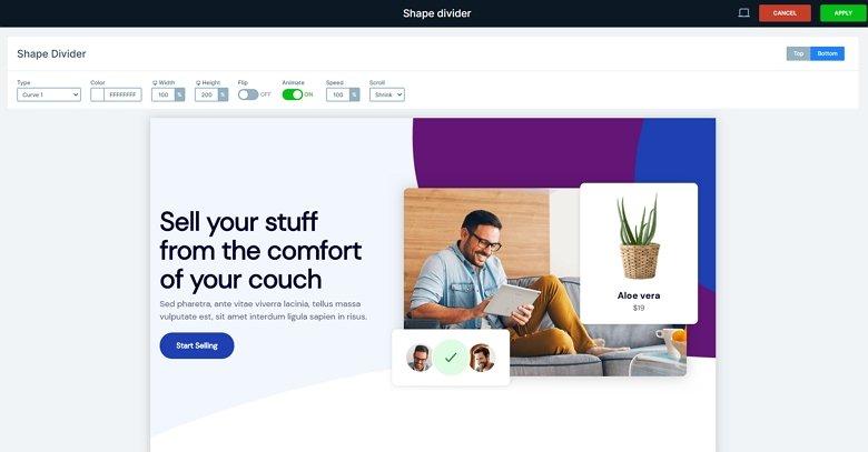
- Shape divider
Settings
The Marketplace block is a full width block type slider. It fills the horizontal width of your browser, and has only one slide without any controls.
🎓 Free Version Available
Did you know you can create Blocks in the Free version of Smart Slider 3? If you like this template take a look at its Free alternative.
On the bottom of the block an animated shape divider cheers up the layout. This is a trendy and modern design element between sections. In addition, it can be used as a separator, too.
You can customize the Shape divider effect in the Slider settings → Animations tab. Here you can change the shape, the color, the height, and you can disable the animation if you don’t need it.

Layers
The block is simple and minimalist, there are simple layers used: heading, text, button and images. The two small images are on the third image thanks to the absolute positioning. The button can be a great navigation element if you put an action on it to scroll down, but you can navigate to another page, too. If you hover over it, its color changes, and a small shadow is visible. You can customize all of this effect in the layer window.
Animations
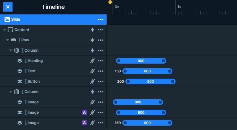
All layers have a layer animation, moreover, they are coming from every side which makes a great visual effect. You can customize each animation, and set the delay and the duration in the timeline.

The image layers are the speciality of this slider, they have a parallax effect. If you hover over the block you can see that the layers move a bit. This mouse parallax effect is based on the mouse cursor position, it creates the illusion of depth for the layers visible on the block. Each image has a different parallax intensity which you can change in the Layer window → Style tab → Effect.
Layout
The block has a simple structure, the layers are in 1 row – 2 columns. However, the 2 small images are in absolute position, above the third image. This was useful because in this case the image layer can be animated. The layers are aligned to the top-right and bottom-left corner of the column, and they keeps that position in different devices.
Responsive
By default the content is on the left side, and the images are on the right side of the block. The basic responsive setting of the row is that it wraps after 1 column on mobile. The left column will be on the top, and the right on the bottom. However, this order is changed at this slider. Therefore, you can see the images on the top. You can change the order of your column device specifically, just drag the green boxes into the right place.
Related Post: 11 Beautiful Full Width Slider Examples


