Settings
The Joomla Article Slider uses the most common slider type. It displays one slide at a time, which contains details from a single article. It uses the boxed layout, which makes the slider fit nicely into the container you place it.
The most interesting part of the slider are the thumbnails. They’re vertical, and have two purposes. First, they allow and easy way to browse the slides. Second, they indicate how many slides there are to see. On each thumbnail you can find the title of the slide as a caption.
The other navigation option is the arrow. It allows checking the slides one by one. The touch navigation is also available.
Layers
Each slide has the same layout, which makes the Joomla Article Slider perfect for creating a dynamic slide. There are two heading and two button layers on each slide. They help displaying the category, title, date and author of the post. There’s also a CTA button that can take the reader to the post.
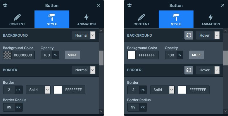
On the button layer there’s an interesting hover effect. The button itself has a white border with transparent background. But on mouse enter the transparent color changes to white.

Animations
The only animation the Joomla Article Slider has is the Main animation. The Main animation is the effect that moves the backgrounds and the layers, if neither has their own animation. in this slider’s case this movement is horizontal, which looks simple but professional.
Layout
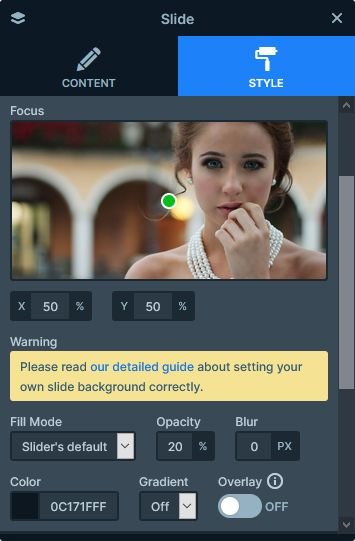
To ensure the legibility of the texts, the background image of each slide has a dark blue overlay. This helps increasing the contrast between the background and foreground. So your visitors will be able to read the post title, date and author more easily.

By default the headline would be too wide. This makes it more uncomfortable to read, so we set a max width on the heading. As a result, the visitor can read the text more comfortably. Additionally, it looks nicer as well.
Responsive
Smart Slider 3 uses a unique way to build slide. It’s called Default positioning, and it works very similar to the way page builders work. Every layer acts like a block, so they won’t overlap each other. This helps creating responsive sliders effortlessly, because the layers make space for themselves. The only change we had to make in the slider for mobile was reducing the font size of the headline. as it was too big. Although it wasn’t necessary, we also increased the top and bottom paddings of the slide, creating a nicer layout.

Related Post: How to Create a Joomla Slider?
Related Post: Create A Responsive Thumbnail Slider


