Settings
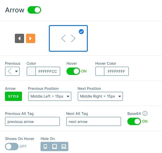
Simple but elegant design elements are the future of web design. This applies to sliders and galleries, too. This simple Image Slider is a great way to display an image slider on any website. It’s a boxed slider, which makes it perfect to publish inside posts or any non-full width sections. The slider’s structure is quite simple, as it has three slides only. The visitor can go through every slide using the arrows, bullets, swiping or dragging.
Layers
Each slide has a short caption that describes the image of the slide. The font color of the caption is white, and there’s an opaque dark background behind it. This ensures that the text remains legible regardless of the image behind it. The font family is Raleway, which is easy to read, especially in such a big size.

Animations
When you switch a slide with a mouse drag or with the arrows, the next slide fades in. This fading effect is the main animation which you can customize at the Animations tab of the Slider settings. It can be a horizontal, a vertical animation, or you also can disable it if you don’t need that animation.

Layout
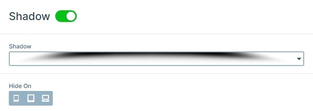
At the bottom of the slider there’s a dark shadow. It’s created by the Shadow control feature. There are seven predefined shadows, and in the Pro version it’s possible to upload a custom image. Just like every control, shadows can be hidden on desktop, tablet or mobile devices. Shadows are great to make the slider pop off the page giving the impression that visitors can physically interact with the slider. Shadows also help to state hierarchy between the slider and the rest of the page. They make the slider appear above the rest of the page content.
Responsive
Thanks to default positioning, the caption remains legible on mobile. The caption is positioned to the the bottom-left corner of the slide on big screens. But on small mobile screens, the caption is moved to the center of the slide. This small change improves the look of the slider on small screens.
Related Post: How to Create Beautiful Responsive Image Slider?
