Settings
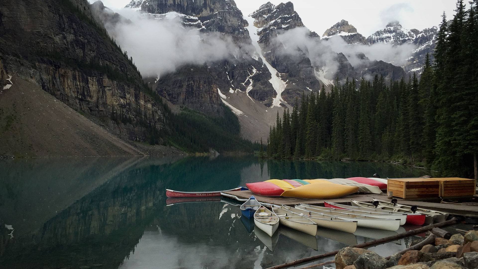
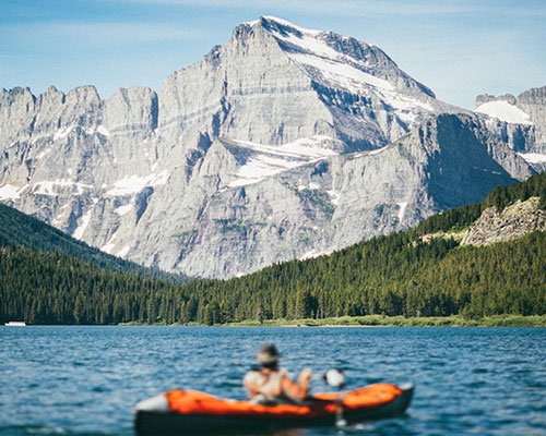
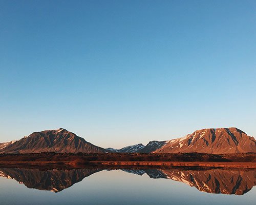
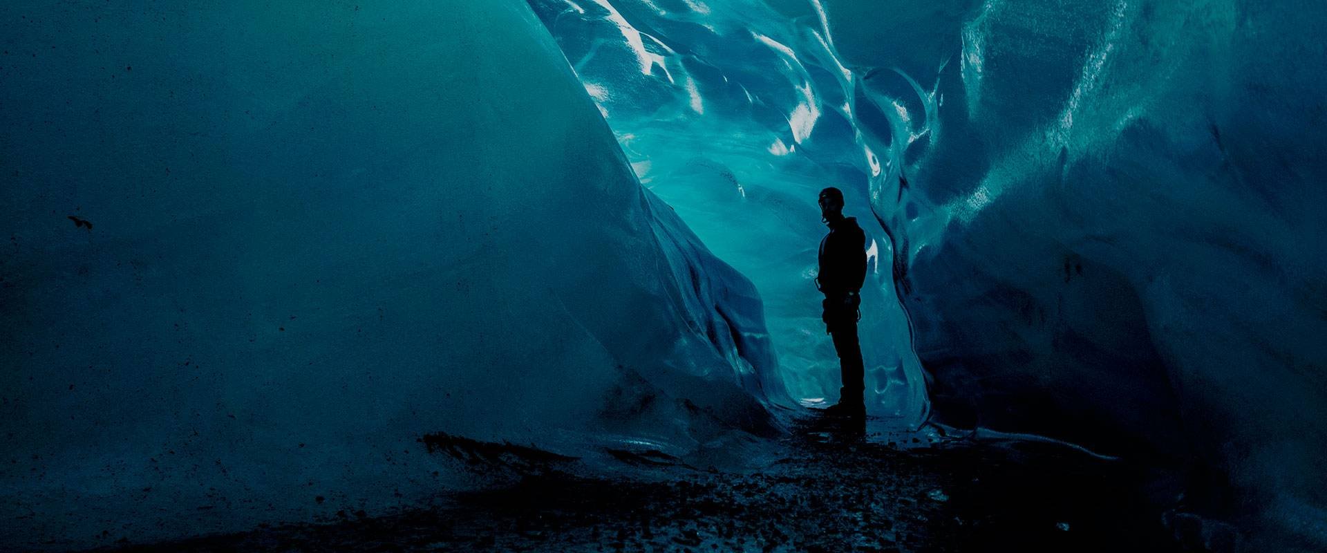
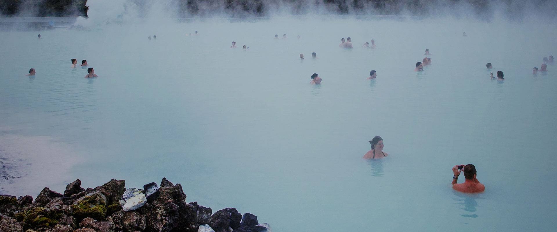
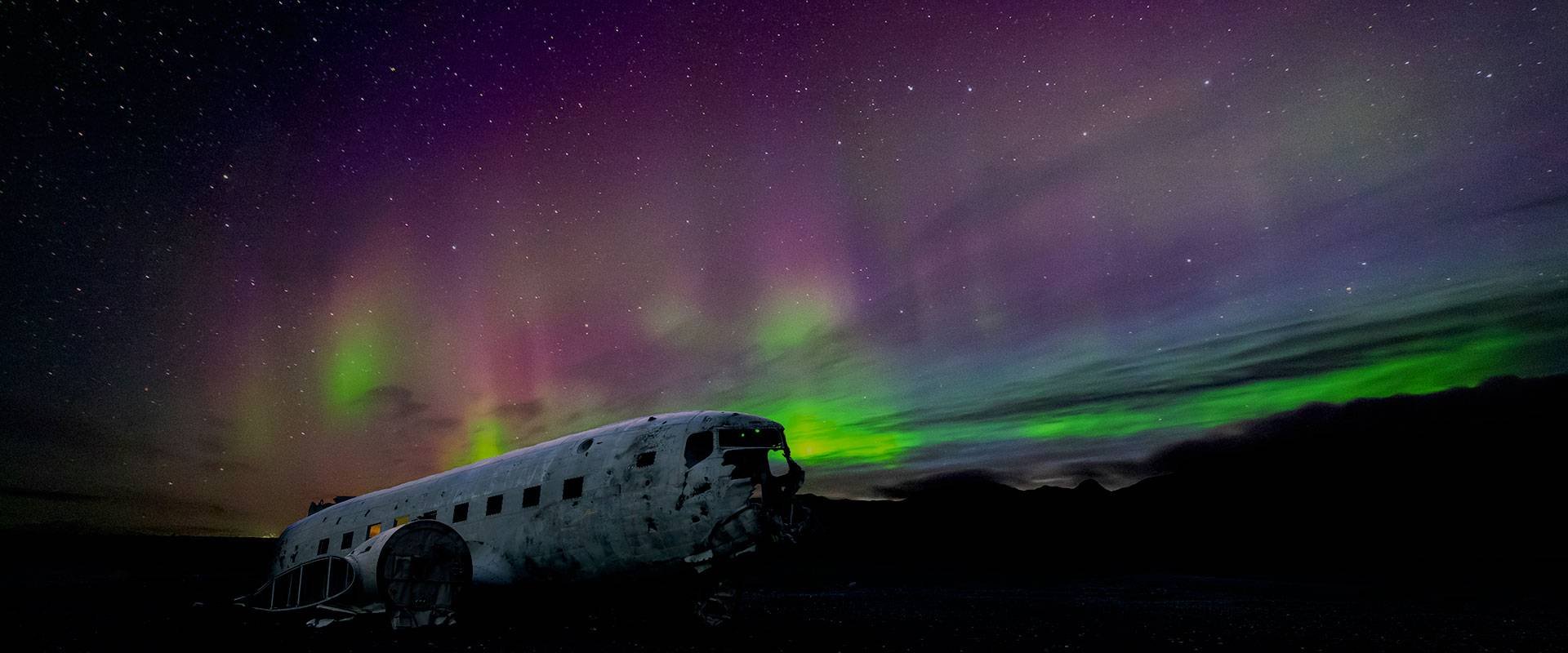
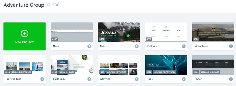
The Iceland Adventure group stays from 9 sliders. You can use Smart Slider to create whole landing pages. This group is the perfect choice to create a landing page for your travel website. You can fully customize each slider, change the images, and texts, also you can add more sliders, or delete them if you want. If you publish the slider group, then the sliders will be under each other.
Layers
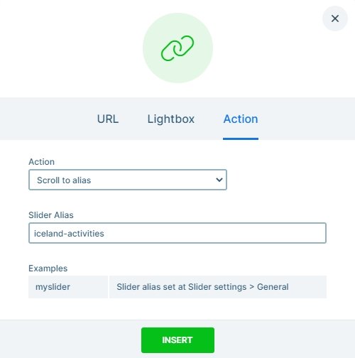
The Iceland Adventure group uses simple layers: headings, images, texts, and buttons. They are usually in rows and columns which you can put them next to each other. There are layers with link actions. For example, the first block of this group is a navigation, and each text layer has a link on it. Here we have used the scroll to action which you can scroll to specific sliders.
Animations
When you check the page you may notice each layer is coming in with a nice layer animation. You can customize these animations in the animation tab of the layer window, also you can use the timeline where all of the animation displays.
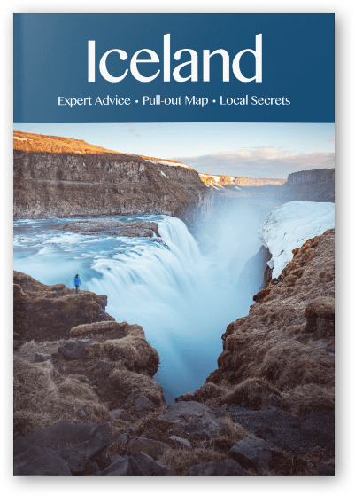
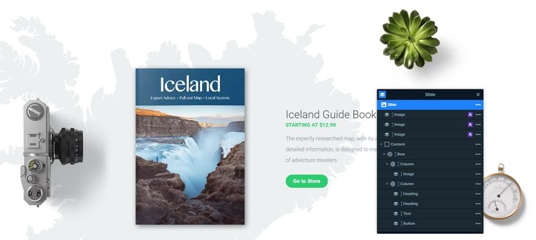
The second section of the page has a shape divider on the bottom which is a great separator between two sliders. Also, you can meet with a great effect on the Guide Book: with the layer parallax. When you scroll up or down, the image layers are moving in the background. You can set this vertical scrolling effect in the Animations tab of the slider settings. Also, you can add different parallax values to the layers in the Style tab of the layer window.

Layout
The Guide Book has the most special layout in this group. There is a row with 2 columns. The first column contains an image, and the second has 2 headings, a text and a CTA button. Below the content you can see 3 extra image layers which are in absolute position. With absolute position you can put your layers anywhere in the canvas, and it can be very useful at the decoration.
Responsive
The whole landing page is fully responsive. The rows wrap in a smaller view, and the texts are smaller. You can change the font size device specifically with the text scale option which you can set in the layer menu or in the Style tab of the layer window. With that you can set different font sizes for different devices.
Related Post: What is a Full Page Slider and How to Use it?
Related Post: How to Create Beautiful WordPress Landing Pages That Convert

