Settings
The Gym slider uses a boxed layout, so the slider can be as big as the container it’s in. You can navigate in 4 ways in the slider: you can drag, use the arrow control in the left and right, use the bullets on the bottom, or you can click on the transition images on the right side of the slider. They have a link action which you can navigate to another slide.
Layers
Sometimes you don’t need complex animations on your images, you don’t even need the image to move, just to be replaced by another image when the mouse is over it. Transition layer is the perfect choice to achieve this. The usage is extremely simple: put the transition layer, select the two images you would like to use (the first one will be shown at first, when there is no user interaction on the image, the second one will be shown when the visitor’s mouse is over the first image), choose the animation that will be played when the images are changing and you are done.
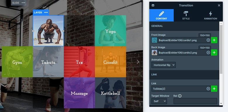
You can select from three animation types that will be used at the Transition layer. One of them is the simple Fade which will fade out the first image, and fade in the second one. The other two animations work the same way: images flipped in 3D vertically or horizontally.
Animations
Image transition animations are used to catch the visitor’s attention and make them interested in your story. Usually they are complex, they move constantly, making the user focus on the events that are happening in front of their eyes.
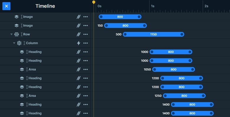
Also the layers also have a layer animation, when you load the slider, you will notice the ongoing animations. You can use the timeline to set the animation duration and the delay, and it can help you to synchronize them.
Layout
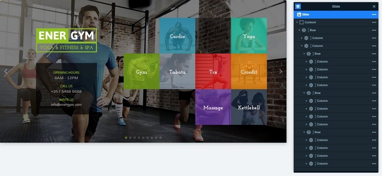
The first slide has a special layout, it has a tile layout. It stays from more rows. The basic of the layout is a row with two columns. The left column contains the image and the textual content, and you can see more rows in the right side.
Responsive
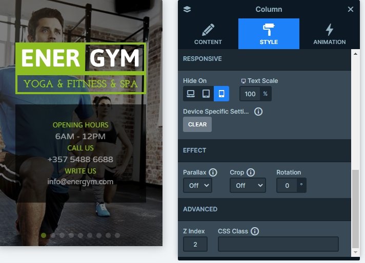
The slider is fully responsive, and looks good on mobile and tablet. If you check it on mobile, you will notice that the whole right basic column is missing, because it is hidden on mobile. It can save space on your page, but the visitors can see there are more slides thanks to the bullets on the bottom.
Related Post: Create a Unique Layer Slider with Smart Slider 3
