Slider Settings
The Greek Restaurant template is a group that contains 6 projects. More precisely, you can find 5 Block type and 1 Simple slider type in this group. Blocks are special kind of projects that can display one slide only. So, they’re perfect for creating hero headers.
The first block in the Greek Restaurant template uses a full page layout. Full page sliders fill the screen vertically and horizontally as well. As a result, they’re a great choice for displaying content above the fold. The other sliders and blocks are full width, so they only fill the screen horizontally.
Layers
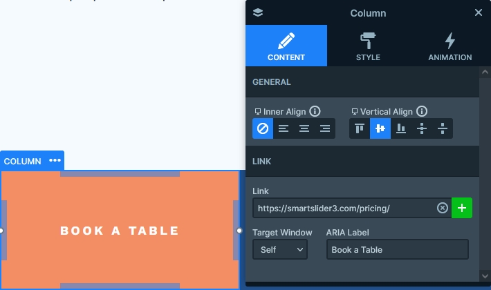
You can find two heading layers on all sliders. One displays the main headline and the other the secondary one. Most sliders also display an image using the image layer. Additionally, there’s a CTA button on two sliders. One is on the first slider, which actually uses a column layer to hold the link. The second CTA button is on the About us slider, and this one uses the button layer.
Animations
As most sliders in the Greek Restaurant template are blocks, they don’t have fancy slide changing animations. However, since they have a couple of layers, they have nice looking layer animations. For example, on the first slider, you can see the Reveal animation. What makes the Reveal animation special is that it introduces the layer by moving a colored shape on top of it. As a result, the Reveal animation looks modern and suits any kind of website.
The other animation you can spot on many sliders is the layer parallax. When you scroll on the page, some layers move at a different speed, which creates a spectacular effect. You can find this effect on the image of the first and 5th slider and the second slider’s cards.
Layout
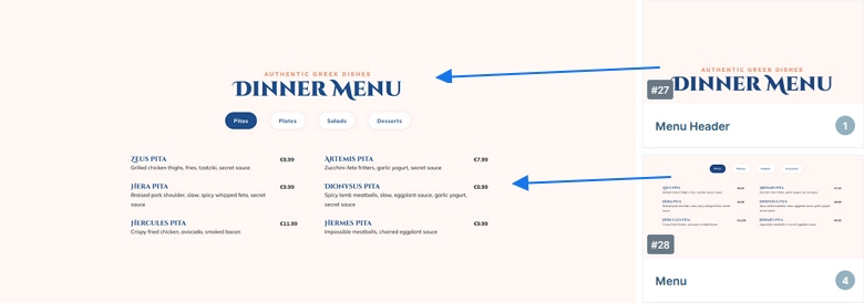
Probably the most interesting layout in the Greek Restaurant template is the Dinner menu slider. This slider is actually made by two different sliders. One block that contains the main and secondary headline, and a slider that has the text bullets and the different slides. The same background color is set at both sliders, which makes it look like they’re one slider, but in fact, they’re not.
Responsive
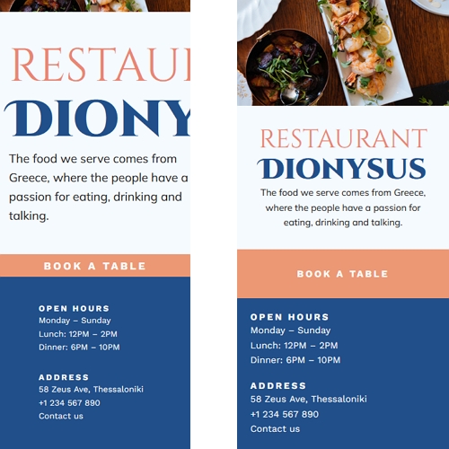
Smart Slider is a responsive slider plugin so it lets you create sliders that look great on any screen. Moreover, it offers many responsive features to fine-tune the result on small screens. One of the most useful tools for optimizing for mobile is the font resizer. It lets you reduce (or increase) the font size for small screens, which is super handy.
Related Documentation: Layer animation
Related Post: 11 Beautiful Full Width Slider Examples


