Slider Settings
This new template is a Slider Group. Slider Groups are known for their capability to contain an unlimited number of slides. This makes it easier to organize similar sliders effortlessly, then publish them all together.
Layers
The Gibraltar template consists of many captivating layers. The first block is created by using Rows, Columns and Heading layers resulting in a unique menu bar for the page.
Certainly, this slider takes advantage of the CTA buttons as it’s used on the Hero and Pricing page, capturing the visitors attention.
Moreover, some of them, like the Features and Content page, are specially designed with Absolute layers. They are perfect for overlapping layers as they can be positioned anywhere by drag’n dropping them.
Therefore, they are also super easy to use, not requiring any previous knowledge of any software.
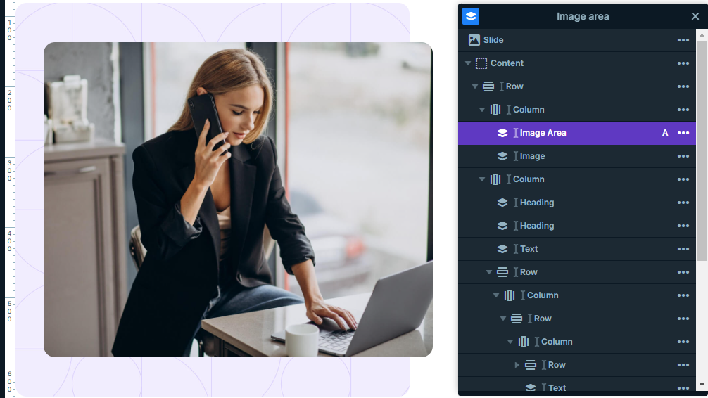
Additionally, some slides employ custom CSS features which are added in the Developer settings tab to achieve their desired result.
The Hero section’s heading is created by using two colors, for this reason implementing its own custom CSS. Just like the Features block, where it also uses CSS to pull off a rounded border for its absolute layer. The Content slider on the other hand applies a custom blending to its absolut layers, enhancing the image’s character.
Animations
The Gibraltar template is made captivating by using several Layer animations. They mostly use the same type of animation which is the Basic one. It is not too fancy simply animating the layer it is applied to.
As a consequence it adds a smooth and captivating introduction to all these layers.
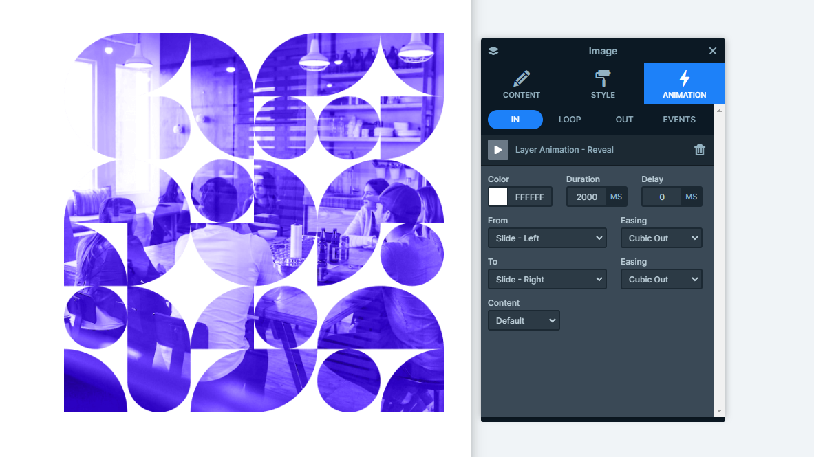
On the other hand, some layers, like the Hero slide’s image layer, show up using the Reveal animation. This animation type is a notable one as it firstly only reveals a solid background only then showing the content of it’s layer. With its up-to-date style it’s perfect for modern websites.
Layout
All of the blocks create captivating layouts using the Row and Column structures. The most interesting solution may still be the last one. It produces a gallery-like layout with its arrangement. There are two rows containing three and four columns each.
However, what makes it unique is the way they are displayed next to each other without any space in-between. This happens because the paddings and margins values are equal to zero.
Furthermore, the row’s gutter is also set to not create space between its columns.

Responsive
Smart Slider offers you many tools to create responsive websites. One of the most useful gadgets is the Font Resizer, which lets you to uniquely optimize your layers based on the device it’s viewed on.
On top of that, the Hide On option on each layer makes it easier to hide layers on smaller screens. In this slider’s case it’s a very useful tool as some of the absolute layers can behave differently in smaller devices, therefore hiding them can be the best solution for these circumstances.
All in all, they ensure your content looks perfect on all devices, offering your visitors a pleasant experience.

