Settings
Smart Slider 3 free version is great if you would like to create a layer slider for free. In the free version you can choose from 6 different types of layer: heading, text, image, button, even you can create a Vimeo or YouTube slider. So with Smart Slider 3 you can build your unique and colorful slider with using layers.
You can import this Smart Slider 3 template from the Template Library and after that you can customize it. You can change the background and the layers too, add a new slide or set a slider autoplay.
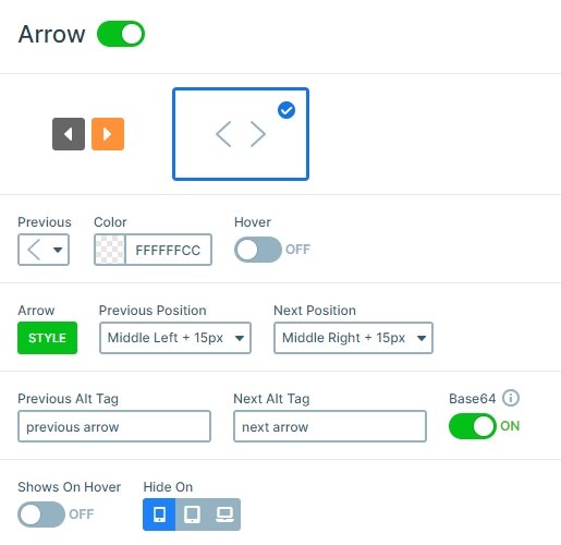
There are 3 ways to switch the slides: with mouse drag, with the bullets on the bottom and with the arrows. You can set these controls at the Controls tab of the Slider settings. You can customize them, you can change their colors, or put into another place.
Layers
This slider uses 4 different types of layers: there is an image layer on the top, after 2 heading layers are, then a text layer comes, and finally a button layer. Every layer is customizable, for example at the heading or text layer you can change the font family or color, you can use margins or padding and set a little shadow or a background. Actually, you can customize everything that people usually want to change. And if it isn’t enough, if you write a custom CSS there is an option to use this class at your layer.
An important part of the slider can be the button layer on the bottom which can call the visitors to take an action and click on that. With the button you can navigate them to another page. Buttons can also be important if you create a Post slider, and put the Post url variable with a Read more text on the button, and the user can go to the actual post and read it. This button layer has a green color with a small opacity, you can customize this color in the Style tab of the layer window.
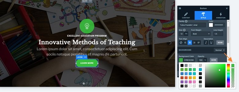
The background image has a black overlay with a little opacity. This is an important setting which makes the text more legible, and the visitor can focus on the layers and not on the background.
Animations
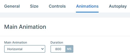
Every slide moves with a horizontal animation at the slide switching. This animation is the main animation of the slider which you can set to vertical or fade at the Animations tab of the Slider settings.
Layout
The slider was built with default layers which works like a page builder, and it is enough if you put your layers with a simple drag & drop on the slide. You can even use columns and rows which can help you make a good structure. The layers are under each other, and looks good on every device.
Responsive
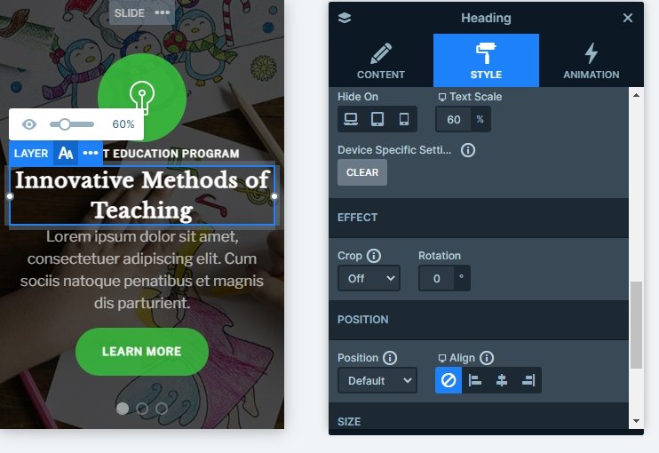
The slider is fully responsive, and each layer is visible on smaller screens. Using the text scale option you can make your text smaller or bigger in different screens, and this size won’t change on other devices.
Related Post: Everything You Need To Know About YouTube Slider
Related Post: Why do You Need a Video Slider on Your Website?
