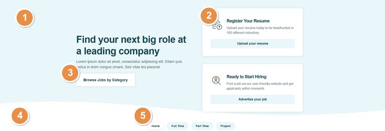
💡 Best features in this slider
- Slider background
- Two rows below each other
- CTA button
- Animated shape divider
- Text bullet
Settings
Full width sliders are popular hero sections on website. Since they take up the full page width, they look amazing on any screen size.
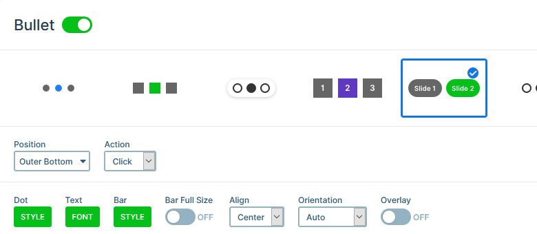
At the bottom of the slider you can find a cool slider navigation option: text bullets. Text bullets are like point bullets, except they display the slide title. As a result, they help learning about the slide content before visiting it. Additionally, the slider generates bullets automatically. So this special control doesn’t need you to maintain it. Furthermore, there are many options to customize how the bullets look. For example, you can change the color of the background and text, and create rounded corners.

The slides themselves have no background. The light blue color behind the layers is the background color of the slider. This makes the background look static, as it doesn’t move with the slides.
Layers
The Career slider has some text and heading layers for displaying textual content. There are some image layers for the icons and logos. But the most important layers are the button layers. With button layers, you can create cool CTA buttons for you website, and boost your conversions!
Animations
The most obvious animation on the slider is the animated shape divider at the bottom. Shape dividers help creating smooth and interesting transitions between sections of your website. Every shape has its own unique animation. Some runs only once, like he “Curve 3”. Some runs continuously, like this “Curve 4” animation.

Apart from the Animated Shape divider, there’s a horizontal Main animation. This moves the layers during the slide switching. It looks especially great on this slider, because the slides don’t have background. As a result, it looks like the layers are moving on top of a static background.
Layout
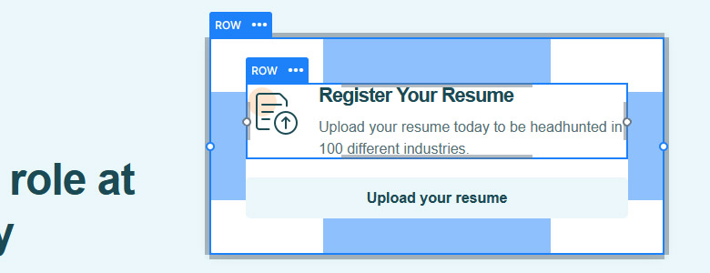
The Career slider has two different layouts on its slides. The base of the first slide is a row with two columns. On the left column there’s a heading, a text and a button layer. But the right column is much more interesting: it has two rows below each other. The structure of these columns is the same. They have one column, and inside that column, there’s another row and a button layer.

On the second, third and fourth slide you can find another layout. This one is based on a 3 columns row. The left column has the same layers as the one on the first slide. But the last two columns have identical layout, which differs from the first one. Each column contains the same layers: an image, a heading, a text, a two column row, and a button.
Responsive
Smart Slider 3 is a responsive slider, and it has many great tools to help you optimize your slides for small screens. To make the slides look as good as possible on mobile, the slider only displays the most important layers. To achieve this, we hid some of the layers, and also adjusted the font sizes.
If you compare the mobile and desktop layouts, you’ll also notice that the alignments don’t always match. For example, the big heading on the first slide is left aligned on desktop, but center aligned.
Related Documentation: Bullet control
Related Post: Add Beautiful Section for your Website with Shape Dividers


