Soon the Gutenberg editor will officially become part of WordPress core. What does this mean for sliders in WordPress? Well, it means a couple of things: Gutenberg sliders will be easier than ever to add to pages and posts, and you’ll be able to preview all your sliders in the Gutenberg editor.
In this post, I’ll walk you through the basics of Gutenberg so you can see how it works, and then I’ll show you how to add a slider to a post using the Gutenberg editor. Lastly, we’ll take a look at some of the different types of sliders you can add using Gutenberg that make great additions to posts.
What is Gutenberg?
Gutenberg will soon be the new visual editor for WordPress. The existing visual editor hasn’t changed much at all since WordPress was first released back in 2003. Since then, other platforms have come along with simplified writing experiences that make WordPress look old-school. Basically, Gutenberg is WordPress’ attempt at catching up with the cool kids.
Here’s what the classic editor and the Gutenberg editor look like side-by-side:

When you put together a page or post with Gutenberg you use “content blocks,” which are basically blocks of text, headings, images, and other media. With blocks, you can achieve what might otherwise require shortcodes or custom HTML.
Work on Gutenberg started in early 2017 and it’s still a work in progress. You can download it as a plugin from WordPress.org and try it out. It’s slated for release with WordPress 5.0 but there’s no set date. Some say it might be released later this year or even early next year.
So far, reviews have been mixed—people either love it or hate it. In fact, reviews are split down the middle with an average 2.5 stars.
I’m firmly in the “love it” camp. I’ve had Gutenberg installed on my site for a few months now and it’s been cool seeing how the interface has changed with every update.
As a writer who’s been working with WordPress for many years, I think Gutenberg is a breath of fresh air and well overdue.
I mean, why shouldn’t WordPress be as easy to use as Medium?
Working with Gutenberg and Content Blocks
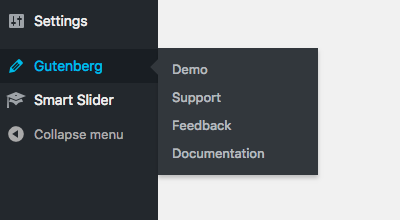
After installing and activating Gutenberg, it will become the default visual editor for your WordPress site. You’ll notice a new Gutenberg menu item at the bottom of the sidebar, which includes a demo (which we’ll explore below).
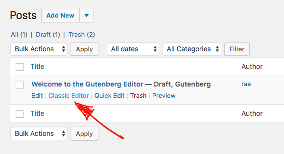
You’ll also see links underneath your posts that let you switch between using Gutenberg and the classic editor.
If you haven’t used it yet, let’s take a look at how it works using the demo post:
On the right, you’ll see the sidebar has been copied over from the classic editor. It hasn’t changed all that much and still includes all the usual options, such as updating visibility, and post time and date. Underneath, you’ll see meta boxes for categories, tags, and featured image, as well as excerpt and discussion.
The “Publish” button has been moved to the top right, and you can still preview posts. When you click the click cog, it hides the sidebar so there’s even more room to write.
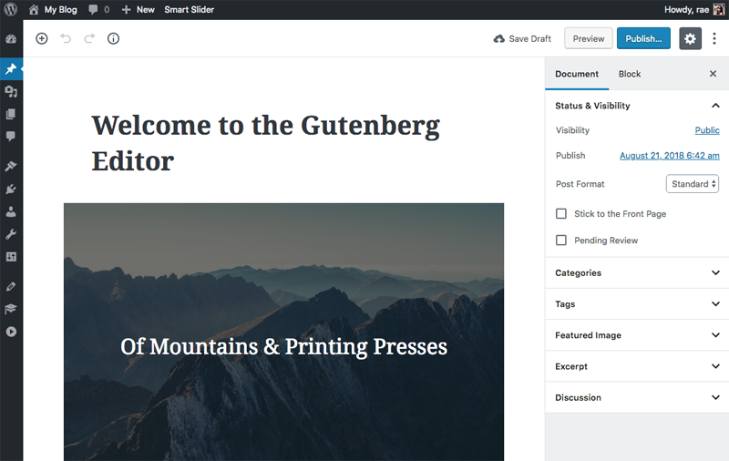
If you’re wondering how to switch to the code editor, just click on the three dots in the top-right and you’ll see the option there. With all this familiar kind of stuff out of the way, let’s dive into working with content blocks.
Using Content Blocks
On the left you’ve got a big ol’ space for writing. It’s especially convenient for laptop users (like myself!) who struggle using the classic editor’s bulky interface.
To access content block, click on the “+” icon in the top-left. You’ll see “most used” blocks displayed first, but when you scroll down you can access other blocks for formatting, layout, widgets, and a ton of different embeds for everything from YouTube and Twitter to Spotify and SoundCloud.
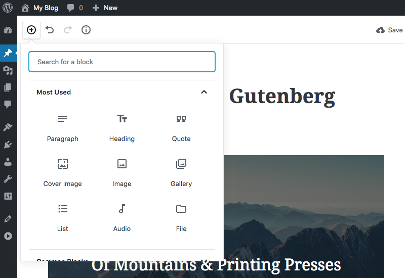
Let’s take a look at how these blocks work. The demo already has a title and when you hover over it, you can click anywhere within the block to edit the text. Clicking on the block also brings up the option to edit the post’s permalink.

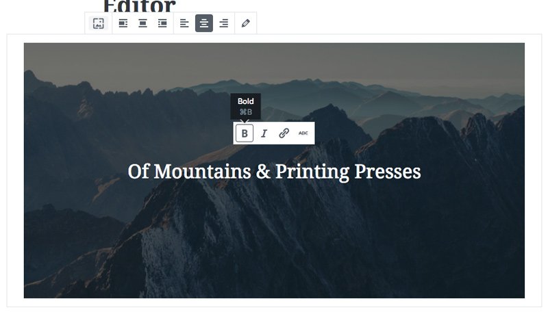
Underneath the title is a cover image block, which is a new concept for WordPress. This type of block lets you display text over an image, or just an image without text. When you click on this block, it displays options at the top for editing the image, including replacing it and alignment.
Options also pop up for editing the text to make it bold, italicized, or to add a link. Strangely enough, there’s a fourth option for adding a strikethrough.
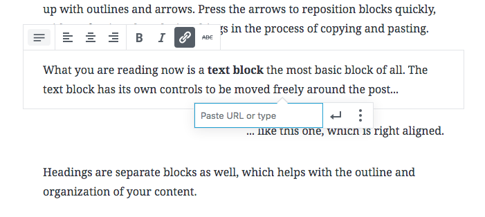
Adding and editing text is super intuitive. Gutenberg treats each paragraph of text as a separate block, so when you type something and hit ‘enter,’ a new paragraph block will be automatically created so you can continue writing.
When you click on a paragraph of text, you get options for aligning and formatting the text, and also adding links and strikethroughs.
Overall, Gutenberg is really easy to use and it takes no time at all to work out how to use it. I would suggest installing it on a staging site before adding it to your live site, just so you can get a feel for how it works before you start playing with post on your live site.
Adding Gutenberg Sliders to WordPress
The Smart Slider 3 team have been working hard since Gutenberg was announced to ensure that sliders are compatible.
And I’m happy to tell you Smart Slider 3 is compatible with Gutenberg! When you update SS3, you’ll see a new slider content block the next time you use Gutenberg.
Here’s how to add Gutenberg sliders to WordPress using the new Smart Slider 3 content block:
1. First up, install (or update) Smart Slider 3 so you’re running the latest version.
2. Click on Smart Slider in the sidebar, create a New project and choose the Start with a Template option.
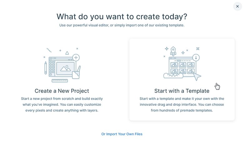
3. Choose the template you would like to use. I’m going to go for a simple image slider.

4. You’ll be redirected to the editing screen for your imported slider. Go ahead and make any changes to your slider.
5. When you’re ready to add your slider to your post, open it up in Gutenberg and click the content blocks icon. You’ll see Smart Slider 3 has been added to your “Most Used” list of blocks.
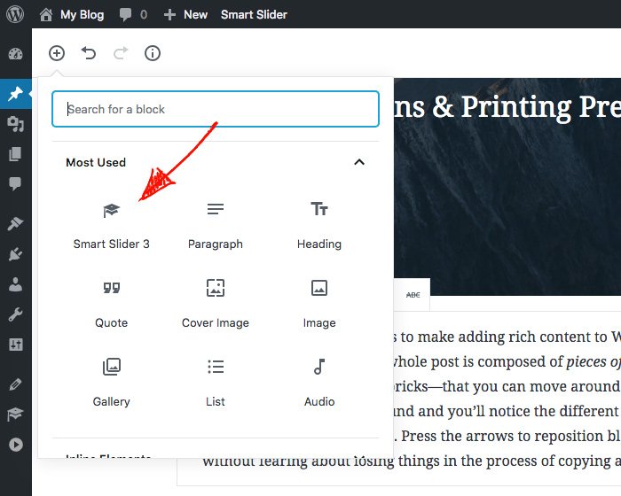
6. When you click it, a new slider block will be added to your post. If you don’t have a block in your post currently selected, by default your slider will be inserted at the bottom of the post. If you do have a block selected, it will be inserted underneath your highlighted block.
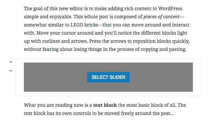
7. Click Select Slider and your sliders for Smart Slider 3 will be displayed. Choose your slider and it will appear in your post.
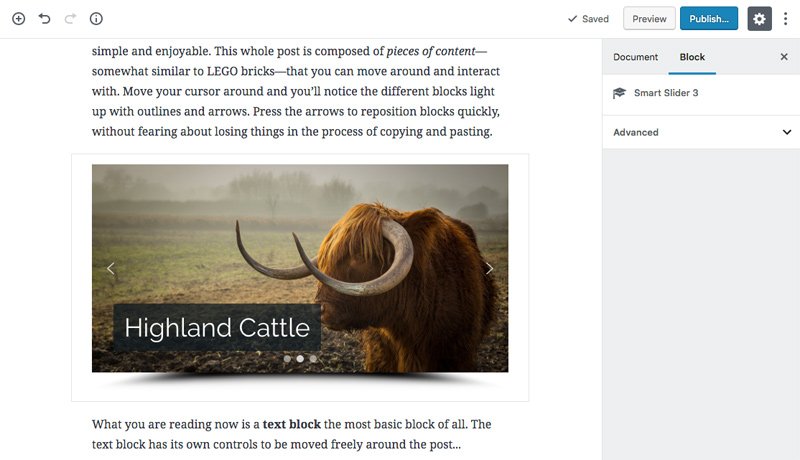
8. There’s one more easy way you can add sliders to your post: When you add a new paragraph content block, you’ll see three little icons in the bottom-left of the block, including the Smart Slider 3 icon. When you click it, you can then insert a slider.
And that’s all you need to do to add a slider to a post using Gutenberg. Even easier than copy+pasting a shortcode, if you ask me!


