Slider Settings
The Banking App template is a simple type slider. Simple sliders are the most common sliders you can find on the web. They display one slide at a time which is handy because it lets users focus on one message at a time. The slider is also full width, which means it fills the browser horizontally. Full width sliders look especially great on today’s large desktop monitors, which makes them one of the more popular layouts to display a slider.
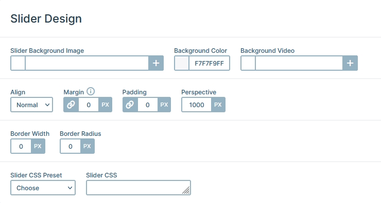
The Banking App template has a slider background color set. Slider backgrounds are special because they stay in their places while the slides move on top of them. It’s worth noting that the slider background is covered by the Slide background unless it’s at least semi-transparent. At this template the slides don’t have background, letting the slider background color display.
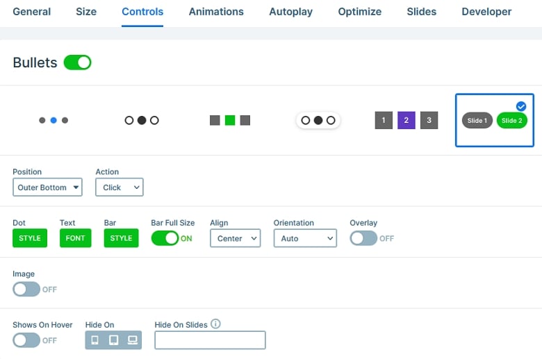
Being able to go through the slides of a slider is super important. If people can’t reach the slides after the first one they can’t see their content and your hard work was in vain. To ensure that your visitors can check out your slides Smart Slider offers many different navigation options. In the Banking App template we used the Text bullet navigation. What makes this navigation special? It creates bullets using the Slide Title as their label. This helps giving the visitors a pretty good idea about the slide they are about to check out.
Layers
If you check the Banking App template it looks super special, doesn’t it? But it was built with the most basic layers: heading, text, image and of course rows and columns. Rows and columns are the building blocks of Smart Slider and help you create amazing layouts.
Each slide has a colored image in its middle part. That is the background image of the Content layer. The slides themselves have no background to allow the slider background to show up.
Animations
You can find a bunch of cool animations on the Banking App template. Let’s start with the most interesting one, which is the Particle effect. It’s the small dots behind the main content that keep moving around. They’re pretty subtle but give a nice touch to the slider.
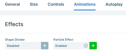
Another animation you can see are the layer animations. They introduce some of the layers to the slide with a nice fading effect. Layer animations are available for each layer and have many customization options to create a nice looking effect.
Layout
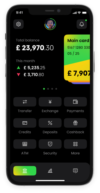
The Banking App template’s layout is pretty special. It starts with a row which columns have 40% and 60% width. The right column contains the content: it has heading and text layers. It also has another row which has a negative bottom margin to make it move out of the container row.
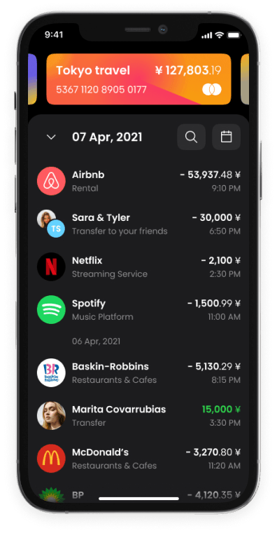
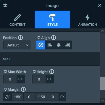
But what’s more interesting is the mobile phone image. It has negative margins to make it bigger than its container. It’s a creative solution that makes the whole slider stand out from the crowd.
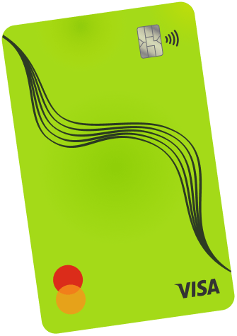
There are also some decorational layers in Absolute position. What’s Absolute positioning? A special way to add decorative elements to your slider. Absolute positioned layers don’t take up space, they’re just floating on top of the slide, which makes it hard to use them to achieve a good responsive result. On the other hand, they can help adding a nice touch to the slider because they can overlap other layers.
Responsive
Smart Slider is a responsive slider that offers tons of tools to ensure your slider looks perfect on small screens. The Font Resizer is one of these options, and it’s going to be your best friend when you optimize for small screens. It helps you reduce (or increase) the text size on the current device.
Another great feature you can use is to hide unnecessary layers on different devices. For example, usually it’s unnecessary to have decorational layers on mobile. So you can just go ahead and hide them.
Related Video: Particle effect
Related Post: 11 Beautiful Full Width Slider Examples
