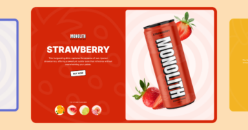
💡 Best features in this slider
- Shape divider
- Bullet control
- Image layer in absolute position
- Icon layers with link actions
Settings
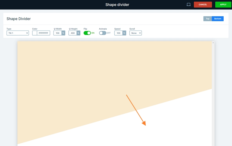
The broken grid slider is a full width slider where the layout is special. Each slide has a different background color, but the bottom white shape isn’t changing. This shape is a cool effect of Smart Slider: the shape divider which creates the curved white area behind the image layer.
Layers
The content is a small image layer, three headings and two icon layers. The default positioning helps create a nice, easy to follow structure with great responsive behavior. On the left side, you can see the Content layer that has 500px maximum width. This leaves enough space to see the image layer in the back. The icon layers help with the slide to slide navigation as there’s a slide switching action on them.
Animations
When you switch a slide, you can notice the reveal layer animations. The reveal animation is a modern effect which is perfect to reveal images and texts as well. It animates a simple colored box on your text or image which you can fully customize in the Animations tab of the layer window.
Layout
A broken grid slider is a modern way to design your slider content. It gives the illusion that you’re not using a slider at all. I’m sure you’re familiar with “traditional” sliders. They have an image in the background and likely some text in front of this image. This couldn’t be further from broken grid layouts.
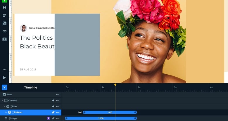
When we created this broken grid slider, we mixed Smart Slider 3’s two positioning, default and absolute. The block on the left side with the textual content is in default position. This ensures a good responsive behavior. And if you look at its structure, you can see that it’s based on a simple grid layout as well.

The image is a simple illustration of the grid layout. You can see rows and columns and inside the columns there are layers for your content. As I mentioned before, the slider mixes default and absolute positioning. First, have a look at the single image in absolute position, that’s in the background. It’s a large image layer, positioned to the right middle of the slide, taking up almost the full width and height of it.
Responsive
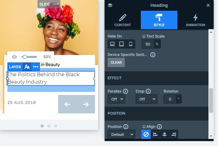
The broken grid slider is fully responsive, and all of the layers are visible on smaller screens as well. The text scale option helps you make the text smaller on tablet and mobile. This is a responsive setting so you can use different values on different devices.
Related Post: 11 Beautiful Full Width Slider Examples
Related Post: Introducing Reveal Animation
Related Post: Add Beautiful Section for your Website with Shape Dividers


