Slider Settings
The Blur slider is a stunning full-width slider. Just as its name states, fills the horizontal area of the browser which makes it increasingly popular on today’s wide monitors.
Moreover, one of its outstanding benefits is that it offers a fully responsive look that’s perfect for every device.
Visitors have two different ways of browsing the slides. One option is to use the arrows on each slide of the slider. They offer a nice hover effect that provides an easy-to-understand way of switching between the slides.
On the other hand, they can also navigate by dragging the slider horizontally. This mostly excels on touch screens, as in their case swiping the slider offers more convenience.
Each of these settings is available under the Size and Controls setting.
Layers
This template makes use of many unique layers. You can find the basic layers, like the heading layer, text layer, image layer, and button layer. They encourage visitors to take action.
However, on the third slide, you can find some special ones, like the Area layer. This offers an empty layer which lets you give a background color to the layer that fills it up.
On top of that, the Countdown layer is perfect for getting your visitors excited about an event that’s coming up or building trust in them by providing numerous statistics about your company. You can set it to any given number of your choosing.
Some of them are more interactive than others. This is achieved by adding a simple layer parallax to enhance them.
Furthermore, some rows and columns of the slider have a noticeable blurry border added to them. This outstanding effect is the result of the custom CSS they have. Add your special design to the Developer settings CSS section, then insert their class on the containers in the style settings to achieve this look.
Animations
You can notice different types of animations on this slider template. Its Main Animation is set to Crossfade, which offers a simple, sophisticated look.
On its background, the smooth Distortion-Shard animation with its normal pace catches the visitor’s eye with each transition.
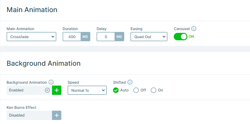
Moreover, all the layers stand out with their own unique animations. All of them are introduced using the Basic Animations easy-to-use interface.
Layout
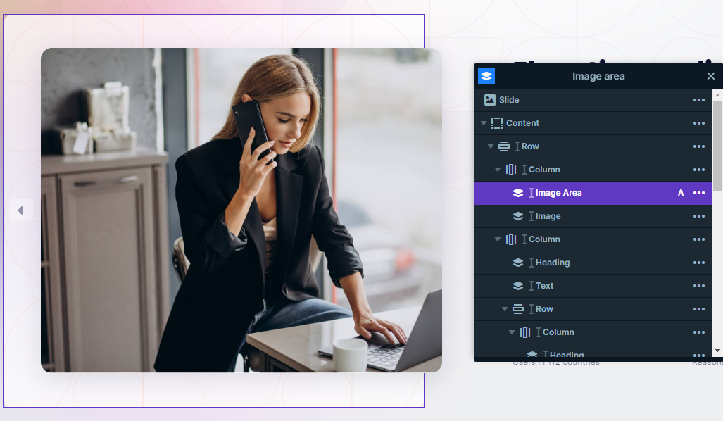
All of the slides create captivating layouts using Rows and Columns for their structure. Two of the slides use almost the same structure for their content.
In addition, both of them have their image and absolute layers on one side, while the main contact stays on the other side.
Furthermore, what stands out is how they make use of the absolute layers. If you place the layers on top of each other you can create a cool 3D effect. It can be very useful, you can set their Z-index as well. Absolute layers are perfect solutions for overlapping layers and they are super easy to use, as they don’t require any previous knowledge in the tech department.
Responsive
Smart Slider is a fully Responsive slider and offers many useful tools to help you optimize the mobile result.
In this template, the Font resizer was used many times. It was created so you can optimize your layers uniquely for each device’s screen.
Another setting that could be useful in case you adapt absolute layers is the Hide on option, which you can apply on each layer. Absolute layers can behave differently on smaller screen sizes, therefore in some cases hiding them could be the best solution.
All in all, the responsive settings ensure that your visitors are always provided with the best experience while visiting your content.
