Settings
The WordPress Carousel Post Slider is a cool slider you can highlight your post content with. It uses the Carousel slider type, which can display more slides at a time. For this reason, carousel sliders are perfect for displaying dynamic slides. For example, you can use it to create a post or a product slider.
Layers
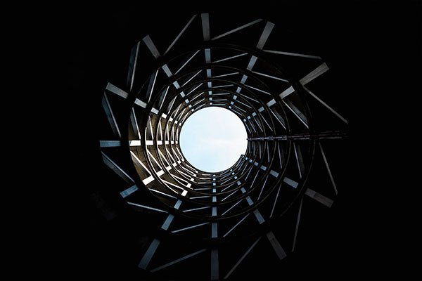
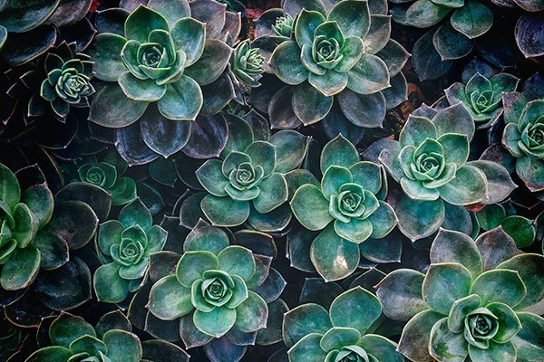
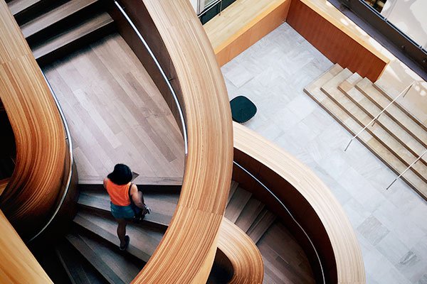
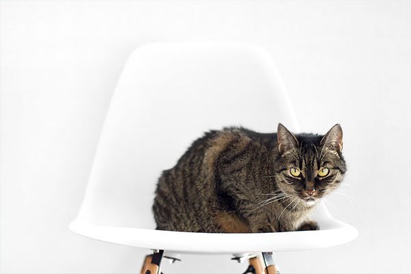
The layers on the slider are quite simple. There are two images: one at the top, that displays the featured image. You can find another image below the post title, and it’s used as a separator. There are two headings and a text layer. The first heading displays displays the category of the post. The second heading displays the title of the post.
Animations
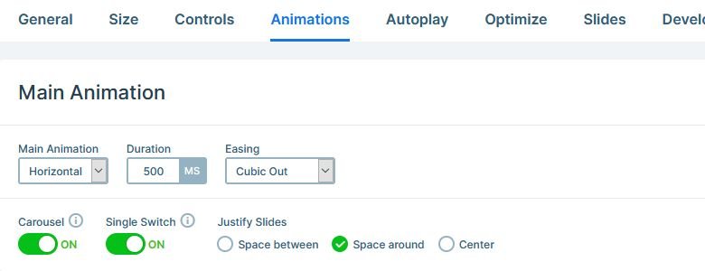
The only animation you can find on this slider is the slide changing effect, which is a simple horizontal animation. By default the Carousel slider switches all visible slides. But as you can see on this slider, it switches slides one by one. This behavior happens because we turned on the Single switch option at the Slider settings → Animations tab.
Layout
In Smart Slider you can position your layers from their parent elements. For example, if you want to place your layers to the bottom of the slide, you need to set that at the Content layer. Simply change the Vertical align option to bottom, and the layers will be at the bottom.
By default the Vertical alignment is set to center. When we created this slider, we wanted to make sure that the large images start at the top of each slide. So, we changed the Vertical align to Top at every slide.
Responsive
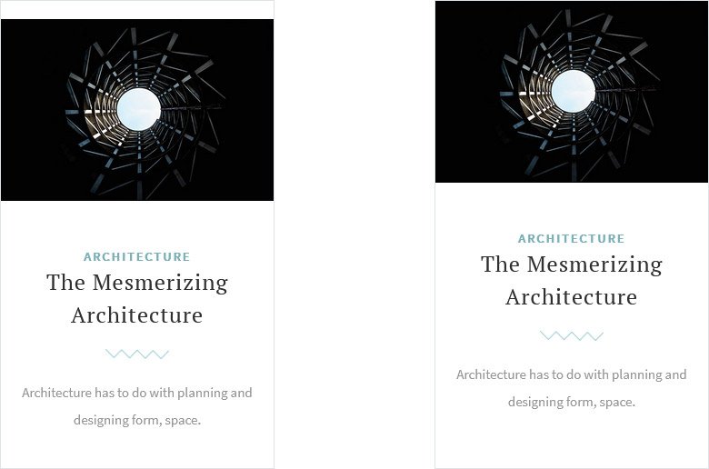
In most slider plugins you can only place your layers absolutely. This means the layers won’t adapt to each other, for example, when a text breaks into more lines on small screens. As a result, the layers will overlap, and you’ll need to spend lots of time to make your slider responsive.
Smart Slider 3 uses a different positioning method. It’s a relative positioning, what we call Default position. Default layers can’t overlap, and instead they’ll make the slider taller if they need more space. As a result, your content will always be visible. Furthermore, Default layers keep their original size on small screens by default, which ensures the good look. Of course, you can make device specific adjustments, but it’ll take a lot less time.
Related Post: Enrich your Blog with a Post Slider
Related Video: Slide Editing – Alignment & Spacing
