Slider Settings
The Virtual Conference is a simple type slider. That’s the most common slider type you can find on the web. Simple sliders display one slide at a time, which helps visitors focus on the content of the slide. The Virtual Conference template is also a full width slider. Full width sliders fill the entire browser horizontally. This makes them popular on modern websites, as they look great on a large monitor.
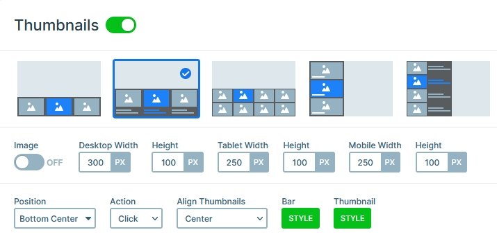
For navigation this template offers two options. First, the most obvious one, the text blocks at the bottom. They were created by the Thumbnail control, but they don’t display any image. This makes the Thumbnail control versatile, because you can choose not to have an image but text only. As a result you can create special navigation for your visitors to enjoy.
The other way to switch slides it via dragging or swiping. In fact, a swiping navigation is on of the most comfortable actions for touch screen devices. It’s especially liked by mobile users because it feels natural.
Layers
Each slide of the Virtual Conference slider has three layers: image and headings. The image layer displays a custom icon. It also has a semi-transparent background color, a padding and a border radius.
The heading layers display the textual content of the slide. Additionally, on the first slide there’s a special layer: the Animated heading. The Animated heading layer can display content with cool effects. For example, it can use the typewriter, which makes the slider look more interesting.
Animations
Smart Slider has many cool animations to choose from. They help to make your slider slider look more interesting and stand out from the crowd. At the Virtual Conference template we choose to add a modern background animation. Background animations play when the slides are changing. So they won’t distract the visitor from enjoying the content. We choose one of the new Morph animations, Wave.
Layout
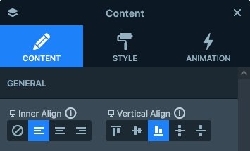
The base layout of each slide is aligning the content to the bottom of the slide. In Smart Slider layers are positioned from their parent element. So to align layers to the bottom you need to edit their parent, which is usually the Content layer. At the Content layer you should choose Bottom at the Vertical align option.
Responsive
Smart Slider is a responsive slider and it offers many tools to fine-tune the look on small screens. One of the most common things you need to do to make the slider look good on mobile is reducing the text sizes. Otherwise the content would be uncomfortably large, and make the slider way too tall as well.
Related Post: Create A Responsive Thumbnail Slider
Related Post: 11 Beautiful Full Width Slider Examples
