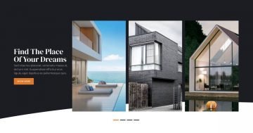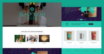
💡 Best features in this slider
- Highlighted heading layer
- Columns with Link Action
- Absolute positioned decorational layers
- Shape Divider
- Bullets
Slider Settings
The Renovation template is a simple slider that takes up the full width of the browser. Such sliders are popular in modern web design, because they look great on any screen. What’s also cool about this template that all of its slides use different color scheme. As a result, it’s a colorful addition to any modern sites.
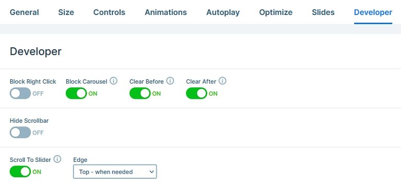
One of the most interesting features of this slider is that if its top is not visible during slide switching, the slider scrolls to it. This way if your smaller screen users check out the full slide, they’ll be at the top of the next one after they switched forward. Small features like this can create a super cool experience for visitors. How to achieve this scroll to top behavior? Change the value of the Scroll to Slider option to Top – When needed.
Layers
You can find the most common layers on the Renovation slider. There are headings, texts and images to display content. You can also find a special layer on each slide, the Highlighted heading. It’s a great way to make some content stand out, and this template uses it to highlight the keyword on each slide.
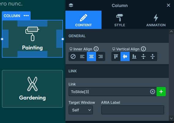
There’s also a custom navigation on each slides using Link Actions on the columns of a row. This navigation is not only looks great, but it’s very convenient as well. Also, there are bullets available for navigation.
Animations
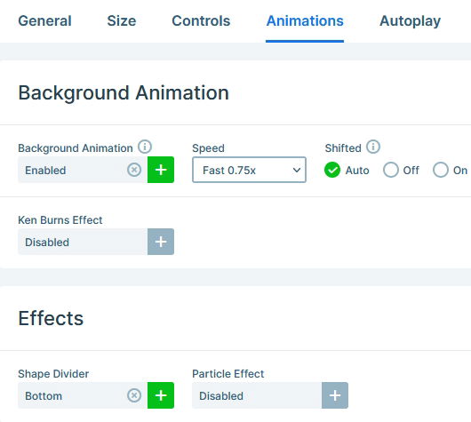
Smart Slider has many amazing animations and effects. To make the Renovation template more interesting, we added the layer parallax effect to some of the layers. So when you move the mouse over the slide, some layers make a subtle movement. As a result, the slider look more interesting.
At the bottom of the slider you can find a cool looking Shape Divider. It uses one of the new shapes, Paper 4.
Layout
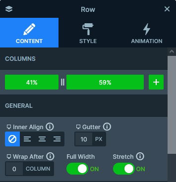
The base of all slides is a two column row. By default when you add a row, it has two columns, each having 50% width. However, you can adjust the width of the columns to make their sizes fit better for what you’re creating. On this template we split the columns 41-59%, so the right column is slightly wider than the left.
Another interesting thing is that we used Absolute positioned layers to decorate the slider. Absolute positioned layers are floating on the slide, without taking any actual space which means you can place them anywhere. This makes them perfect for creating decorative stuff on the slide.
Responsive
Smart Slider is a responsive slider with many tools to help you make your slider look perfect on any device. You can adjust font sizes to make the texts fit better into small screens. Additionally, you can break a row’s columns into separate lines to make more room for the content. Alternatively, you can also hide layers to make the content fit better for small screens.
Related Post: Everything You Need to Know about the Parallax Effect
Related Post: 11 Beautiful Full Width Slider Examples


