💡 Best features in this slider
Settings
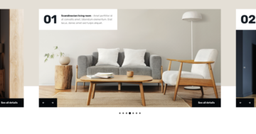
Traditional sliders, which display one slide at a time, are still very trending. For this reason, we chose the Simple slider type for our new slider template, the Real Estate. Nowadays it’s common to use a slider as a hero section of the page. Typically, these sliders take up the full width of the page, just like the Real Estate slider does.
So, this slider is perfect to use it as the hero header of your site. Because it displays only one slide on larger screens as well, it has plenty of space to create a gorgeous layout.
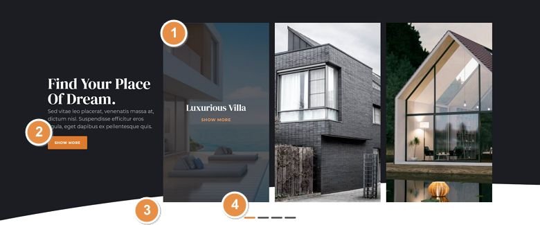
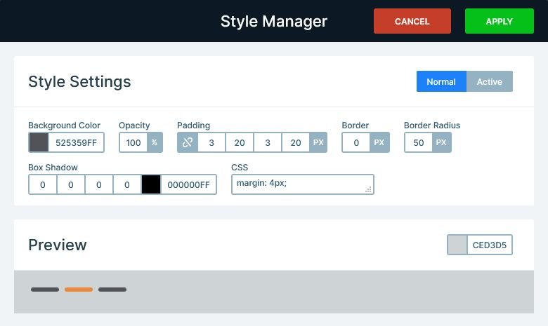
There are several ways for the visitors to browse this slider. The most obvious way is using the bullets at the bottom of the slider. Their unique, line-like layout makes the bullets look trendy and modern.
Apart from the bullets, visitors can browse with swiping or dragging. Additionally, the first slide has a custom navigation via the images. Clicking on each image will switch to one of the last three slides.
Layers
The first slide of the Real Estate slider provides a unique experience due to the Caption layers it has. The Caption layer is a special layer in Smart Slider 3 Pro. It helps you create a caption for your image on mouse enter easily. This caption layer is also used for navigation, which can be done easily using the Link Actions. Watch the video below to see how easy it is to set up a Link Action for a layer.
Apart from the Caption layer, each slide has a CTA button.
Animations
There are some interesting animations and effects in this slider. First, it has a Shape Divider, which creates the white-colored curve at the bottom of the slider.
Then, on each slide there are layer animations. The text use a basic animation, that moves them in from the left. But the images use the Reveal type animation. Reveal animations are special kind of layer animations. They don’t just animate the layer, but they place and move a single colored box in front of it. This make the effect look more special.
When you switch slides, you can stop a simple fading effect as the layers fade out. This is the Main Animation, which affects the layers, when they don’t have animations. Since the layers have incoming layer animations, they don’t fade in. Instead, they use their own special animation to appear on the slide. But none of the layers have outgoing animations, so they just fade out.
Layout
The layout of the Real Estate slider looks very special, but it’s actually quite simple. It’s based on a large row, which has two columns. The first column, where the texts are, is 1/4 wide. The larger column is 3/4 wide, and contains another row in each slide. However, on the first slide, the inner row has three columns, and each column is 1/3 wide. On the other slides, the inner row has two columns. One of them is wider, for the bigger image, and one smaller, for the 3 small images.
Responsive
Smart Slider 3 is a responsive slider, and it has a unique way to position layers. These are the Default positioned layers, and you should use them to create your slide content. First, you can work quickly and precisely with them. Second, they’re easy to use. Third, they help creating responsive sliders with minimal effort.
When you add a Default positioned layer, it keeps the text size on smaller screens. This ensures that your content remains legible even on the smallest mobile device. Default positioned layers can increase the height of the slider, if they need more space. As a result, your slider stays enjoyable for mobile users. But you haven’t had to make any changes for mobile yet, because the system takes care of these for you.
Of course, there are responsive options you can use to adjust your slider for small screens if needed. For example, you can change the font sizes to make the content fit better into mobile size. When you add rows to your slides, then their columns break into new lines on mobile due to the Wrap after option. To create the layout of the inner row, the Wrap after option had to be adjusted there.
Related Post: 11 Beautiful Full Width Slider Examples
Related Post: Add Beautiful Section for your Website with Shape Dividers
