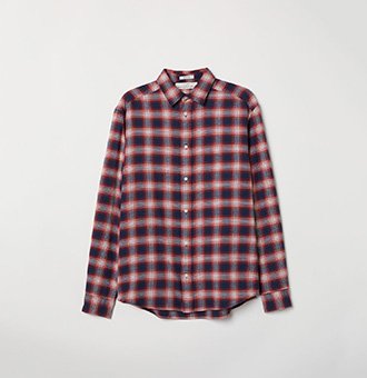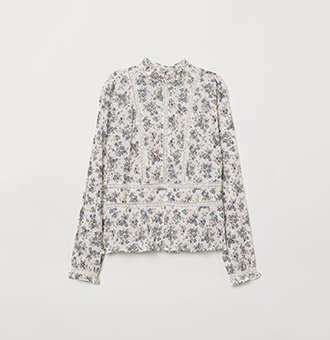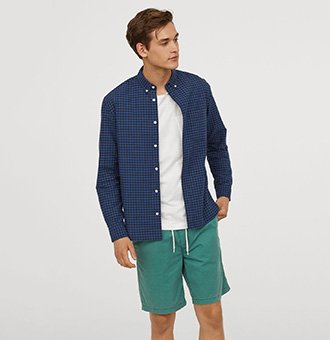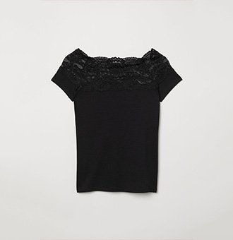
💡 Best features in this slider
- Slider background color
- Transition layer
- Layer in absolute position
- Bullet control
Settings
Unlike normal sliders, WordPress carousels show multiple slides at the same time. This is a really good way to showcase the latest or hot products, blog posts, images or videos. You can set the whole slider and the slides widths and select the number of items to move. Creating and managing a responsive carousel has never been easier.
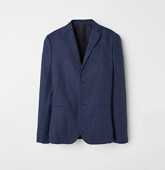
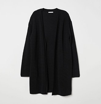
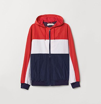
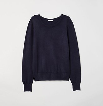
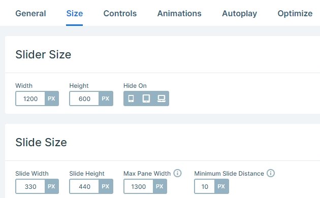
At carousel sliders you can set the slider size and the size of the slides separately. The slides which display next to each other are in one pane. You can set a maximum width for the pane which you can limit the maximum amount of slides that can be displayed next to each other. In this slider 3 slides appear in one pane.
Layers

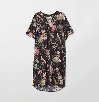
The most attractive layer is the Transition layer in this slider. If you hover over the image, you can check another image with a fading effect. With this you can display 2 images in the same place.
In some slides you can notice a new or sale badge in the top right corner. These layers are in absolute position, and always are in that corner. You can anytime replace the text, or delete it.
Animations
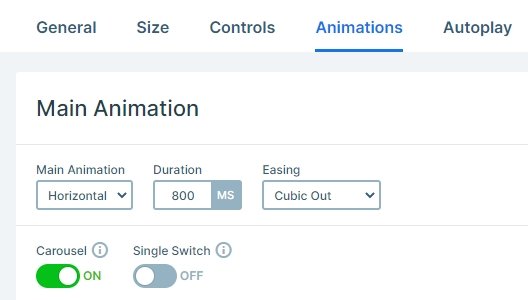
The carousel uses a horizontal main animation, if you click on the arrows, bullets or drag with your mouse, the whole pane will move horizontally. If you want to switch only one slide, not the whole pane, then you can enable the single switch option at the Slider settings → Animations tab.
Layout
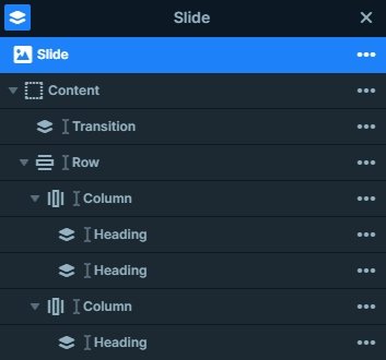
If you open the layer list, you are able to check all of the layers on your slide. As you can see on the image below, there is a transition layer on the top of the slide, and a row below that image. This row stands out from 2 columns where heading layers are.
Responsive
If you check the carousel on smaller screens, you will notice that the carousel slider works that way, that it can only show as many slides as many can fit into the available space. So on mobile devices you can see only one slide, and should drag if you want to see the others. The arrows are hidden on mobile, because with that you can save space on the edges, but the bullets helps the visitor to see there are more slides in the slider.
Related Post: All You Need To Know About Carousel Slider Type
Related Post: Do you Need a Product Slider for your Webshop? Yes, you do!
