Settings
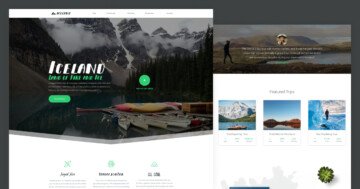
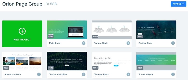
The Orion page group is a landing page which stays from 6 blocks and a slider. You can create your whole page using sliders and blocks. If you create a slider group then you can put your sliders together, and it is enough to publish the group, and your sliders will be under each other.
Layers
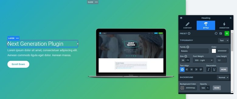
You can meet with basic layers in this slider group: headings, text layers, images, and button layers. Usually they are in rows and columns which you can use to create a great layout. You can customize each layer in Smart Slider. For that, open the Layer window. Here you can change the content, or the style of the actual layer. Also, you can add a layer animation to the layers in the Animation tab.
Animations
There are many amazing effects to make the sliders stand out. For example, the parallax effect on the Partner block, which looks really great on any slider. When you scroll up or down, you can see different parts of the background image. We’ve also used the shape divider feature to improve the visual experience. The shape divider is a great separator between sections, also you can animate them.
Layout
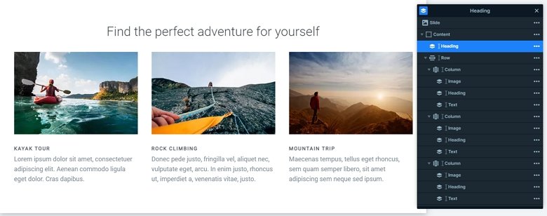
In most of the sliders we have put the layers in rows and columns. With using rows and columns we can create good looking and responsive structures. One of the most special structures of this group has the Adventure block. There you can see a heading layer on the top, and there is a row with 3 columns. In the columns the layers are under each other.
Responsive
We built the slides using default positioning, which grants them great responsive behavior. If you check the page on your tablet or mobile, you can see the text sizes are smaller. You can set the font sizes device specifically with the text scale option what you can find in the layer menu or in the Style tab of the layer window.
Related Post: Add Beautiful Section for your Website with Shape Dividers
Related Post: Use Beautiful Layer Animations in Smart Slider 3 Pro
