


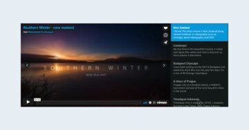
💡 Best features in this slider
Settings
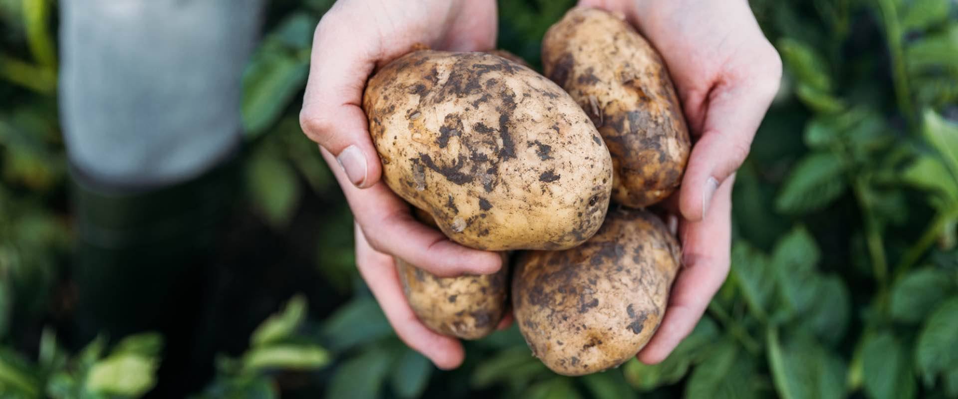
The most common sliders you can see on websites display a single slide at a time. The Organic Food slider is similar to these popular sliders. In Smart Slider, we call these traditional sliders Simple type sliders. They display a single slide, which can fill its container, the full width of the page, or the full width and height of it. This Organic Food template takes up the full width of the page. Full width sliders give plenty of space to display content. As a result, they help showcasing gorgeous images.
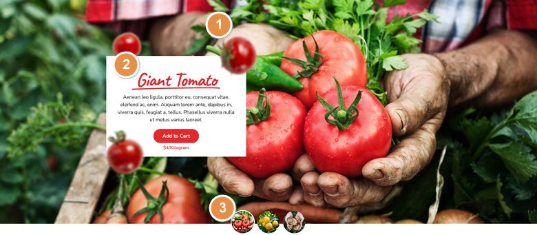
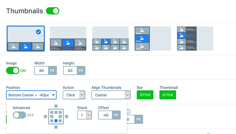
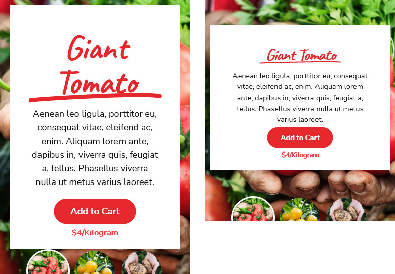
The slider doesn’t have arrows for navigation, but it has thumbnail images. They’re located at the bottom of the slider. What makes them looks special is that they look like half of them is on the slider, and half of them below. This happens, because of the size and position of the thumbnails.
Layers
The most special layer on this slider is a Highlighted heading layer. This layer draws a special shape around the highlighted text, which helps drawing attention to it.
The white layer on the left is a row, which has 500px maximum width. This limits the space the row can take up, which allows seeing bigger part of the slide background image.
Animations
There are three cool animations on the slider. First, the most noticeable animation is the Ken Burns effect. The Ken Burns effect is a zooming and panning effect, which came to the web from video editing. In this slider, the effect slowly scales down the images. In fact, web designers love using the Ken Burns effect because it’s subtle yet elegant. So, it helps making the images stand out.
The second animation is a Main animation. The Main animation is the effect, that can affect both layers and slide backgrounds. At this slider the Main animation is a simple fading animation. It fades out the background images, and also the layers. Since the layers have an incoming animation, the Main animation doesn’t fade them in. Instead, the layer’s incoming animation makes the layers appear on the slide.
The last effect on the Organic Food slider is the most fun one. It’s the layer parallax effect, which makes them react to the mouse movement. As a result, when the cursor moves to one direction, the layers move to the opposite direction.
Layout
The Organic Food slider uses both Default positioned and Absolute positioned layers. Default positioned layers are great to build content. They let you create a good looking, responsive slider super fast. In fact, Default positioned layers generally need little to no responsive adjustments. They’re marked with a blue color on the canvas.
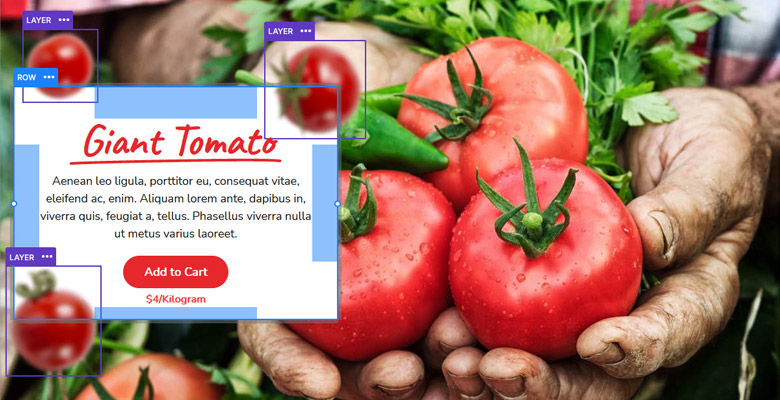
Absolute positioned layers, on the other hand, are great for creating decorative elements. Although their responsive behavior isn’t as great as Default layers’, you can place them anywhere on your slider. On the canvas they’re marked with a purple color.
Responsive
Like any slider you’ll create with Smart Slider 3, the Organic Food slider is responsive, too. This means that the slider is enjoyable even on the smallest screens. To help with this, we hid the Absolute positioned layers on mobile devices. As a result, they won’t cover the content.
The text sizes have been reduced, too, to make the highlighted heading fit better to the mobile screen. We also adjusted the padding on the Content layer, to make the slides look less crowded.
Related Post: Use the Popular Ken Burns Effect on your Slider
Related Post: Everything You Need to Know about the Parallax Effect