


Slider Settings
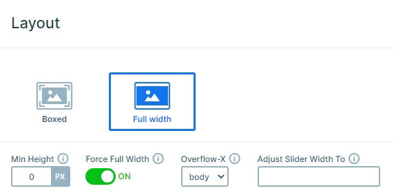
The Magic Dev slider template is a slider that keeps things simple and focused. Since it only shows one slide at a time, your visitors won’t get overwhelmed or distracted by anything else on the page. Plus, it’s full-width, so it stretches across the entire screen, giving your content plenty of space to shine.
Navigating the slider is pretty easy. You’ve got three easy ways to do so:
- First, there are the shapes at the bottom you can click to jump to any slide.
- If you’re on a touchscreen, you can just swipe left or right to move between slides.
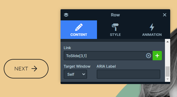
- And from the second slide onward, you’ll spot a “Next” button that makes switching slides even easier.
Layers
After the first slide, all the others stick to the same basic layout, with familiar layers like headings, text, images, and buttons. But there are still some unique looks to keep things interesting.
One of the coolest details is the progress bar that shows up from the second slide onward, which creatively highlights the skills of the people featured. We’ve already mentioned that there’s a built-in navigation, from the second slide, that’s super easy to set up by simply adding a link action to your layer.
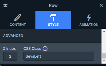
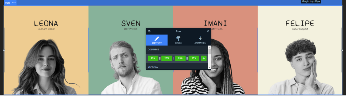
On the first slide, you’ll spot rounded borders around the columns that showcase each person against colorful backgrounds. This is all thanks to some custom CSS. If you want to recreate it, you just need to apply a CSS class to the columns in the style settings and add your custom design in the Developer settings.
And, there’s one more design detail that we can’t forget about: the highlighted part of the heading on the first slide. This is done with the Highlighted heading layer, this way you can add an extra personal touch to your design.
Animations
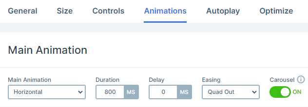
After you’ve switched through a few slides, you’ll probably notice the Main Animation in action. It’s a simple, smooth horizontal slide that’s quick and doesn’t overpower the content. It affects both the background and the layers on each slide.
Each element on the slide has its own little entrance animation too, which makes the whole slider feel more lively. And it’s all done using the basic animation settings, so it’s super easy to pull off without any complicated setup.
You’ll also notice some hover animations on the earlier-mentioned rounded border elements. Here we’ve used IN and OUT layer animations for each row to create these visual effects.
For the IN animation, we’ve set the Y-axis offset to -316px, which means the element will slide up from its original position by 316 pixels.
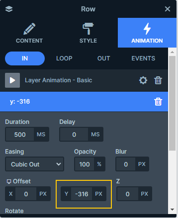
Conversely, for the OUT animation, we’ve set the Y-axis offset to 316px, so the element will move down by the same amount when it exits.
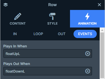
These animations are triggered by specific layer events. Each row has two events added. Let’s look at the first row:
- Plays In When: floatUpL
- Plays Out When: floatDownL
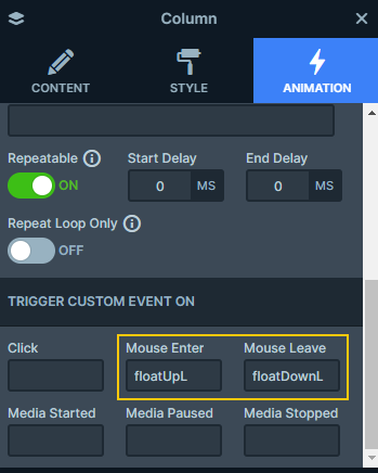
Additionally, we’ve set the ‘TRIGGER CUSTOM EVENT ON’ feature for the row’s columns. They are set to respond to mouse actions:
- Mouse Enter: Triggers floatUpL
- Mouse Leave: Triggers floatDownL
Layout
Most of the slides stick to a simple, straightforward layout with two columns, each taking up half the slide. The right side is all about the visuals, usually just an image, while the left side is where all the important stuff happens, like text, which naturally grabs the visitors’ attention.
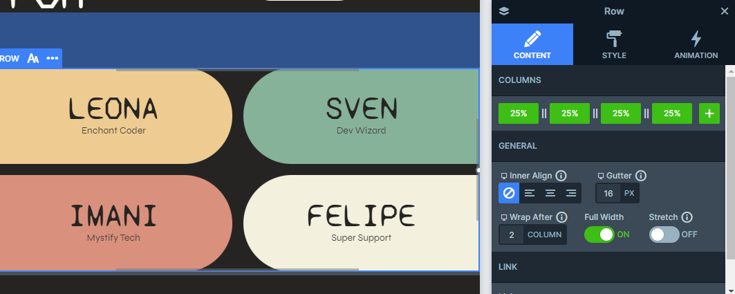
The first slide, though, mixes things up a bit. The top half still uses that two-column layout, but the bottom half adds a unique touch with four equal columns.
Responsive
Every slider is fully responsive, so you can easily adjust it to match your needs. This template is a great example of how flexible these settings can be, using tons of them to make everything look great on any device. For example, with the font resizer, you can adjust text sizes depending on the screen, so it’s always easy to read.
One fun detail is how the bottom row of the first slide changes when you’re viewing it on tablets and mobile devices. The reason for this is that on smaller screens, the original row holding these elements is hidden using the useful ‘Hide On’ option. In its place, we’ve added a new row designed specifically for smaller screens.
Instead of the original four columns, this new row has just two columns per row, with some space in between to keep everything organized. You can easily set this up by going into the row settings, choosing how many columns you want per row, and then adjusting the spacing with the ‘Gutter’ setting.