Slider Settings
The Instagram Slider is a full width slider which uses Simple slider type. This is the most common usage of the sliders, because it displays one slide at a time, which helps the visitor focus on one message.
There are three slides in the slider, which the bullet control indicates at the bottom of it. Apart from the bullets, the slider supports touch screen navigation. Additionally, there’s a special CTA that goes to the next slide.
Layers
The Instagram Slider template uses simple layers. There are three image layers, one for the image image, another for the decoration and the third is for the icon. You can also find two heading and a text layer that create the main content.
Animations
Smart Slider is a great tool to create animated layers. In this slider there are two layers which have layer animations: the main image and the decoration one next to it.
Layout
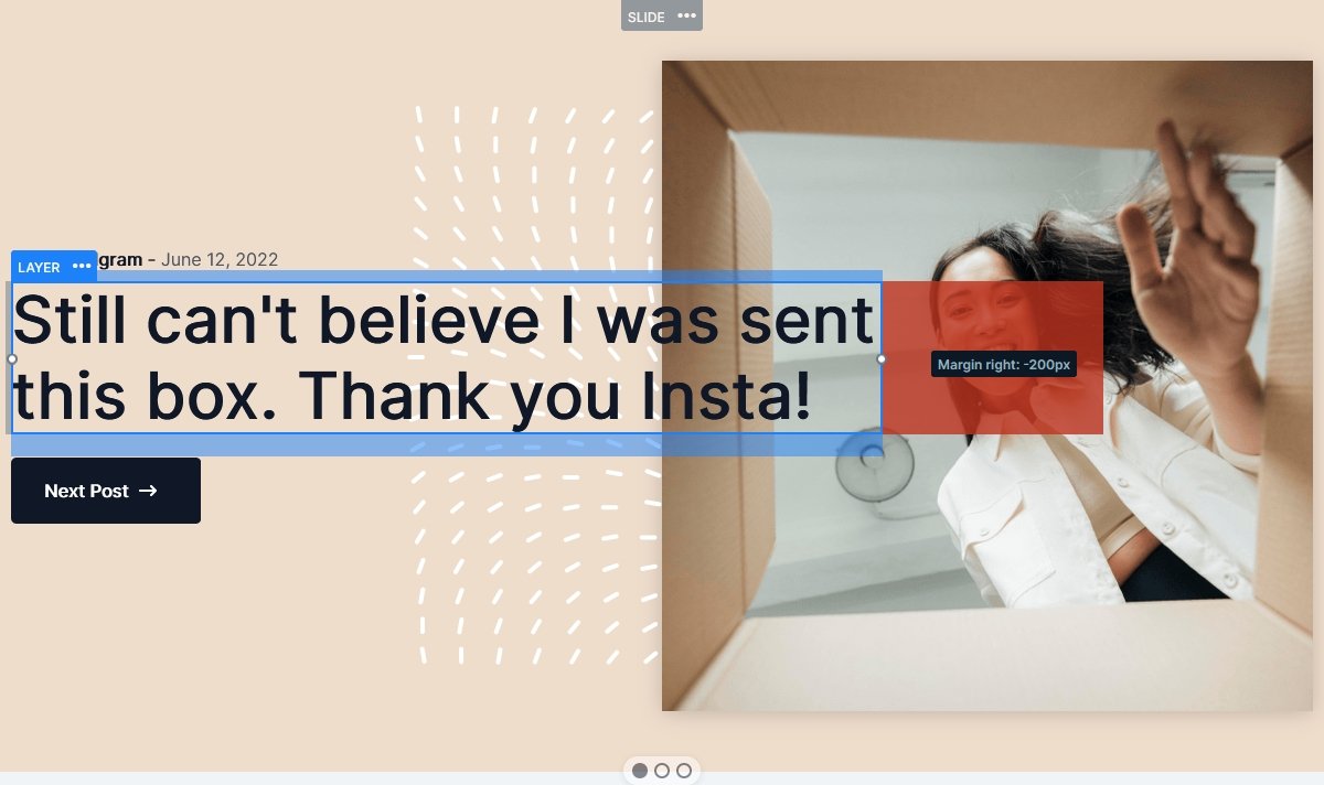
There are lots of interesting layouts in the Instagram Slider. The most obvious one is the main headline that partially covers the image. How to create such layout? Simply give a negative margin to the text to make it partially cover the image. Then increase the z-index of the column which contains the text.

The other interesting layout is the CTA button what you can use for navigation. Smart Slider has a dedicated button layer to create buttons. However, this special button is completely custom, which we built using a row, a heading and an image layer.

Responsive
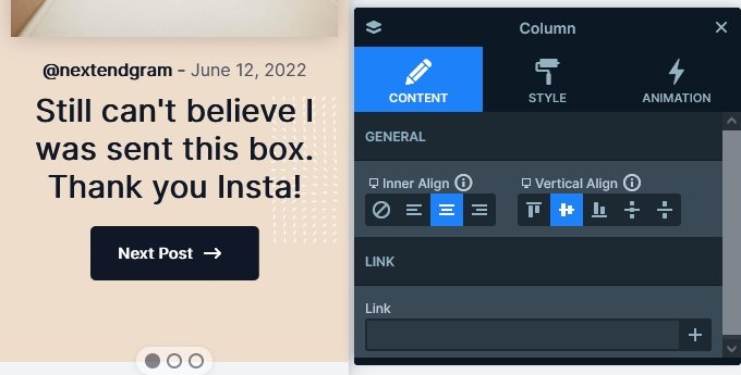
Smart Slider has many cool responsive options, and we used a bunch of them to optimize the slider for mobile. If you check the slider on your phone, the first thing you might notice is that the text align has changed to center, while it was left on desktop. To create a layout like this, simply change the Inner align option on the container of your layer. In this case, it was the column layer.

Rows automatically break their columns into new lines on mobile. Thanks to that, the left column with the textual layers ends up above the right column where the main image is. However, on mobile they appear in a different order, because we changed the column order.
Also we reduced the size of the texts to make them fit better into the mobile layout.
Related Video: Smart Slider Pro Tutorial – Instagram Slider
Related Post: How to Add an Instagram Slider for your WordPress Site?


