
💡 Best features in this slider
Settings
A hero slider extends the idea of a hero image, allowing you to present multiple hero images and videos in sequence, using captions, transitions, and animation.
Hero headers are among some of the best and most visually appealing trends in web design in recent years, but paired with sliders, they have even more visual punch. When done correctly, hero sliders deliver context and clarity, helping visitors quickly understand what your site is about and what you have to offer. A great hero slider needs great design, and thanks to solutions like Smart Slider 3, anyone can create a beautiful slider with little effort, using features like drag-and-drop, animations, transitions, buttons, and more.
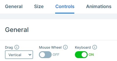
This hero is a full width slider, so fills the 100% width of your page. It’s not an average slider when you check it, because it is a vertical slider, so you can switch slides with vertical dragging, or with the bullets control on the right.
Layers
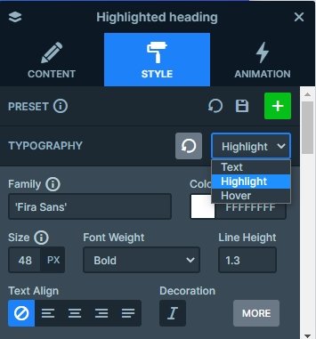
The hero slider stays from 5 different slides. You can see a highlighted heading layer, simple heading layers, buttons, images and text layer on the slides. Text layers are specials because you can use your own code inside the layer, so you can add a different style for the texts. In this example there are headings where a part of the text is bold. But you can replace these layers with highlighted heading where you disable the highlight. At highlighted heading you can add different styles for the main text, the highlighted text and the hovered text.
Animations
Each layer has a good looking incoming layer animation. When you switch a slide, you can see the layers are coming in after each other. The first slide is special because there is a highlighted heading used where the highlight also has a nice underline effect, and the button layer has a loop which calls the visitors attention to click.

Layout
The 5 slides have different layout and structure, but you can see a curved white shape below the slider. This is the shape divider effect, which you can fully customize, you can change its color, make it smaller, but you can disable it if you don’t like it.

Responsive
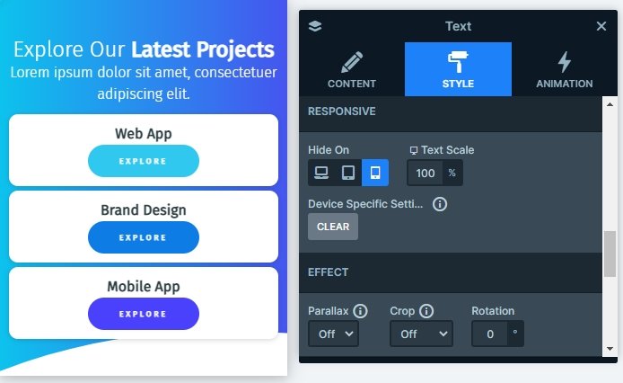
There are layers which aren’t visible on smaller screens. With hiding a layer you can save space on your slider. In Smart Slider your slide’s height is based on the layers and all the slides’ height are based on your highest slide. So if you have a tall slide on mobile, then your whole slider will be taller. To avoid this you can hide layers on different devices.
Related Post: Use Beautiful Layer Animations in Smart Slider 3 Pro
Related Post: 11 Beautiful Full Width Slider Examples
Related Post: Add Beautiful Section for your Website with Shape Dividers
