
💡 Best features in this slider
- CTA button
- Bullet control
Settings
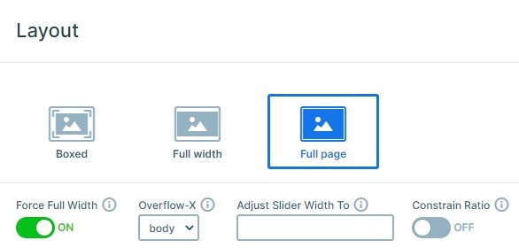
This slider is a full page slider, so it is as big as your screen, filling the 100% width and height of your browser. When you scroll with your mouse or use the bullet control on the right, you can notice the background animation which gives a great experience. The slider has 3 slides, and when you are on the third slide and scroll down, you can see the content below the slider.
Layers
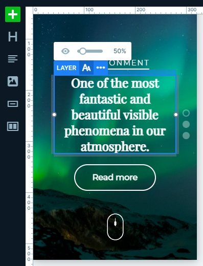
There aren’t too many layers in this slider, there are 2 headings, a button and an image layer. You can easily customize them, change the text, the font family, colors, or any styles. Also, you can add layer animation to each layer if you want.
Animations
How your slider works might have a bigger design influence on your website, than the actual contents on it. You need to carefully pick the right choices of what you would like to say with your slider. It can be “party all time”, or “we are professionals”, maybe something else. But you don’t want it to be too simple, which wouldn’t tell anything besides “boring”. The background animations give you many options to choose from, but being boring isn’t one of them.
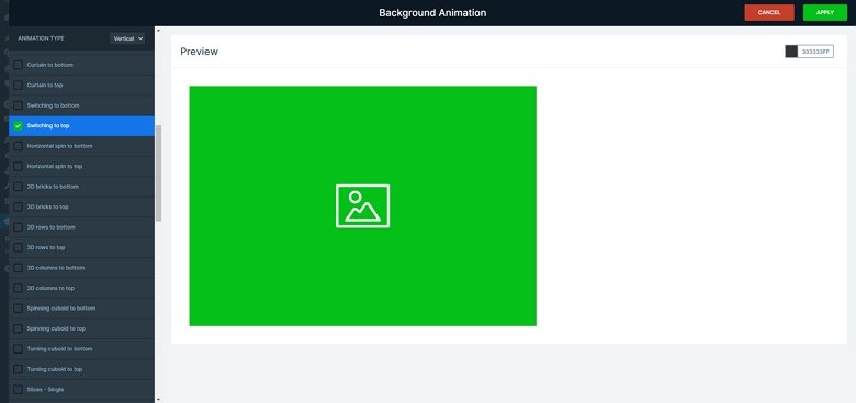
The best thing about background animations is that they are attractive. They can be implemented to the background images, which usually cover your whole slides, so the effects can be very powerful. You can also handle them easily, we have “sets”, where you can even choose from only vertical animations, if your slider is set up to have a vertical behaviour. This animation option is available globally, but you can select them individually for your slides, too, to have specific effects on the different slides. There is a preview, which helps a lot with picking out the animations.
Layout
The slider has a simple layout, the layers are under each other, each layer is in a new line. You can easily use this layout on a dynamic slide, just copy the slide and paste the content in the dynamic slide. Then replace the content fields with variables. The top heading can be a category tag, the big heading the title of your post, and the read more button can link to the actual post.
Responsive
The slider is fully responsive, it looks good in each device, on bigger and smaller screens as well. On smaller screens we used the text scale option to make the text smaller. This helps that the text isn’t too big on mobile, and won’t take up too much space.
Related Post: What is a Full Page Slider and How to Use it?
Related Post: Animations & Effects in Smart Slider

