


💡 Best features in this slider
- 3 columns row inside a left aligned column
- Heading layer in a right aligned column
- Arrow control
- Text bar control
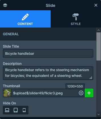
Settings
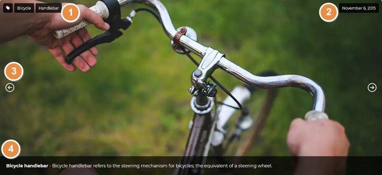
The Flickr Slider template is a simple boxed slider. It’s a great choice for creating image galleries which you can display in your posts. There are arrows on each sides of the slider, which help visitors browsing the images. Also, mouse drag and touch controls are available for the same purpose. The slider has Boxed layout, which makes it fit perfectly into the post content.
The most interesting part of the Flickr slider is the Text bar control at its bottom. The Text bar is a special kind of control, that can display the title and description of the currently viewed slide. As a result, you need to set it up once, and every slide will copy the layout. This gives the flexibility of dynamic slides for your non-dynamic content as well.
Layers
There are 4 layers on this slide to display content: 3 headings and 1 image. On the left side you can find the tag image, and next to it two tags related to the photo. The Heading layer on the right side displays the date of the image.
Animations
The Flickr slider doesn’t have any layer animations. For slide switching it uses the Main animation. This effect can move the slide backgrounds and the layers simultaneously. As a result, it creates a nice and smooth effect during slide switching.
Layout
While the Flickr slider’s layout is super simple, it looks special, because the layers appear on opposing sides of the slide. This happens, because the base of the layout is a two column row. In the first column we used left align, to place the content on the left side. In the right column, however, we used left align. As a result, the single heading layer shows up on the left side.
Responsive
Smart Slider 3 is a responsive slider. In fact, it has exceptionally good responsive behavior. As a result, every slider you create is responsive, and look great on any device. Additionally, you have many cool options to fine-tune the responsive look.
In case of the Flickr slider, we made two responsive adjustments. First, we hid the column where the date is on mobile. Second, we adjusted the wrap after at the 3 column row. The Wrap after is the setting that devices how many columns can fit into a single line. By default it’s set to 1 to ensure that the each column breaks into separate lines on mobile. This helps creating a layout, that better first for these small screens. However, at this slider, we changed it to 0 on the 3 column row. As a result, the columns stay next to each other.
Related Documentation: Text bar
Related Post: How to Create Beautiful Responsive Image Slider?