Settings
It is a common practice among website owners and developers to welcome the visitors with a nice-looking, clean landing page where the users can find call to action buttons, and where they can get basic information about the website and its purpose. If it’s a company website, then a landing page usually lets the visitor know about the name of the company and what they are doing. If it’s a webshop then you can show some featured products, discounts and most popular products.
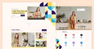
This whole page was made using sliders and blocks where you can display your portfolio. The Portfolio group stays from 5 sliders, which will be under each other if you publish the slider group. You can add more sliders to this group if you want, also you can fully customize each slider.

Layers
The first slider contains some basic information about the one-person company, giving the visitor a clear idea on what to expect when they arrive at the website. The clean design speaks for itself; no users will have trouble reading the texts on the slide, or on the buttons. Speaking of the buttons, the first slide has two of them. The first will scrolling further down on the page, while the How I work button will take the user to the second slide.
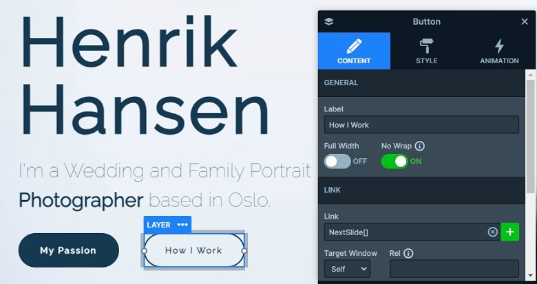
Besides that you can meet with heading layers, texts and image layers in the sliders. The third slider uses a special kind of layer: the caption layer. When you hover over the images, a caption will appear at their bottom part, giving some additional information. These images also have lightboxes on them, so when you click on any of the images, a lightbox will pop up, showing an extra image.
Animations
When the page was loaded, a simple and elegant flip layer animation happened on the texts and buttons. If you happened to miss it when you loaded the page, press the How I work button, wait for the second slide to load then click on Who are you? to see the animation.
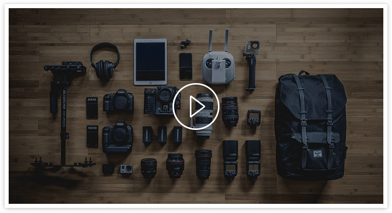
Once you press the How I work button and the slide is changing, you can see a professional-looking background animation which conceals the first slide and introduces the second one. This slide’s specialty is the lightbox video, which opens up when the image with the play button is clicked.
The parallax effect is a special effect becoming more and more popular on websites, and used mainly for one reason: to wow the users. And it is doing a marvelous job with that. Parallax effect is creating the illusion of depth by moving some elements slower, than the others. You can see this parallax effect on this slider group.
If you hover over the second slider, and start moving your mouse (when it’s still over the slider) you’ll notice that the five small photos are trying to follow your mouse, creating a breath-taking effect even on a simple block element like this. This parallax effect can be added to any layer, and their depth can be adjusted at the layer settings. At the Animations tab on the Slider settings page additional customization options can be set such as the effect’s behavior on Horizontal and Vertical use cases (whether it will move by the mouse or by scrolling).

Layout
The slider group contains 2 sliders and 3 blocks. Slider blocks are basically allowing you to display one slide only without any control elements on it, but the same layers and slide-level options are still available, therefore it is like a row editor from a page builder. You have the elements to be added, and you have a visual way to configure them to your liking.
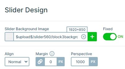
The portfolio block has a special layout, because there is a fixed slider background. If you scroll back and forth a little bit, you see that the illusion of depth is a little bit different in this block than it was in the previous one. In this case, the illusion is given by the fixed background.
Responsive
The whole landing page is fully responsive. There are layers which are hidden in smaller views, also the font sizes are smaller. You can set the font size with the text scale option device specifically, so you can set different values on different views.
Related Post: How to Create Beautiful WordPress Landing Pages That Convert
Related Post: Everything You Need to Know about the Parallax Effect
