Settings
The Cosmetics slider is a modern looking full page slider, which is perfect to display your products. Full page sliders fill the screen both horizontally and vertically. They’re super popular nowadays, because they look stunning on the large monitors that people use.
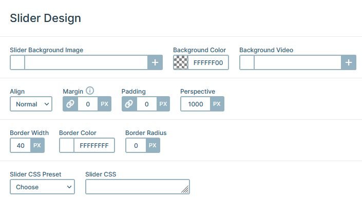
There’s a white border around the slider, which gives a nice frame to the slider. You can adjust the border at the General tab, under Slider Design.
Layers
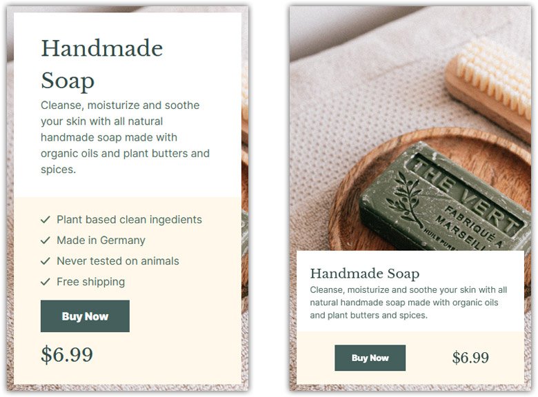
You can find the same layers on each slide of the Cosmetics slider. There are two heading layers, one for the main headline and another for the price. There’s a text layer to display the description of the product. Also, you can find a nice CTA button the visitors can use to buy the product.
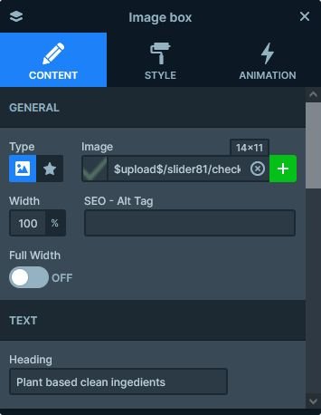
Every slide has four image box layers. These are special kind of layers, which can display an image or icon, a heading and a description. We used this layer to display the list with the check marks.
Animations
There are interesting animations on the Cosmetics slider. The first animation you’ll see is the layer animation, that introduces the row to the slide. It’s a simple left move animation, but it looks a lot more special because of the masking. The masking is a special kind of animation that makes the layer animation play inside the layer’s boundaries. In other words, the layer animation is only visible when it’s inside the current layer’s area.
The other animation is the Background animation what you’ll see when you switch slides. It’s a parallax-like effect, because it moves the two slide background images at the same time, just with a different speed. As a result, when you switch to the next slide, the next slide moves in fast and covers the current slide.
Layout
The content is placed to the bottom left corner of the slide, which makes the layout trendy. Creating such layout is very simple. First, you need to set a maximum width to the Content layer. Second, align it to the left. Finally, change the vertical align to bottom so the content will appear in the bottom of the slide.
The other cool layouting the Cosmetics slider is the usage of the row and columns which contain the layers. The white and cream colored boxes are columns of the same row. By default the columns of the row are next to each other, but using the Wrap after option on the row it’s possible to display them below each other.
Responsive
Smart Slider 3 is a responsive slider, and offers many tools to fine-tune the look of your slides on mobile. The two most useful tools are the font resizer, and the ability to hide layers on different devices. Additionally, the padding and margin values what you can use to create distance between the layers can be changed on tablet and mobile devices.
At the Cosmetics slider we hid the image box layers on mobile to reduce the height of the slide. Also, we reduced the font sizes to allow the texts to better fit into the slide. By default the Wrap after of the rows is set to 0 on mobile, which causes the columns to break into new lines. We changed it to 1 at this slider to put the CTA button and the price into the same line.
Related Video: Layer Animations & Timeline
Related Post: What is a Full Page Slider and How to Use it?
