I am 100% sure that the collaboration with Nextend was the best choice we could have made. Nextend turned a highly complex product into a simple but premium user experience.
Trienke van Aartsen
Amper AI
Slide 2
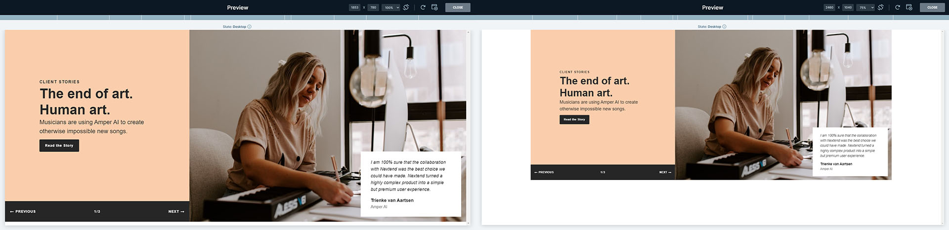
CLIENT STORIES
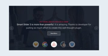
Revolution in the agriculture.
Their farms grow fresh produce 2x faster using 90% less water than conventional agriculture farms.
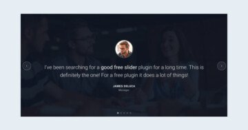
Description: Do you need a modern and clean slider to showcase the success stories of your clients? Have a look at the Client Stories slider, which displays these stories in an attractive way.
Premium: Gain access to all slider templates with a
single purchase.
Full width layouts are one of the trendiest elements of modern web design. Nowadays people ether use super large screens, where such huge layouts look nice. Or they use small mobile devices where every pixel matters. Full width sliders look great for users of either screens. What makes this slider look unique is that the Limit Slide Width is disabled for this slider. As a result, the slider height is proportionally scaled up with the slider width.
Limit slide width off (left) and on (right)
Let’s talk about the navigation. You can drag the slides with your mouse to switch to the next or previous slide. If you’re using a touch screen device, you can change slides by a horizontal swiping. Additionally, keyboard navigation is enabled, so you can navigate with the left and right arrows. There are no actual controls, such as arrows or bullets on this slider.
Layers
On each slide there are two button layers with a nice icon. These button layers, when clicked, will make the slider go to the next or previous slide. This special functionality is achieved by the Link Actions. They’re special features in the Pro version of Smart Slider. They let you create special navigation buttons without having to code.
There’s another special layer on each slide. Between the two buttons there’s a text layer which is used as a counter. It shows how many slides are available, and which is the active slide.
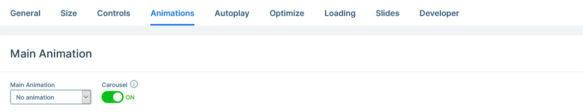
Animations
If you switch slides a few times, you’ll notice interesting things about the animations of this slider. Focus on the right column, where the large image is. It doesn’t move at all, which happens because the Main Animation is disabled. Main animation is the effect, that moves the layers if they don’t have layer animations. The single colored column, and the image doesn’t have that, so they don’t animate at all.
Disabled Main Animation
There’s layer animation on two columns, which breathes life into the slider, and creates a memorable experience.
Layout
The layout of the slider is quite simple: it features a two column row. When you add a new row, the two columns have 50% width. In this case, the columns have different size: the left one which has the text is only 40% wide. The column on the right, which contains the image of the slide has 60% width.
To ensure the row always covers the whole height of the slide, we turned on the Stretch option. This allows the image in the right column to be as large as possible.
Responsive
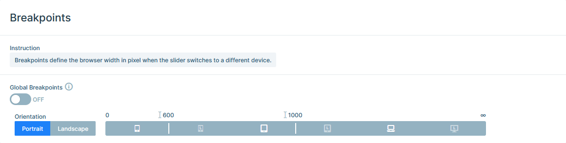
The most significant responsive setting of this slider was adjusting the Breakpoints. By default the newly created sliders switch to tablet below 1199px screen width. At this slider the tablet breakpoint was lowered to 1000px. As a result, larger tablet devices still show the desktop layout. This makes sense, because the tablet layout of this slider is rather optimized for smaller tablet devices.
Breakpoints of the Client Stories slider
The Client Stories slider has a similar tablet and mobile layout: the two columns are below each other. By default columns break in the same order as they appear on desktop. So the column on the left is at the top, and the one at the right is at the bottom of the other columns. But we changed the column order at this slider. As a result, the right slider ended up in the top, while the left slider is on the bottom.