Settings
The shape dividers are between the slide background and its layers in a Simple or Block slider. The Carousel and Showcase types work in another way: the whole slides are above the shapes. This makes it important to make the sliders high enough to avoid the slides covering the shapes. This slider also uses animated wave-like shapes. The result is simply marvelous.

The slider has a slider background image which you can set in the Slider settings → General → Slider Design. This image will be below your slides like in the example.
With a WordPress Carousel you can display more slides next to each other at the same time, which can save place on your website. Carousel can be useful in product sliders or logo sliders, but you can use it to show your latest post as well.
Layers
Every slide has an area layer, a caption layer, heading layer, button, and at the bottom of the slides there is an image box.

You can use the area layer to create a line as you can see in this template. With area layer you can create a layer which is filled with a simple or gradient color. It can be used to create lines which can be a good separator between your layers, like in this example. All you need is to set the area height to 2px and change the color.
Animations
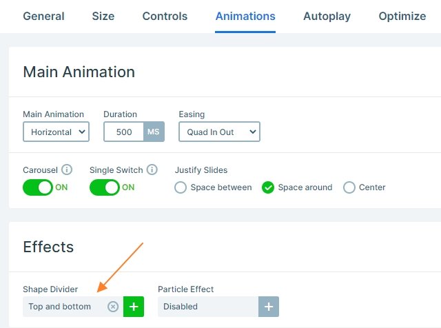
This carousel type slider has an animated shape divider in the background which is continuously moving with a wave effect. You can change the speed of the animation at the Slider settings → Animations → at shape divider. Now the speed is the default: 100%, but if you want to a slower movement, you can simply change it.
Layout
Each slide has the same layout: there is a row which contains another row. The layers are under each other, a caption layer on the top, then comes a button, a heading and an area layer. Finally, there is an image box on the bottom of the slides.
Responsive
When you check the slider on mobile, you can see only one slide. This is because the carousel type slider can only show whole slides at the same time, and in mobile one slide is visible. To pay the visitors attention there are more slides, we have enabled the bullet control on the bottom of the slider which shows how many slides are in the slider.
Related Post: All You Need To Know About Carousel Slider Type
Related Post: Add Beautiful Section for your Website with Shape Dividers
Related Post: Enrich your Blog with a Post Slider


