Get ready to explore the amazing world of animations! Animations are known to add flavor to any website, and you know what? Smart Slider is no stranger to such magic either.
Are you looking for ways to make your website more engaging? Look no further! In this blog post, we’ll be sharing the top 10 animations that will keep your visitors hooked and turn your website into a real crowd-pleaser.
So, grab your coffee, maybe a snack, get comfy, and let’s explore the amazing world of Smart Slider animations. You can be a web designer or a beginner, these animations are sure to add that extra flair to your website.
Intrigued? Well, you should be! Let’s get started on this exciting journey.
📚 Table of contents
🎬 1. Main Animation
🌌 2. Background Parallax
🖼️ 3. Background Animation
🌟 4. Highlighted Heading Layer
✂️ 5. Shape Divider
🎥 6. Ken Burns Effect
✨ 7. Particle Effect
🔮 8. Layer Parallax
🚀 9. Animated Heading
🎨 10. Layer Animations
💡 Conclusion
1. Main Animation
Dynamic websites rely on animations to keep things entertaining, and the slider’s Main Animation is a key player in this. It’s the leader of all animations, setting the mood during slide-switching and ensuring your slider flows smoothly from one slide to the next.
Imagine this, instead of a static first impression, your website greets visitors with a mesmerizing blend of images and information. The Main Animation guarantees a seamless visual experience, instantly captivating your audience.
How to Enable and Customize
Go to the Animations tab and voila, you will find an entrance to a whole new world of possibilities. Need a different animation type? It’s just a click away! Adjust the duration to control the animation speed or add a delay for a grand entrance.
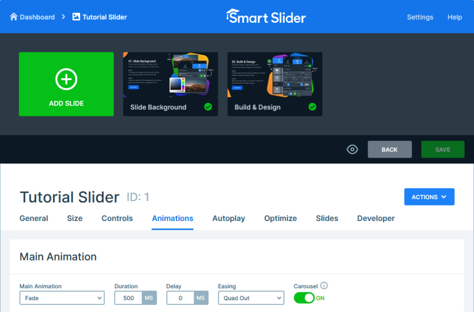
To add a little more smoothness, change the easing settings. With the Main Animation, you have the power to create a perfectly fine-tuned sliding with each transition.
Bonus: Carousel Mode
But wait there’s an extra setting! Let us introduce you to the carousel mode, a fantastic feature that brings elegance to your website. It’s like pressing the replay button, but with a touch of sophistication. Once you reach the end of your slides, bam, you’re right back at the start, creating a smooth and captivating loop of content.
2. Background Parallax
Have you ever thought about adding a touch of three-dimensional magic to your website? If yes, then your answer is the Background Parallax, a captivating feature, that can mesmerize your audience with depth and dynamism.
Picture this, as your visitors scroll, the content on your slides moves at a different speed compared to the background. This is what we call parallax scrolling. It adds a mesmerizing touch, that truly captivates your audience.
How to Enable and Customize
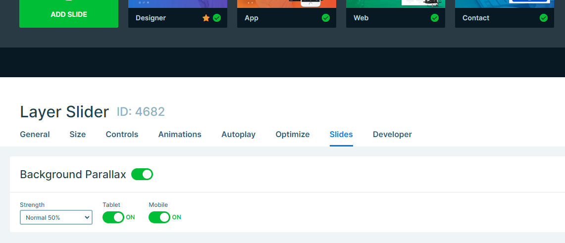
So how do you create it? Go to the Slides tab where all the magic happens. Then, simply enable the “Background Parallax” option at the bottom. That’s it, now your slides will be transformed with a sense of captivating depth.
There’s more! The Background Parallax provides a wide range of customization choices. You can increase the intensity of the effect and also make sure that visitors from tablets and mobiles also get to experience the effect. This feature also offers you the ability to personalize it to perfectly match your website’s vibe.
3. Background Animation
Why stick to the boring static when you can add a touch of animated charm to your slides? Background Animation is the key to creating visually captivating sliders, where every transition is transformed into a beautiful sequence.
How to Enable and Customize
Go to the Animations tab, and that’s where you can find a whole bunch of captivating background animations. Simply click on the Background Animation field, and all the options will appear right before you.
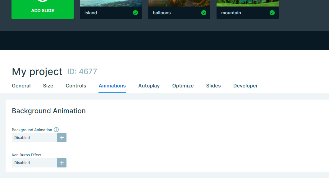
Pick an animation that matches the vibe of your website. You can go for all kinds of animations, the choices are endless. To make it even more unique, you can select a background color that compliments your overall theme.
But the fun doesn’t stop there. Want to add an extra element of surprise? Choose multiple animations and watch as each slide change brings a new burst of excitement. Customize the animation speed, choose when your background Animation takes center stage, and watch your slider come alive with fresh energy.
And if you are someone who wants even more customization, then you can explore the world of unique Background Animations for each individual slide.
4. Highlighted Heading Layer
It’s about time you give some attention to the text elements on your website with the Highlighted Heading layer! If you’ve ever thought that your headings could use a little something extra, this feature will make them truly stand out, and make an impact on your visitors.
The Highlighted Heading layer can turn boring headings into eye-catching elements with a simple layer. Just imagine text that not only delivers your message but does it with style. Let’s explore how you can actually make it happen.
How to Enable and Customize
To unlock the full potential of this feature, you need to begin by adding a new Highlighted Heading layer. Once you’ve done that, a whole new world of customization options becomes available. Firstly, start by exploring the Before text, as it appears before your highlighted text setting the stage for it.
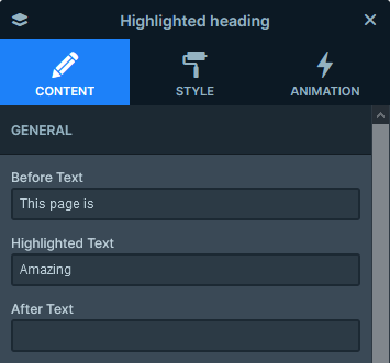
Coming up next is the After text, which is the text that comes after the Highlighted Heading layer. You can make your message complete with it.
Select the Type, Width, and Color that matches your website’s look and feel. Feeling adventurous? Give them all a shot! The Highlighted Heading layer’s charm lies in its adaptability, enabling you to customize it to suit different moods and styles.
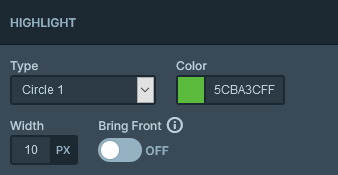
And of course, let’s not overlook the width, the thickness of the line that will make your highlight stand out. Looking for something extra? Boost the width for a statement that can’t be ignored. And for those who want to go even further, activate the Bring Front option to make sure your highlight steals the spotlight.
Let’s explore the colors as well! Choose the one that best represents your vision. With countless options available, you can blend your heading with your website, or create striking contrasts that will grab everyone’s attention.
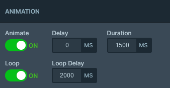
However that’s not all, the animation options are like the icing on the cake. You can add some delay, set the duration, and looping it can also add an extra touch of brilliance.
5. Shape Divider
With the Shape Divider feature in Smart Slider, you can add animated dividers that give your sliders a special touch. In addition, a slider isn’t only about the content, it also offers the chance to display your creativity and design skills.
A Shape Divider not only adds a touch of elegance but also brings in dynamic shapes that blend perfectly with your design. Let’s explore how they can enhance your slider!
How to Enable and Customize
To kickstart it, go to the Animations tab. Then simply scroll down to the Shape Divider effect and decide if you’d like to add it to the Top or the Bottom of your slider. You can adjust it in the upper right corner.
Here you can choose from a wide range of shapes available and let your creativity flow. Whether you prefer waves, rectangles, or curves, each shape has its unique charm. To see your selected shape come alive, preview it.

But the customization doesn’t end here. Pick a color that matches the overall vibe of your slider. Play around with the width and height, to find a balance, and make sure that the shape complements your slider, without stealing the spotlight.
Are you up for smothering even cooler? Try flipping the shape to see things in a whole new way. And why not keep going by animating it too? Adjust the animation speed to match the flow of your slider transitions, and watch as it unfolds right before your eyes.
Shape Dividers not only improve the visual appeal of your sliders but also allow you to decide how they behave as your audience scrolls. With this feature, you can ensure smooth switching between slides, keeping your slider captivating from beginning to end.
6. Ken Burns Effect
The Ken Burns Effect can add a touch of movie effect to your website. Do you know what it does? This awesome animation gives your background images a zooming effect that brings a captivating element to your sliders.
How to Enable and Customize
First, you need to go to the Slide layer, and inside it spot the Content tab. There you’ll find the Ken Burns effect just waiting to wave its magic touch on your background images. However, it doesn’t need to be just one slide, right? You can enable it on all of them if you select it in the Animations tab. This would make it more consistent for the viewer.
You can personalize it in any way you want. To do this try out the different presets available and find the one that matches your unique style. Preview it to make sure, and see your backgrounds in action.
Wanting to adjust it even more? Simply click anywhere on the image, to set where the zooming should start from. There’s another way of doing it, by setting the exact starting place in the top right corner of its editor. To achieve the desired results, set its speed and strengths as well in the Animations tab.
7. Particle Effect
Have you ever imagined particles gracefully dancing and adding a touch of playfulness to your slider? Let’s explore how the Particle Effect can magically transform your website.
How to Enable and Customize
To get this awesome feature up and running, just go to the Animations tab. There you’ll find a bunch of cool presets to choose from, each with its own mesmerizing particle show. Once you’ve picked your favorite, it’s time to add a pop of color. To match your overall design you can change the colors of the lines that connect the particles.
However, the possibilities for customizations are endless. Adjust the speed of the particles, choosing whether they dance on your slider with grace or quickly. Are you looking for more interactivity? Take control of the particles’ behavior, and set how they react to the mouse when your audience hovers or clicks on them.
And if you are looking for a way to bring this effect to mobile view, you have the option to enable the particles on them as well. By default, it’s turned off to save resources, but once you activate it, you can enjoy their magic not just on desktop but also on your phone or tablet.
8. Layer Parallax
Let’s dive into the amazing Layer Parallax effect. It’s the perfect way to turn your website’s layers into interactive wonders. With Layer Parallax you can add depth and movement, making your elements come alive, this way ensuring an engaging experience for the visitors.
How to Enable and Customize
To unlock the power of Layer Parallax, simply select the layer you wish to bring to life. Go to the Style tab and there you’ll find the Parallax option for your layers. The intensity of the effect is completely up to you, ranging from 1 to 10.

There’s no end to the customization options. You can dive deeper to experiment with different strengths and edit your layers to react in subtle or bold ways to user interactions. Then let your slider transform into a dynamic canvas where layers glide along as your visitors view your content.
9. Animated Heading
Are you ready to add some excitement and energy to your text? Smart Slider’s Animated Heading is here to help. If you’ve ever wanted your headings to be more than just plain text, this animation is exactly what you need. Let’s discover how the Animated Heading can bring creativity and movement to your website’s messaging.
Headings are like the foundation of your content, and with the Animated Heading layer, you can elevate them from basic to brilliant. This awesome layer lets you modify certain parts of the text, turning your headings into captivating elements that grab everyone’s attention.
How to Enable and Customize
To get things rolling, include a new Animated Heading layer into your slide. You can find some customization options opening up, allowing you to edit different aspects of it.
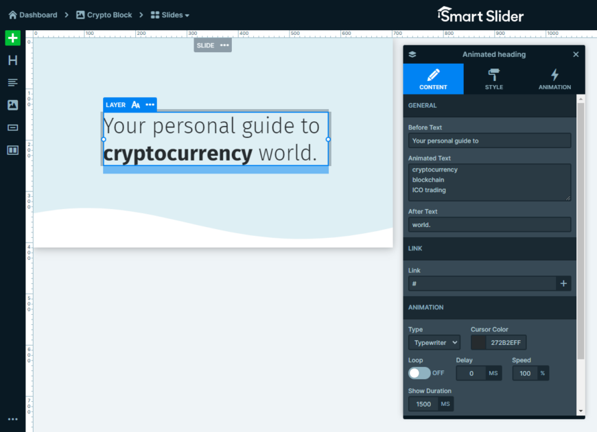
Start by changing the Before text, the text that is before the animated one. After this, you can explore the various text options for the animation and create one that connects with your audience.
The text that follows it is the After text, this is the text that comes after the animated text.
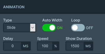
But the truly charming part comes after this when you explore the Type choices. Whether you fancy a timeless Typewriter effect or a daring Rotate type, each option adds its unique touch. Don’t hesitate to try them out and discover the perfect fit for your content.
Looking to have full control over the speed, timing, and duration? Smart Slider has got you covered. You can create a looping animation, increase the speed, add a delay for precise timing, and customize the duration for each line of the Animated text field.
10. Layer Animations
If you’ve been on the lookout for the ultimate method to make your layers more energetic, this feature will take your design skills to unexpected levels.
Layer Animations offer a whole new level of customization that surpasses the usual. With these animations, you have complete control over every detail of how your layers come in, loop, and exit, resulting in an incredibly captivating user experience.
How to Enable and Customize
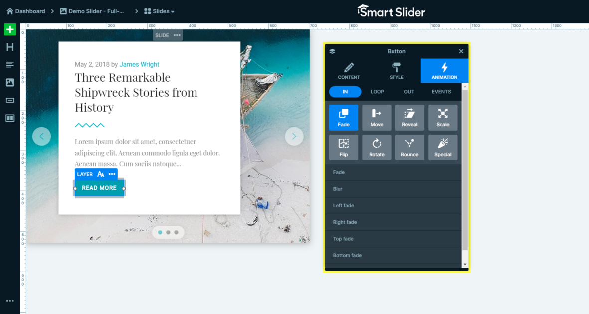
If you’re ready to start your design adventure, just go to the Animations tab in the layer. Get ready to discover a whole bunch of settings that will open up a whole new world of possibilities. Whether you want to create an impressive entrance, mesmerizing loops, or a graceful exit, Layer Animations provide you with the tools to unleash your creativity.
Grand Entrances with In Animations
Start with the ‘In’ tab, where you can customize the animations for when your layer enters the slide. The choices available here are quite varied, giving you the freedom to select animations that can range from gentle fades to captivating reveals. Just imagine your layers gracefully revealing themselves, creating a captivating user experience.
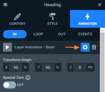
Jump into the settings, and discover animations such as Reveal, and unleash your imagination. Every animation comes with its own distinct settings, allowing you to customize the entrance to match the mood and design of your website.
Loops with Loop Animations
Hold tight for the Loop animations. They start playing once the incoming animations are finished, and boy, do they love to flaunt their looping skills. This brings an energetic and uninterrupted vibe to your design, making sure your layers stay captivating throughout.
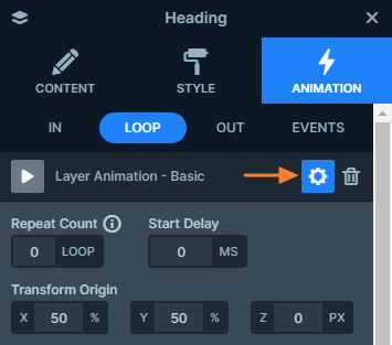
Exits with Out Animations
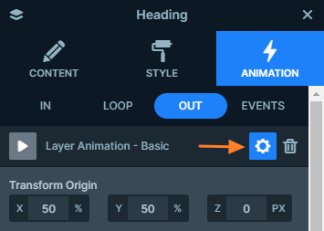
When it is time to move on to the next slide, the ‘Out’ animations steal the show. You can pick animations that say goodbye to your layer in a graceful way, guaranteeing a smooth transition from one slide to the next.
Event-Based Animations
But the fun doesn’t end there, Layer Animations also let you make animations that respond to user actions or specific events. Just think about how cool it would be to have animations that react to what the user does, adding an extra touch of interactivity to your slider.
Conclusion
Wow, you’ve just gone on an exciting adventure into the magical world of Smart Slider’s animations. Each one of these animations you’ve discovered will unlock endless possibilities for creativity and engagement in your design.
From the subtle elegance of the Slider Main Animation to the mesmerizing effects of the Ken Burns zoom, and the dynamic interactivity of Layer Animations – Smart Slider empowers you to go beyond the ordinary. We encourage you to roll up your sleeves, dive into the world of animations, and let your creativity run wild.
Don’t forget, Smart Slider’s charm doesn’t only come from its features, but your skill in using them. Your website is a reflection of your brand and with Smart Slider, it becomes a masterpiece that captivates and delights your audience.
In addition, we understand how exciting it is to see these animations in action, it can truly be a game-changer! That’s why we’ve created a YouTube video guide that serves as a vibrant companion to what you’ve just experienced. Picture the same amazing content but with the added magic of video.
