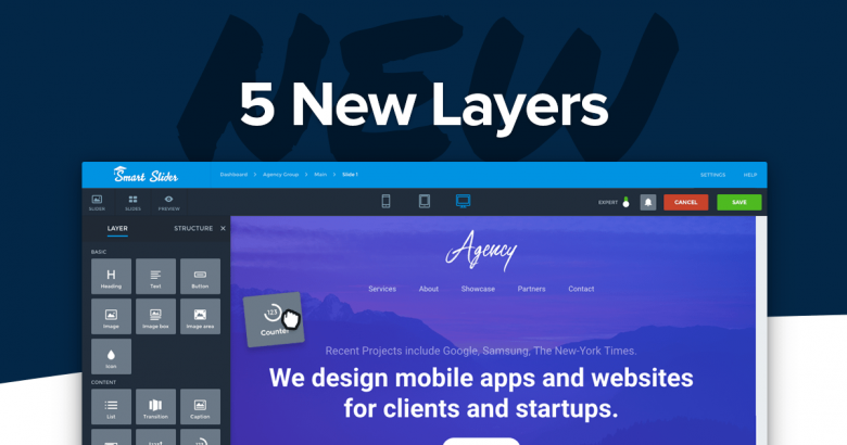
Smart Slider 3 has come a long way since its initial release. The latest version (3.2.4) has some nice surprises for our PRO users. During the development of Smart Slider 3, we request and receive feedback from our users and the most common requests are for new layers. Some of them may be familiar to page builders, so let’s take a look at them!
Counter layer
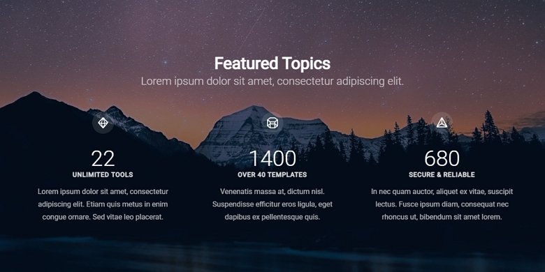
If you have ever used a page builder, you will find these layers really familiar. Usually, people use counters to display the number of their satisfied customers or successful sales. We created two different type of counter layers for you to use. The first one is a basic counter, which counts from the given starting value to the end one. Of course, you can customize it with a prefix, postfix, and label which you can also style, but that’s it.
Circle counter
The other one, the circle counter places a nice looking circle progress bar around the counter. You can change its color, add custom prefix, postfix, or label. You can customize both to your liking by changing the colors, font families and sizes.
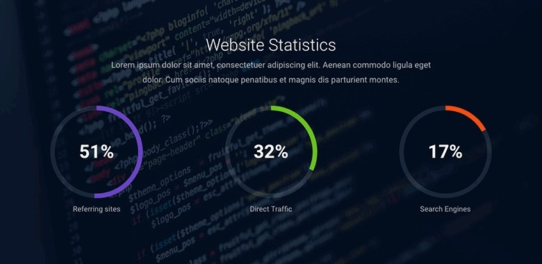
Progress bar
In many ways, the progress bar is a lot like the counter layers, but it’s horizontal. Of course, you can add texts similarly to the circle counter. Every customization option is available to create a nice progress bar that fits your site.
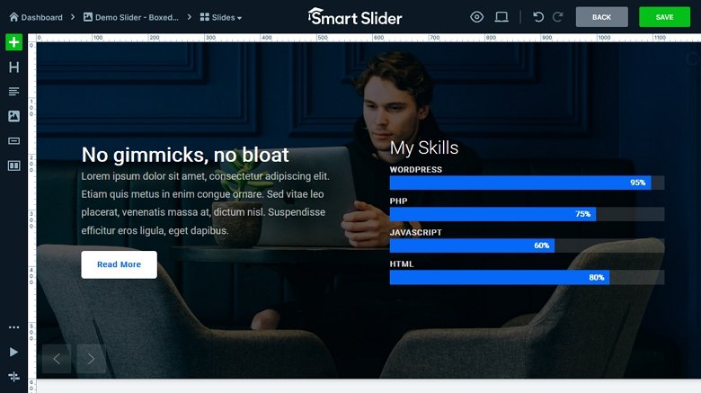
Image box layer
Have you ever needed to quickly create a slide with just a title, a longer description and an image next to them? In canvas mode, it usually takes lot of time and effort to set this up. Making it look good in different responsive scenarios is time-consuming. Of course, it became easier in the new Content mode, but you still need to manage three separate layers. The image box layer keeps the image, heading, and description in the same layer. This means you can manage everything at the same place. No more messing around with the different layer positions!
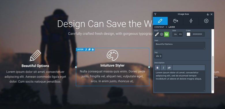
You can also change the layout with a single click, without having to do other adjustments. For example, moving the layer to another column, changing padding and so on. Of course, you can design the heading and description can separately in the layer window. This means you can set different font sizes, color or even font families at each of them. Oh, and you can use icons instead of images if you prefer that.
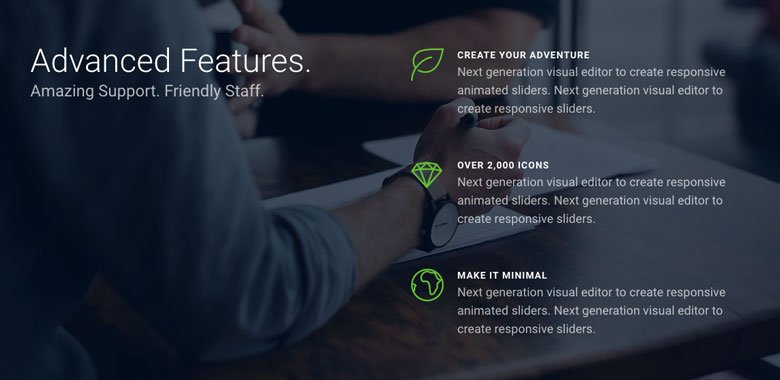
Audio layer
Playing videos on a website is a common practice, but playing sound isn’t so popular yet. So if you play a music on your site, you can give a unique experience to your visitors. Probably this is the reason that the audio layer was the most requested new layer in this list. The audio layer allows you to select an mp3 file which you can play automatically or on user action. As of customization, you can define the main and secondary color of the layer to make it fit your site.

Button icons and icon layer update
It’s popular to put an icon to a call to action button to help to direct the visitor. From now on, the button layer has an option to select font icons from a wide variety of font icon libraries. (Currently you can select them from these libraries: Font Awesome, Icomoon, Linear icons, Material icons or Typicons.) This means that there is a wide variety, constantly updated icon list to choose from. Also, the icon layer uses the same font icons from now on, so you can keep them synced.
Conclusion
Of course, you can find other other great improvements in Smart Slider 3.2.4, but we felt that these are the most notable. What is your opinion on the new layers? Is there any other feature you would like to see in Smart Slider 3? Please tell us in the comments below!
