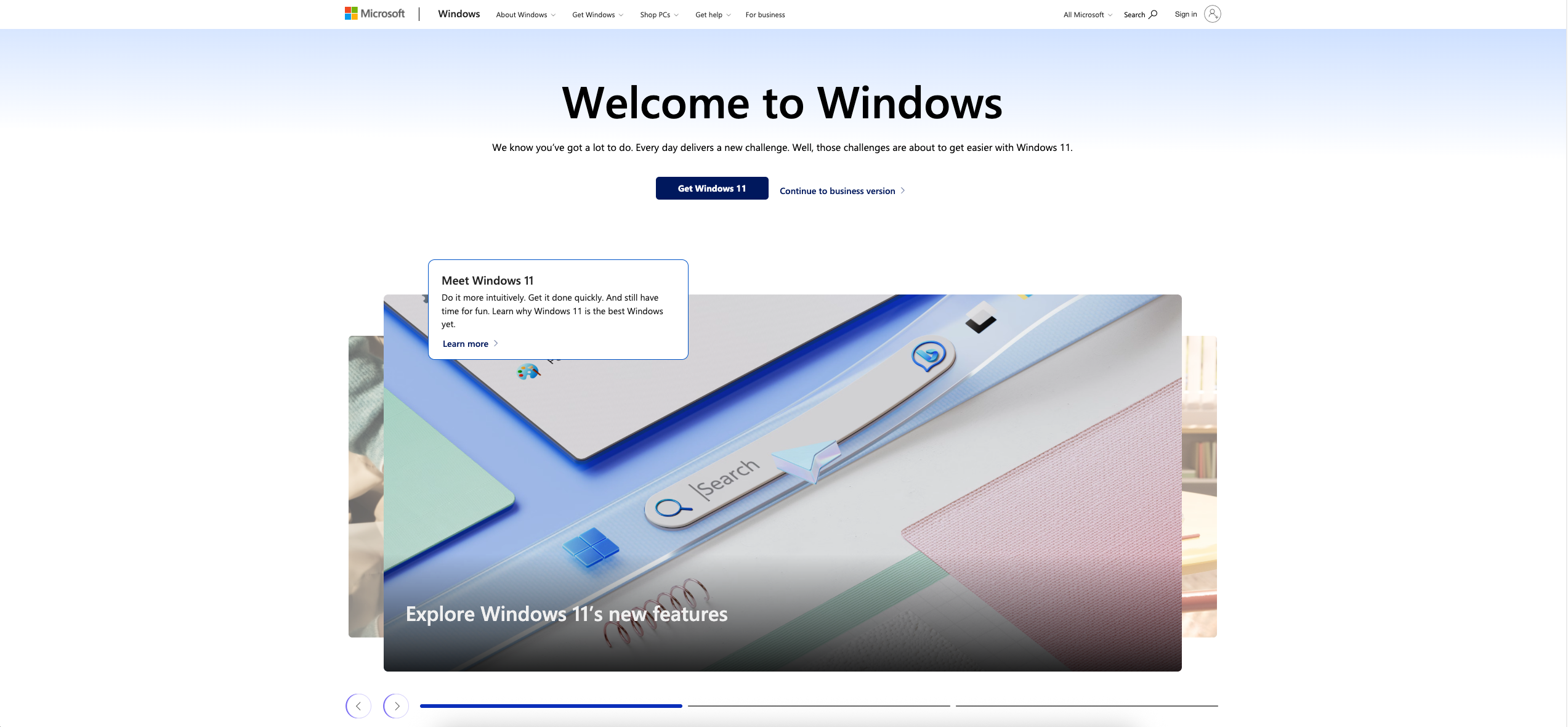
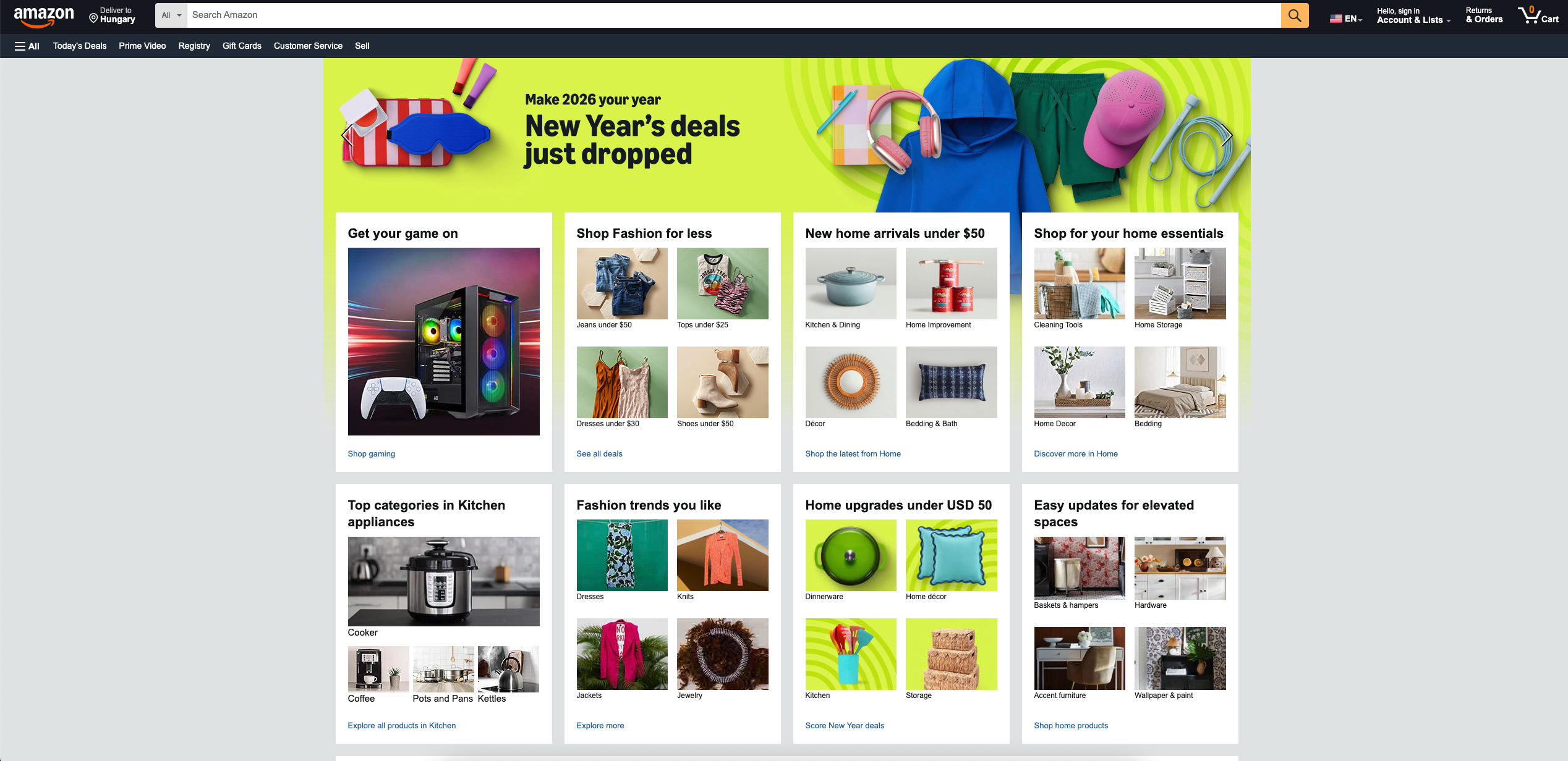
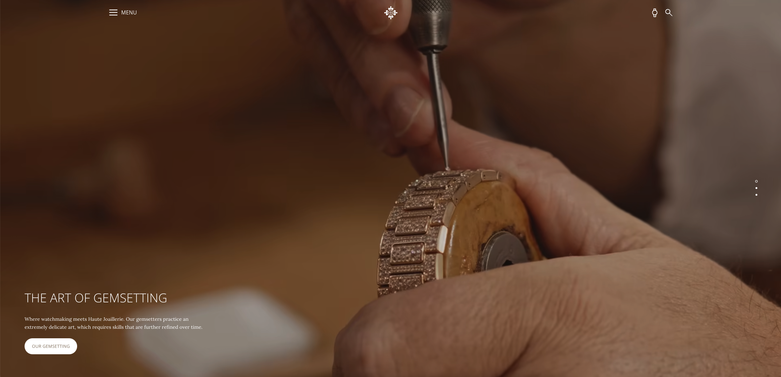
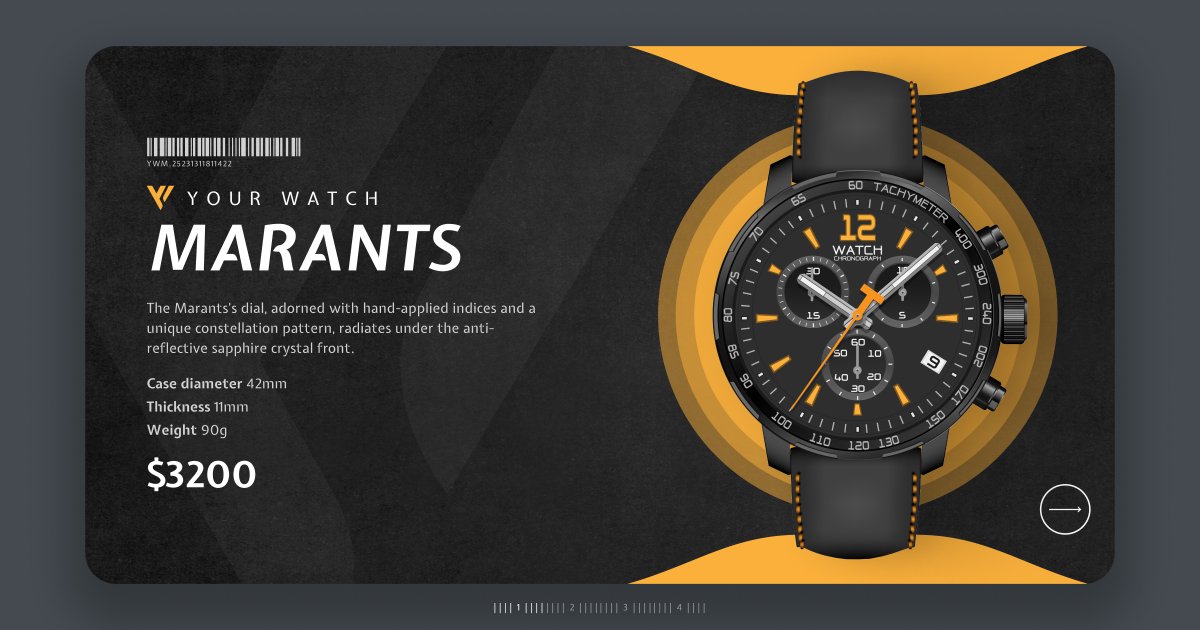
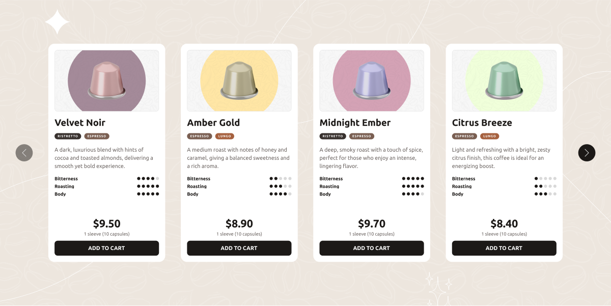
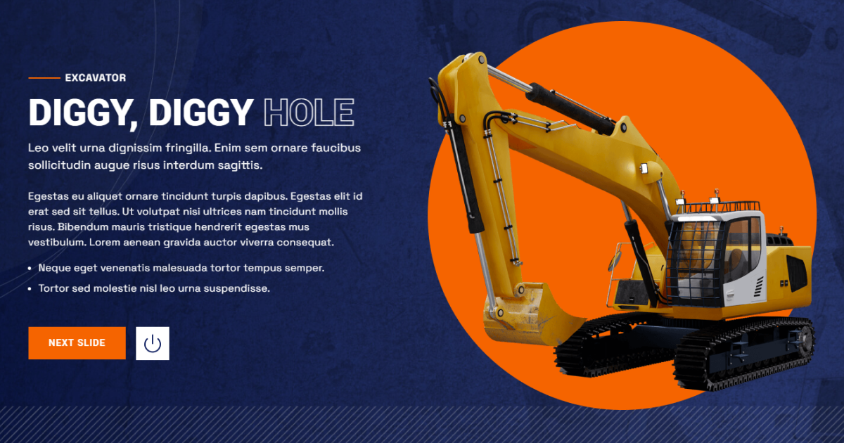
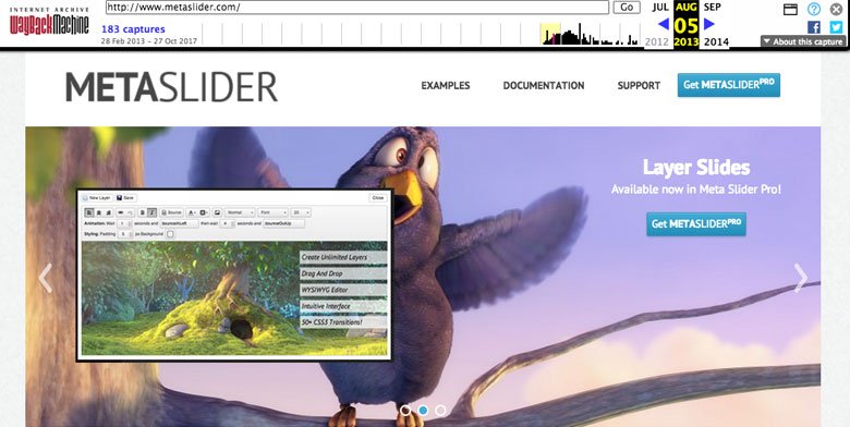
One of the biggest trends in web design and WordPress in recent years has been the use of big images. And not just large, but completely oversized images that come to life on screen. When used at the top of the page, they’re known as hero headers. But what I want to tell you more about today is hero sliders.
What is a hero slider?
A hero slider extends the idea of a hero image, allowing you to present multiple hero images in sequence, using captions, transitions, and animation.
A hero slider is defined as a large, featured series of images prominently displayed on the homepage.
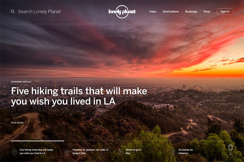
What’s so impressive about this hero slider on the Lonely Planet website is a number of things:
- It features four stunning photos, which you can scroll through at your leisure, or sit back and watch it on autoplay.
- There’s clear navigation at the bottom – each image has a description that puts it into context.
- There are clear calls-to-action labelled “Read More” that direct the reader to complete the desired action.
- When you click on the navigation, the autoplay stops so you can focus 100% on each image.
First impressions count, and this hero slider makes good use of Lonely Planet’s extensive archive of beautiful travel photography, making a strong first impression on would-be travelers.
What’s more, Angie Schottmuller describes a hero shot as “a credible photo or video of a solution that encompasses relevance, context, value, and emotion to support, educate, or persuade”.
So a hero slider isn’t simply a series of large photos – they are large photos that complement your value proposition – in the case of Lonely Planet, beautiful travel locations – to provide clarity and context to your visitors. It’s a series of photos with a purpose.
Why Use a Hero Slider?
To really understand why hero sliders work, it’s important to understand some basic psychology behind how people judge your website. How visitors perceive your website plays a crucial role in how they interact with it. People feel happy when they see a website that:
- instantly makes sense,
- is easy to read,
- clear, and
- understandable.
It doesn’t take long for people to make a judgment about who you are and what you represent, and a hero slider helps create a sense of ease, clarity, and understandability right away.
In fact, it takes only about 50 milliseconds (that’s 0.05 seconds) for site visitors to form an opinion about your site. That’s how long you have to convince visitors to stay and not abandon your site.


