Settings
The Articles is a full width slider where you can display your latest posts. There are many kinds of navigation, which can be used to switch your slider. One of them is the bullet control. These are the little dots under the slider, which can be empty or they can contain the title or the index of your slides. Now the bullets are on the right side of the slider, and display the title of the slides.
These bullets are great, when you have many slides, and you don’t want your user to click through all of them with arrows. You can even turn on thumbnails for them like in this example, so when the mouse cursor is over them, they will show a preview of your slides. With this, the navigation can be super fast, and the desired contents can be easily found.
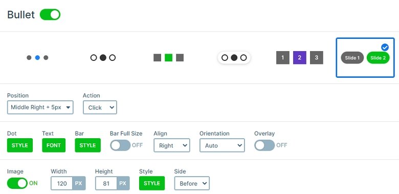
Usually people use this kind of navigation in the bottom of the slider, but it can also look great in a vertical display, on the side of the slider, especially on full page sliders. To know the number of the slides can be helpful, for example when someone is watching a slider made from photographs. It can help the user know how many of them left. It is a dynamic and familiar navigation for the people, which gives a great control to them over the slider.
Layers
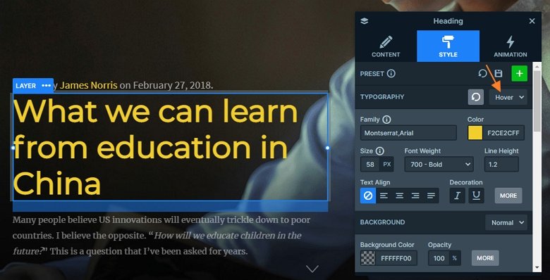
Each slide contains 2 text layers on the top and bottom, and a large heading layer between them. If you hover over the heading layer, the color will change. This is a hover effect on the heading, which style you can customize in the Style tab of the layer window.
Animations
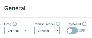
This slider is a vertical slider. You can switch the slider vertically with the arrows or bullets, with scrolling or dragging. The main animation is also vertical, so the visitor can scroll through the slides.
Layout
The layout of the slides is very simple: the layers are under each other. The bullets are on the right side, they display the title of the slides, and if you hover over them, they show the thumbnail images. On the bottom of the slides you can see the next arrow which you can switch slides. The previous arrows are hidden, so you can see only the next arrow.
Responsive
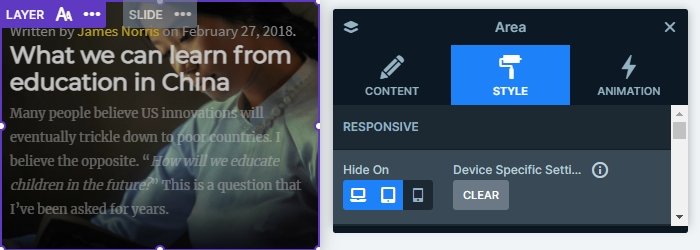
If you check the slider on mobile, you can see the slider is fully responsive. The texts aren’t too big, thanks to the text scale option. With this option you can set the text sizes device specifically. Also, you can notice, there is an extra layer on mobile: an area layer below the texts. This area has a black color with opacity, with this you can make the text legible. This layer is hidden on tablet and desktop, because the text are legible on bigger screens.
Related Post: 11 Beautiful Full Width Slider Examples


