


Slider Settings
The base of the Advertising Agency slider is a simple type slider. These are the most common sliders you can see on websites. You can easily recognize them because they’re pretty much everywhere. They display one slide at a time, which allows the visitor to focus on the content.
Apart from using the Simple slider type, the Advertising Agency slider is also full width. This means it takes up the space between the left and right edge of the screen.
One of the most interesting aspects of the Advertising Agency slider is how it was set up. It contains three slides: a Static Overlay and two regular slides. A Static Overlay is a special kind of slide that is always on top of all regular slides. In this template we used it to display the 3 images around the corners of the content.

Layers
Although there are no special layers, some of them have interesting settings. For example, the video layers which are in Absolute position use a custom Aspect Ratio. This allows them to resize properly when the slider gets smaller.
There’s also an Absolute positioned layer behind the content of both slides. You can easily find this layer from the Layer List.
Animations
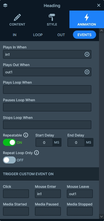
The Advertising Agency slider is full of cool effects. They’re all layer animations, and the most noticeable one is on the Static Overlay. It’s the rotating text, what you can find around the top left corner. It has a Loop animation which makes it rotate continously. The text is actually in an image layer, which contains the words in a circle shape already. Both this layer and the other two layers on the Static Overlay have an incoming animation.
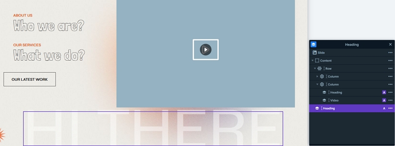
On the slides you can see some spectacular effects. We created them using using events and layer animations. For instance, hovering on the “Who we are?” text does two things. First, it makes the text move 40px to the right. Second, it makes a video appear on the right side.
There’s also a background animation to make the slide switching more interesting. We choose one of the new animations, Distortion for this purpose. It’s Shard type animation gives a nice touch to the template.
Layout
Apart from the Static Overlay, both slides are based on a two column row. The left column contains Default positioned layers, which have text. However, the right hand column contains Absolute positioned layers.
What’s the difference between Default and Absolute positioned layers? Simply put, the way they behave on the slide. Default positioned layers actually take up the space they need. So if you break a one line text into two lines, it will push down the other layers after it. But Absolute positioned layers don’t take up space; they’re just floating around. So if a one line Absolute positioned text breaks into two lines, it will cover the layer after it. We recommend building your main content with Default positioned layers. Then if you want to add some decoration, you can use Absolute positioned layers for those.
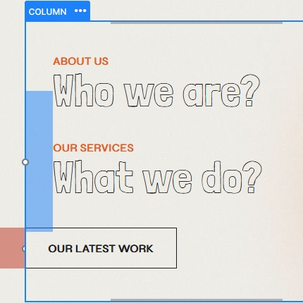
The other interesting part of the layout is the way left columns look and behave. At the editor you can see 40px padding on the Column where the texts are. The button below them has -40px margin, making the content not aligned in the editor. However, when you view the slider in the preview or in a live site, you’ll see they’re aligned. When the mouse is over the text layers, it triggers their layer animation. As a result, the layer moves 40px away to reach its original position. Additionally, they create a super nice effect.
Responsive
Smart Slider is a great tool to create responsive sliders. Additionally, it offers many tools to fine-tune how your slider looks on small screens. Additionally, some responsive-friendly settings activate automatically. For example, a row’s columns automatically break into new lines on mobile. This gives more space to display their content.
You can also adjust the font sizes separately for each device. Additionally, you can also adjust the margin around the layers. Furthermore, you can change and the padding of the rows and columns. These options help create the perfect distance between your content.
Related Documentation: Layer Animations & Events
Related Post: Do you need a Free Full Width Slider for your Site?