From the creators of Smart Slider: Meet Mosaic, our new visual theme builder for WordPress.

Join Beta
Design

Hero Sliders in Web Design: Ideas, Examples and Inspiration

Raelene Morey
Raelene Morey
January 1, 2026

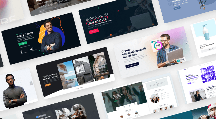
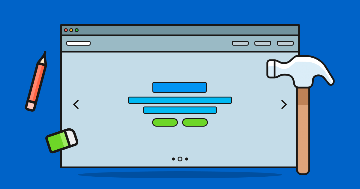
One of the biggest trends in web design and WordPress in recent years has been the use of big images. And not just large, but completely oversized images that come to life on screen. When used at the top of the page, they’re known as hero headers. But what I want to tell you more about today is hero sliders.

What is a hero slider?

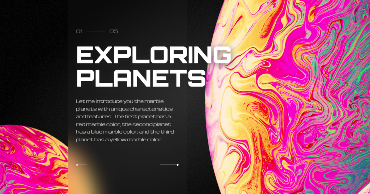
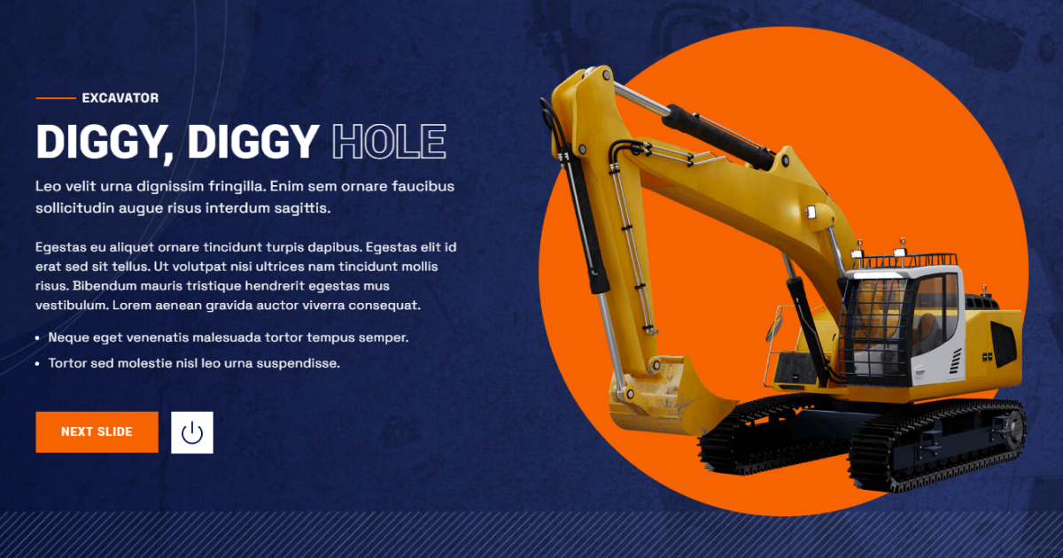
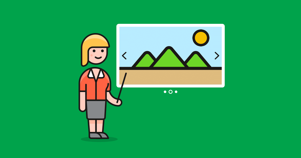
A hero slider extends the idea of a hero image, allowing you to present multiple hero images in sequence, using captions, transitions, and animation.

A hero slider is defined as a large, featured series of images prominently displayed on the homepage.

Example for a hero slider
Lonely Planet’s hero slider

What’s so impressive about this hero slider on the Lonely Planet website is a number of things:

  • It features four stunning photos, which you can scroll through at your leisure, or sit back and watch it on autoplay.
  • There’s clear navigation at the bottom – each image has a description that puts it into context.
  • There are clear calls-to-action labelled “Read More” that direct the reader to complete the desired action.
  • When you click on the navigation, the autoplay stops so you can focus 100% on each image.

First impressions count, and this hero slider makes good use of Lonely Planet’s extensive archive of beautiful travel photography, making a strong first impression on would-be travelers.

What’s more, Angie Schottmuller describes a hero shot asa credible photo or video of a solution that encompasses relevance, context, value, and emotion to support, educate, or persuade”.

So a hero slider isn’t simply a series of large photos – they are large photos that complement your value proposition – in the case of Lonely Planet, beautiful travel locations – to provide clarity and context to your visitors. It’s a series of photos with a purpose.

Why Use a Hero Slider?

To really understand why hero sliders work, it’s important to understand some basic psychology behind how people judge your website. How visitors perceive your website plays a crucial role in how they interact with it. People feel happy when they see a website that:

  • instantly makes sense,
  • is easy to read,
  • clear, and
  • understandable.

It doesn’t take long for people to make a judgment about who you are and what you represent, and a hero slider helps create a sense of ease, clarity, and understandability right away.

In fact, it takes only about 50 milliseconds (that’s 0.05 seconds) for site visitors to form an opinion about your site. That’s how long you have to convince visitors to stay and not abandon your site.

The new way to build a Slider
Next generation visual editor, customizable animations & effects, and access to hundreads of premade templates.
Get Started
Smart Slider 3 - The new way to build a Slider

Inspiring Examples of Hero Sliders

Some of the world’s biggest brands have recognized the value of hero sliders and their ability to grab a visitor’s attention, allowing them to deliver key information in an organized and focused way.

Microsoft hero slider

Microsoft slider
Microsoft slider

Microsoft uses a clean, content-driven hero slider to guide visitors through what’s new in Windows, without overwhelming them. The slider combines large visuals, short, focused messages, and clear calls to action, while subtle navigation indicators show users there’s more to explore.

What works especially well here is how the slider balances simplicity with flexibility. Instead of cramming everything into a single hero, Microsoft can highlight multiple features and entry points in the same space, keeping the page calm while still surfacing important updates and options.

Hero slider at Amazon

Hero slider by Amazon

Amazon uses a high-impact promotional hero slider to surface multiple deals and categories at once, helping visitors quickly spot what’s relevant to them. The large seasonal banner sets the context, while the grid-style slides underneath guide users into specific product groups, offers, and price ranges.

What works especially well here is how the slider prioritizes speed and clarity. Instead of focusing on a single message, Amazon can promote many entry points in one view, letting shoppers jump straight into deals that match their intent, all without slowing down the browsing experience.

Patek Philippe’s hero slider

Patek Philippe’s hero slider

Patek Philippe’s hero slider is refined and immersive. It uses full-screen video and imagery to highlight craftsmanship in motion, letting visitors move through carefully curated stories rather than promotional messages. Why does this work? It feels calm, intentional, and premium. Instead of pushing actions, it invites visitors to slow down, appreciate the detail, and explore the brand’s world at their own pace.

Stunning Examples of Smart Slider 3 Hero Sliders

With Smart Slider 3, you can easily recreate any of the slider designs above and make customizations to suit the look and feel of your WordPress site. Give Smart Slider 3 a try for free! And here are a few great examples that show off what you can achieve with this versatile plugin.

Undiscovered Universe

Undiscovered Universe slider
Undiscovered Universe

Undiscovered Universe uses an immersive hero slider that puts visuals front and center while supporting them with bold typography and short, focused text. Each slide pairs a large planetary image with clear headlines and descriptions, creating a strong sense of scale and curiosity without overwhelming the viewer. By keeping the text on one side and letting the visuals dominate the other, the layout feels balanced and intentional, making it a great fit for storytelling or concept-driven pages where atmosphere and first impression matter most.

Watch showcase

Watch showcase slider
Watch showcase

The Watch Showcase template uses a horizontal product slider to present premium items in a clean, focused way. Each slide centers around a large, detailed product image, paired with clear specifications, pricing, and branding elements that feel refined and intentional. The wide layout and generous spacing give the product room to stand out, while subtle navigation cues encourage browsing without breaking the flow. This setup works especially well for high-end products where visual detail and a sense of quality play a key role in capturing attention.

Brew Yourself

Brew Yourself Slider
Brew Yourself

The Brew Yourself template uses a horizontal product carousel to showcase multiple items at once in a clean, shop-friendly layout. Each slide presents a compact product card with an image, name, short description, visual indicators for attributes like bitterness or roast level, and a clear price and add to cart button. By showing several products side by side, visitors can easily compare options without leaving the flow of the page. The consistent card design and smooth navigation make this slider especially effective for e-commerce use cases where clarity, scanability, and quick decisions matter.

Magic Devs

Magic Devs in Smart Slider 3
Magic Devs

The Magic Devs template uses a bold, character-driven layout to introduce people behind a service in a playful and memorable way. Large typography sets the tone at the top, while rounded profile cards slide into view to showcase individual team members with names, roles, and portraits. The contrast between the dark background and colorful shapes keeps the design lively without feeling chaotic, making it easy to scan and visually engaging. This slider works especially well for agencies or teams that want to highlight personality, approachability, and human connection rather than just listing features or credentials.

Construction

Construction Slider
Construction

The Construction template uses a strong hero-style slider to present projects and services with confidence and clarity. Each slide combines bold headings, structured text blocks, and a large 3D visual element, creating a clear focal point that immediately communicates scale and professionalism. The contrast between the dark background and the bright accent shapes helps important details stand out, while the clear call to action guides visitors forward. This layout works especially well for construction, architecture, or engineering sites where trust, structure, and visual impact are key to making a strong first impression.

Common Problems with Hero Sliders (and Their Easy Solution)

Unfortunately, hero sliders do have haters. It’s true. And it’s a shame because, as I’ve outlined above, hero sliders have clear benefits for both site owners and users. Some of the common misconceptions include:

What you’ll notice about each of those links is that they were published in 2013 (with the exception of one review, which is even older). Well, it’s now 2026, which in tech years is a lifetime! Design techniques have advanced immensely over the past years, nullifying many of the assertions made against hero sliders in these posts.

For a start, hero sliders back in 2013 (thanks to Wayback machine) looked a lot like this:

Hero slider in 2013
Hero slider in 2013

Ugly, right? No wonder people hated hero sliders. In 2026, hero sliders look like this:

Hero slider in 2018
Hero slider in 2026

Stunning! I often trot out this example because it’s so freaking beautiful. If it’s not already obvious, the difference between hero sliders from 2013 and those created in 2026 is design. It all comes down to good design. But also, modern slider solutions, such as Smart Slider 3, provide modern features, such as layers, transitions, text editing, custom CSS, and more, that make it easier than ever to design stunning sliders like the Squarespace one above with little effort.

Clearly, designing and choosing images and videos for your hero sliders is as much art as it is science. It’s also just as much about branding as it is conversions. Fortunately, some frameworks can help guide decisions around hero slider design.

Angie Schottmuller’s 7-step framework provides a set of questions to ask yourself when judging hero images and video:

  1. Keyword Relevance – Does the image visualize the targeted keyword or referring link text?
  2. Purpose Clarity– Does the featured image help identify the page’s purpose and/or offer?
  3. Design Support – Does the featured image support and enhance the seamless flow of the page design leading to the CTA? (i.e., photo size, complementary CTA color, contrast, complexity.) Does the featured image have a subtle cue pointing in the direction of the CTA? If yes, +1 bonus! (e.g., eye path, lines, shadows)
  4. Authenticity – Does the featured image represent the organization and offer in an authentic, credible fashion? (i.e., genuine, honest, believable, actual vs. stock photo, brand-aligned)
  5. Added Value – Does the featured image add value by showing detail or context to improve relevance, demonstrate benefits, and answer questions?
  6. Desired Emotion – Does the featured image portray desired qualities or emotions to resonate and inspire action? (Considerations: mood, lighting, scene, body language, colors, urgency)
  7. Customer “Hero” – Does the featured image depict the customer as the “hero” once equipped with this solution?

The hero slider above from 2013 lacks all of these points. But when you look at the slider from 2026, it’s obvious a lot of thought has been put into its design, and it checks off each and every one of the 7 steps in Schottmuller’s framework.

Ultimately, great hero sliders have great design. They aren’t simply a sliding series of images. They are designed with purpose and with the user at the center of that purpose. Because when you ignore the user, and basic design considerations such as clarity, authenticity, and emotion, you’ve really just got a boring set of images that don’t make any sense.

Again, with your hero slider, you’re looking to complement your value proposition and create a great first impression. And a well-designed slider will help you do exactly that.

What About SEO?

“Sliders are bad for SEO.”

Yes, this is true of some poorly-designed slider solutions. But modern options, like Smart Slider 3, make SEO a priority. This WordPress slider plugin allows you to add alt tags for each of the images in your sliders, as well as each layer in your slider. This ensures your images are not only accessible but searchable in Google.

What About Mobile?

“Sliders don’t always work well on mobile devices.”

This might’ve been the case five years ago, but nowadays, slideshow plugins like Smart Slider 3 provide responsive solutions for different devices, including:

  • The ability to swipe through slides rather than click
  • You can turn layers on and off for different devices
  • The ability to optimize fonts for smaller devices

With these features at your disposal, you can ensure your hero sliders look fantastic on all devices, including desktop and mobile.

Ready to Create Your Own Hero Slider?

Hero headers are among some of the best and most visually appealing trends in web design in recent years, but paired with sliders, they have even more visual punch. When done correctly, hero sliders deliver context and clarity, helping visitors quickly understand what your site is about and what you have to offer.

A great hero slider needs great design, and thanks to solutions like Smart Slider 3, anyone can create a beautiful slider with little effort, using features like drag-and-drop, animations, transitions, buttons, and more.

I hope this tutorial has inspired you to experiment with hero sliders. Feel free to share your thoughts and questions in the comments below!

Raelene Morey

About Author

Raelene Morey is the Chief Bird at Words By Birds , an agency that helps WordPress businesses make better content. Computer science grad turned newspaper journalist and ex-managing editor at WPMU DEV. Raelene has been developing WordPress sites for over 10 years.