

Settings
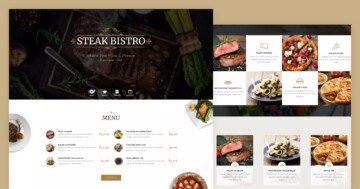
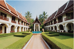
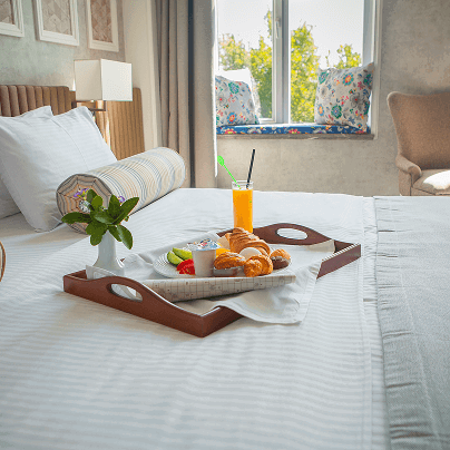
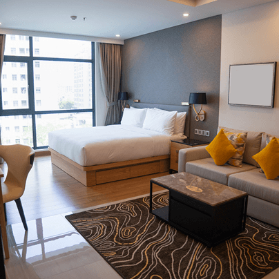
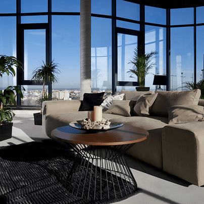
If you’re looking for something clean and easy to use, the Favorite Resort slider is a great pick. It shows one slide at a time using a full-width layout, which helps keep things focused and not too busy. Plus, it stretches all the way across the screen, so your content gets plenty of space to shine.

There are a few navigation options. On phones or tablets, people can just swipe through the slides. On the other hand, right from the first slide, you can make certain layers clickable so people can tap through to the next one.
Layers
Each slide sticks to a simple setup using layers like rows, columns, headings, images, and text. Even with that shared look, every slide still has its own unique feel so it doesn’t get repetitive.
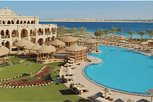
When you get to the third slide, you’ll notice something a little different, an Image Area layer. Unlike the regular image layer, this one lets you fill a specific space with an image and crop it if needed. It’s great when you want more control over how your image fits into the design.

Remember those clickable layers we mentioned earlier? Setting them up is pretty straightforward. Just use the link action on the layer you want, and you’re good to go. You can even adjust a few settings to make sure it works exactly how you want. In this slider, we’ve set it to move to the next slide when clicked.

Animations
This slider has some really fun animations built in, and they add just the right amount of movement as you go from slide to slide.
On the first slide, the content slides up from the bottom with a bit of a delay. The button’s little arrow rotates 90° when you hover over it. That’s set up using ‘Plays In When’ and ‘Plays Out When’ event settings. It also uses something called Special zero, which just means it instantly snaps back to its starting position (rotated -90°) when your mouse leaves.

The second slide is more low-key. When you hover over the images, they float up slightly from the bottom, with a simple animation using the same kind of hover triggers, without being too flashy.
On the third slide, animations are layered a bit more. First, the text slides in from the bottom, and then the images follow. Hovering over the cards makes them rotate just a little, each one in its own direction with events set up. Like before, Special zero helps them snap right back to their original angle when the hover ends.

The last slide keeps things smooth, content comes in with a slight delay, and the rotating arrow button also makes a comeback.
Layout
Each slide keeps things organized with a clean, row-based layout, but there’s still some variety to keep it interesting.
On the first slide, the content is stacked in rows, one under the other. The first row has an image with a negative margin, which pulls it up so it sits just below the text.

The button at the bottom also uses a negative margin to slightly overlap the image above it. It’s built using a mix of rows and columns and has a subtle border to help it stand out nicely.
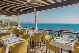
The second slide also uses rows as the base structure. Each row is split into three columns, one for the image, one for the text, and one empty column just for spacing. The middle (text) column takes up a bit more room, while the other two evenly share the space that’s left.

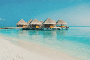
The third slide is still sticking with rows, but now we’ve got two main sections, one row for the text and another just for the cards. The card row is split into four equal parts, each taking up 25% of the total width, with equal spacing between them. It keeps everything evenly spaced.
The last slide’s layout circles back to the style of the first slide. You’ve got the image and the button again, with the button overlapping the image using the same negative margin trick.
Responsive
All the sliders are fully responsive, which means they automatically adjust to look great on any screen size, so no extra work for you when it comes to mobile or tablet layouts.
This template does a great job showing just how flexible these settings can be. One example you’ll notice right away is the use of the font resizer. It’s used throughout to keep text readable, whether someone’s viewing it on a big screen or a small one.
A pretty nice touch happens on the second slide. When you switch to a smaller screen, the layout shifts slightly into a zig-zag pattern. That’s because the third column (which is empty and just there for spacing) is hidden on mobile using the ‘Hide on’ option. It’s a clever way to make the layout feel balanced without taking up unnecessary space on smaller devices.