Slider Settings
Smart Slider’s newest template takes advantage of the Simple Slider type‘s easily manageable features. These slides are known for displaying only one of them at a time.
Besides that, they usually take up the full width of the page. You can easily change these settings to match your preferences in the slider’s Size settings tab.
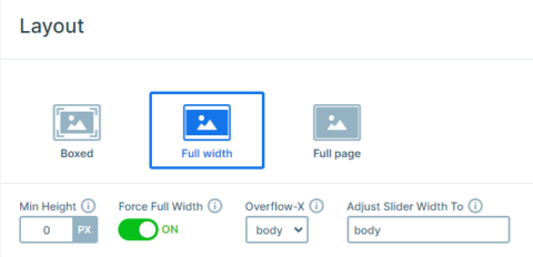
In addition, for a smooth navigation the Tattoo Studio template applies the Arrow option on each slide. Therefore, inside the Controls settings this feature offers many ways for a unique design, just as it can be seen on this slider.
The navigation is nice and fully visible with a special hover effect, which makes it possible for the user to have an unmatched experience while browsing your site.

On top of that each slide has it’s own arrow button with a custom navigation that takes your visitors to the following one.
Layers
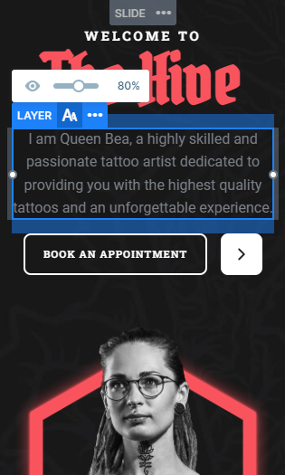
The Home, the Tattoo and the Piercing slide each uses the same layers for their design with almost exactly the same layout.
Nonetheless, all slides have one thing in common that instantly catches the visitors eye. They all have a CTA layer with a navigation as well. To achieve this result you can simply set up the Link Action on the layer.
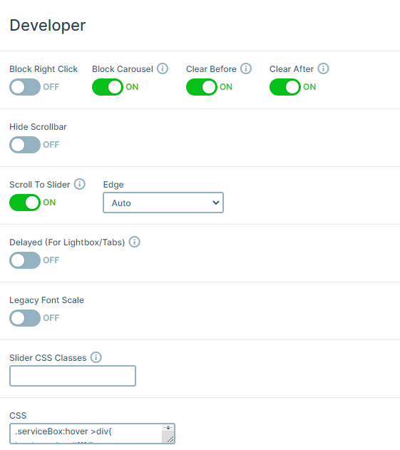
Furthermore, the Services, the Gallery and the Pricing slide each provides a unique experience due to the custom CSS they have. This nice hover effect is achieved by applying a CSS class to their containers in the style settings. The following step consist of completing the Developer settings’ CSS section with it’s own unique design.
Animations
This template uses many fascinating animations that makes it into it’s own unique self. For instance, it’s Main Animation is set to Horizontal. It creates a moving effect that slides each one from their right to the left very smoothly.
Then, it applies layer animations on each layer. These can be very useful in making the introduction of each of your layers stand out.
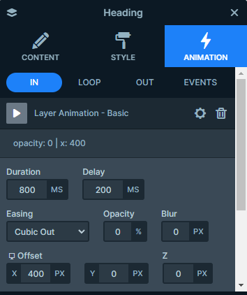
Additionally, all the layers use the same basic animation that moves them in from either side of the slide.
Layout
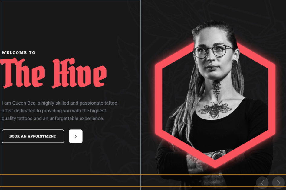
There are two bases for the slides in this template. One of them is built up with using a two column row, each taking up 50% of the slide’s width.
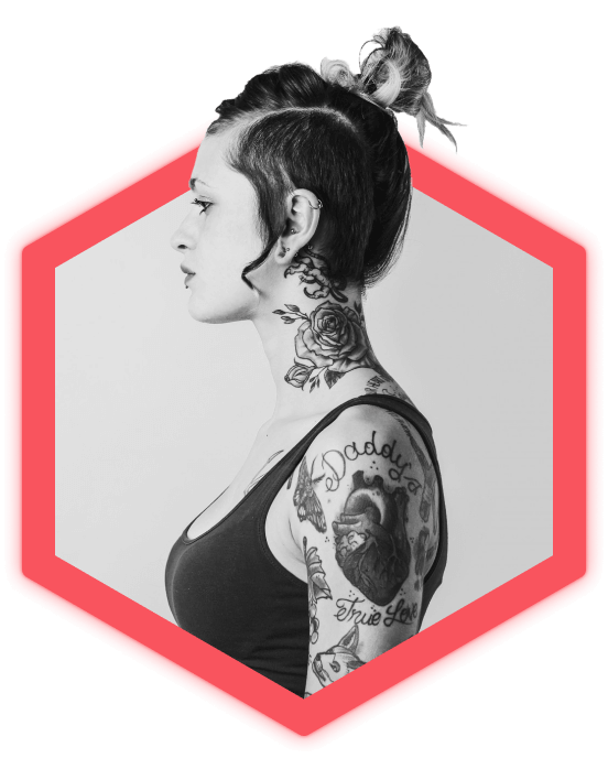
While the right side contains an image layer, the left side holds the slide’s heading and text layers. These come to an end with an individual row design that creates a CTA button, completed with it’s heading and image layers.
Additionally, the next type of layout consists of rows upon rows, that contain the main content. Therefore, creating more of a centered layout for them.
The above mentioned heading and CTA button is paired with either a row showcasing it’s eccentric images or it’s own columns providing information by using image, heading and text layers for it’s sole purpose.
Responsive
If you check the slider on smaller devices, such as your mobile, you can see that the columns wrap under each other creating a better user experience on the additional device.
There are many other options that you can take advantage of in Smart Slider’s mobile-friendly features.
Such as setting specific font-sizes for each particular device, as well as hiding layers to improve your visitors’ circumstances on smaller screens.
