Settings
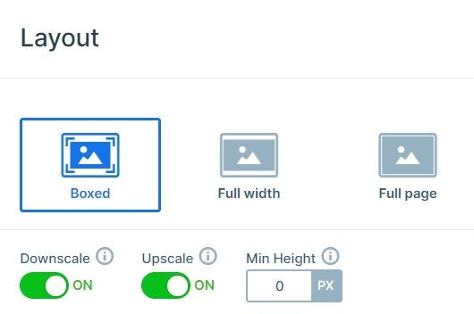
This boxed slider fits perfectly into your page or post content. It’s easy to set up and customize the thumbnails to ensure that the slider fits your site’s layout. Using a thumbnail slider is a great way to encourage the visitor to see more slides. The slider looks simple but attractive with its carefully chosen colors. It can display the post title, and above it the post’s category and date.
Layers
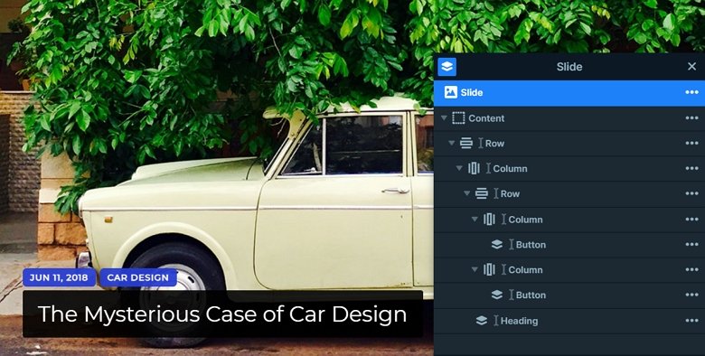
Each slide has the same structure, there is a row, and inside the row there is another row with 2 cols and the heading layer. The heading layer has a black background color which is similar to the captions. The small heading layers have a blue background, and if you use a dynamic post slider, you can replace their text with a variable.
Animations
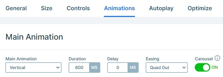
The slider moves vertically, you can drag to the top or bottom, or you can use the thumbnails for navigation. This vertical animation is the main animation of the slider which you can change in the Animations tab of the slider settings.
Layout
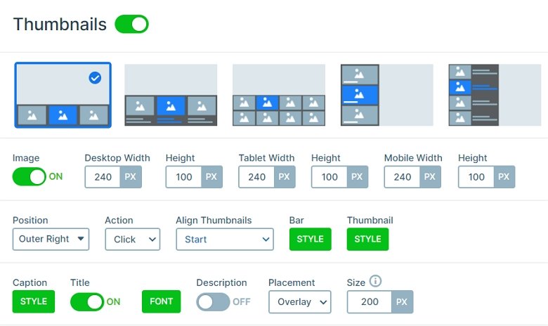
The slider has a simple layout, there is a row, and inside this row is another with 2 columns and with the heading layer. On the right side of the slider you can see the thumbnails which you can fully customize. In this template the thumbnails are 240x100px big. The caption texts have black background and white font-color on the thumbnails, and they are legible because of that contrast.
Responsive
We don’t need thumbnails for mobile, because they don’t look fine in small view so the thumbnails are hidden in this view. The text sizes are smaller on mobile. You can set the font size device specifically with the text scale option.
Related Post: Enrich your Blog with a Post Slider
Related Post: Create A Responsive Thumbnail Slider
