


💡 Best features in this slider
- Text layer, hidden on mobile
- Custom navigation using Link actions
- Shape divider
- Bullet navigation
Slider Settings
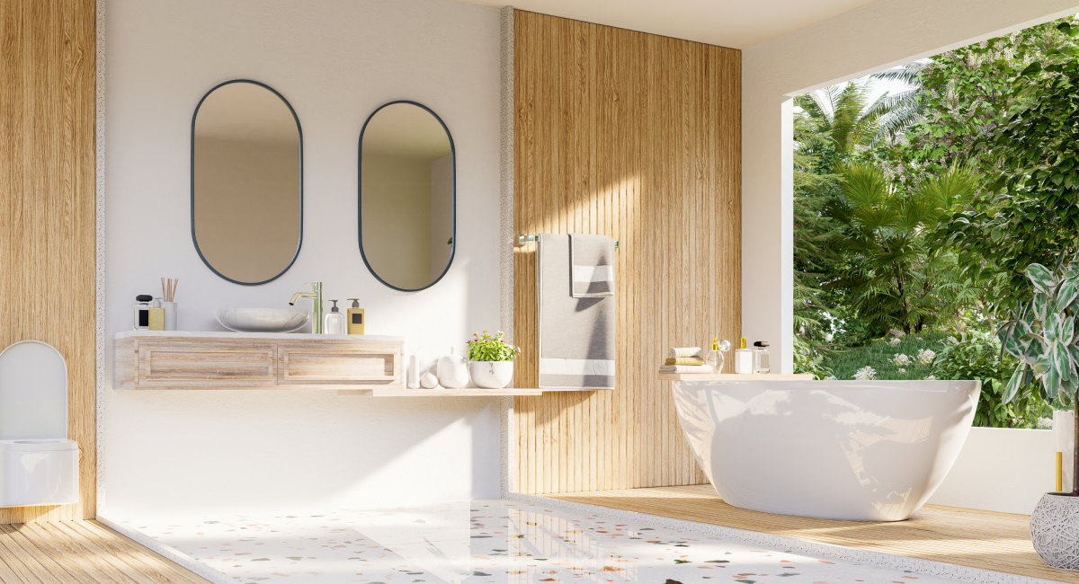
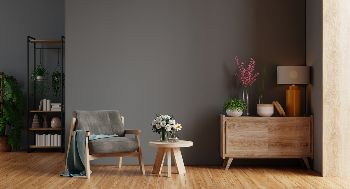
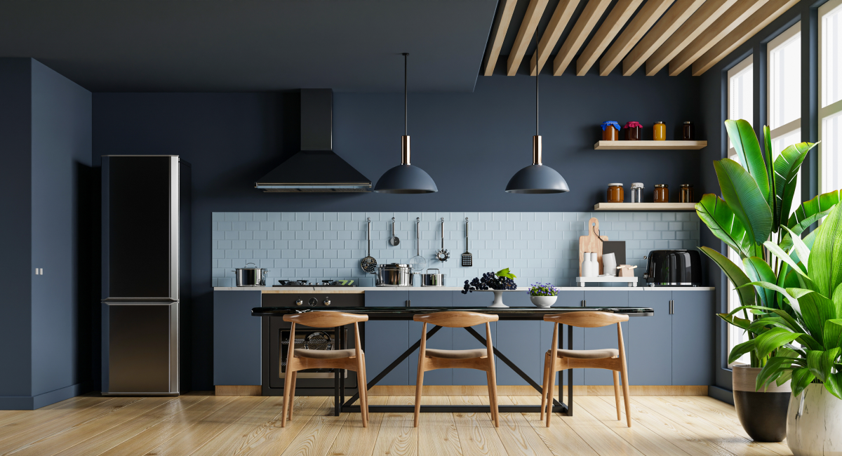
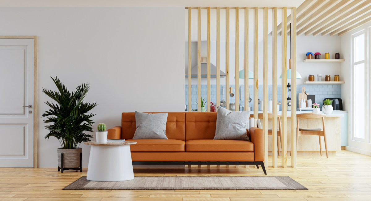
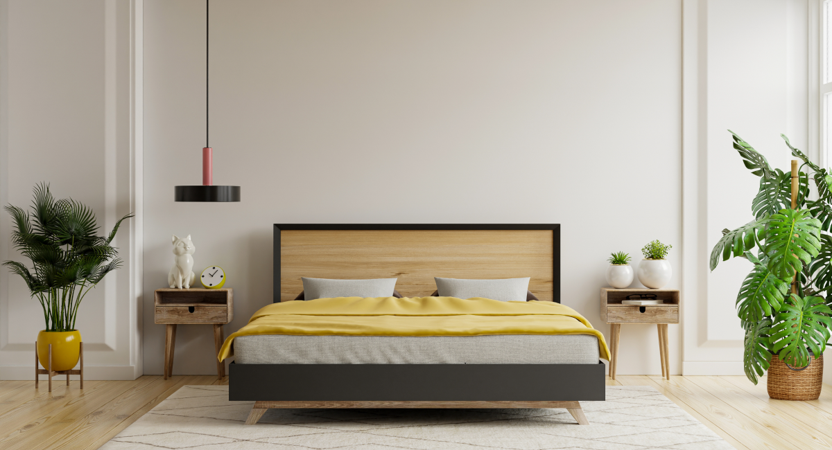
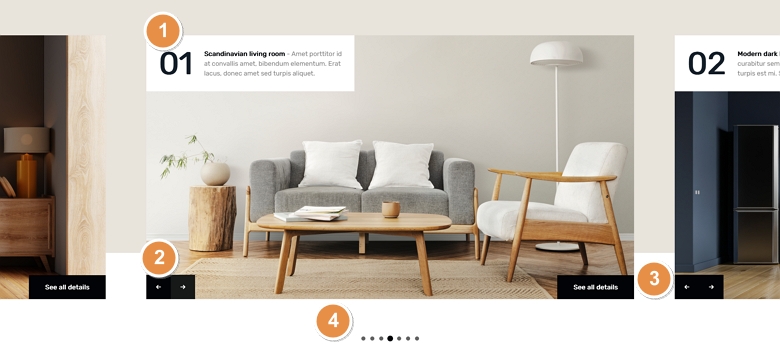
The Interior Showcase template displays more slides next to each other. The showcase slider type which is the base of the slider can display an odd number of slides together. But it always keeps the active slide in the middle. This helps the visitor focus on the primary slide and also see that there are other slides which they can check.
The extra slides displaying next to the middle one can be used for navigation. Clicking on any of these slides makes the clicked slide appear in the middle. Apart from these slides, each individual slide contains navigational arrows to switch forward or backward. Additionally, you can switch slides by dragging or swiping.
There’s also a bullet navigation at the bottom of the slider. Bullets are great way to indicate how many slides there are to see and you can also use them for navigation. The bullets show the slide that has the number 1 on it in the middle. This happens because the starting slide is actually the one in the middle of the slider that was set to be the first slide.
Layers
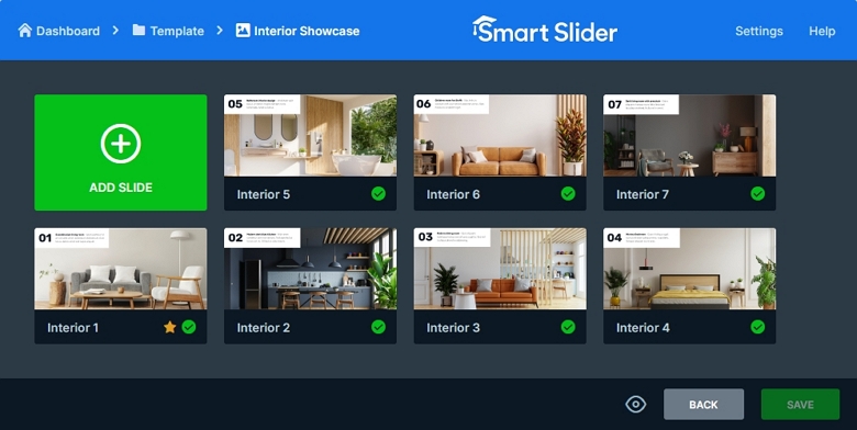
The Interior Showcase slider uses simple layers to display the content. It has a heading, a text, two image and a button layer. The image layers create the forward and backward navigation using Link actions. While the other layers provide the textual content of the slide.
Animations
Although Smart Slider has many great animations, such as layer animations or parallax effect, we choose to keep this template simple. For this reason, the only special effect it has is the Shape Divider at the bottom of the slider.
Layout
The Interior Showcase slider uses a simple layout, but it still looks special. It’s content it placed at the top and bottom of the slide. How to achieve such look? Well, you need a row where the Stretch option is enabled. The Stretch makes the row fill up the whole slide vertically, so it can push the content above it to the top of the slide. Then inside the row’s column the content is Vertically aligned to the bottom.
Responsive
Smart Slider is a responsive slider that offers many great features to make your slides look perfect on small screens. For example, you can adjust font sizes to make the texts easier to read on small screens. Additionally, you can hide layers that are less important to save space on your slider. At the Interior Showcase template we hid the button and the text layer on mobile.
Related Documentation: Link actions
Related Post: 11 Beautiful Full Width Slider Examples